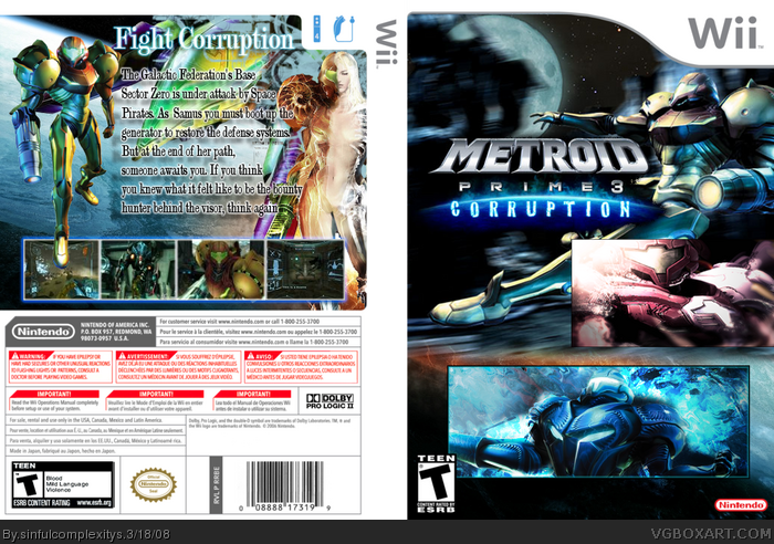
Having three separate pieces of art on the front cover is distracting. I think going with just one would be more appealing. I'm not so sure about Samus' foot blocking the leftmost screenshot on the back, either. I do like the "skeleton" artwork of Samus you used, though.
 Metroid Prime 3: Corruption Box Cover Comments
a new box tell me wat u think @(*.*)@
[ Reply ]
Uhhh... is Samus naked? ...
[ Reply ]
#1, Not bad, yet I don't like the text in the back, and the game logo is a bit choppy. Nice work on the front picture =]
[ Reply ]
It's kind of...uhhh...odd. The logo isn't cut out good, it needs some work, the spine is also without a logo. 3/5
Edited at 1 decade ago
[ Reply ]
I like the front, but a poorly cut logo. The back isn't as good though. 58% and if I could fave the front, I would.
[ Reply ]
i updated the box any thoughts?
[ Reply ]
#6, Nice with the logo change. What about the font in the back =] needs a bit of work?
[ Reply ]
looks good.
[ Reply ]
#8, thanks
#6 i will work on that
[ Reply ]
Having three separate pieces of art on the front cover is distracting. I think going with just one would be more appealing. I'm not so sure about Samus' foot blocking the leftmost screenshot on the back, either. I do like the "skeleton" artwork of Samus you used, though.
[ Reply ]