Well... I don't really like the colin mcrae I don't like the colour or the text. other than that little thing I like it. 3/5 :) Happy saint patricks day.
#2, It was in red at first, I thought it was pretty odd. I may change it. And I don't live in USA or UK, so I odn't even know what Saint Patricks Day is...
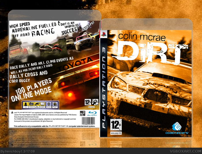
Hmm... the orange colorization really fits DiRT... the image used in the front is really suitable and all labels are used perfectly... the design/layout of the back is really nice and neat... but i think some more text would be nice... (i wouldn't be pround of the online play of DiRT if I was you xD)
9.4/10 is my score for your cover...
(btw may i ask how is the font you used for the text on the back called?)
#7, thanks, I may add text to. And what the "100 player online" thing means is that you can play one race with 99 contestors... I believe it's cool. Anyway, the font is called "28 Days Later" and I forgot to say something :
#9 Well... since it is a cover, the reference to 100 online players is ok, since every developer/publisher is overhyping their games xD, that wasnt meant to be a negative critisism btw, you did what a developer/publisher would do really do, which is what covers are all about, appealing the user to buy a game :D
As for the fonts... thanks a lot, i found and downloaded them... they should come handy for my future creations... :-)
Nice McRae box... fits the bill well with all the dirt and grudge.
Only thing I don't like is the blue Codemasters logo.. I would change it to yellow/orange like the front... and you might like to change the lega text on back as it says "Juiced: Hot Import Nights and THQ! ;)
 Colin Mcrae: DIRT Box Cover Comments
I put about 2 days of works on making it =p I hop you'll comment !
PS : It was kinda hard to make, pretty materialless...
[ Reply ]
Well... I don't really like the colin mcrae I don't like the colour or the text. other than that little thing I like it. 3/5 :) Happy saint patricks day.
Edited at 1 decade ago
[ Reply ]
#2, I agree with the name.I really like the text you used for the back. The screens don't stand out much. Nice work.
Edited at 1 decade ago
[ Reply ]
#2, It was in red at first, I thought it was pretty odd. I may change it. And I don't live in USA or UK, so I odn't even know what Saint Patricks Day is...
[ Reply ]
#4, Green Green day for the irish =]
Try using a better font for the Colin Mcrae.
[ Reply ]
The logo needs a drop shadow, and the Colin Mcrae part doesn't look good. Also, 100 players online is ridiculous.
*pinch*
[ Reply ]
Hmm... the orange colorization really fits DiRT... the image used in the front is really suitable and all labels are used perfectly... the design/layout of the back is really nice and neat... but i think some more text would be nice... (i wouldn't be pround of the online play of DiRT if I was you xD)
9.4/10 is my score for your cover...
(btw may i ask how is the font you used for the text on the back called?)
R.I.P. Colin McRae :-(
Edited at 1 decade ago
[ Reply ]
despite these minor issues, im faving it because i can tell you worked hard, and there wasn't much material.
+fav
[ Reply ]
#7, thanks, I may add text to. And what the "100 player online" thing means is that you can play one race with 99 contestors... I believe it's cool. Anyway, the font is called "28 Days Later" and I forgot to say something :
......R.I.P. Colin......
[ Reply ]
#9 Well... since it is a cover, the reference to 100 online players is ok, since every developer/publisher is overhyping their games xD, that wasnt meant to be a negative critisism btw, you did what a developer/publisher would do really do, which is what covers are all about, appealing the user to buy a game :D
As for the fonts... thanks a lot, i found and downloaded them... they should come handy for my future creations... :-)
Edited at 1 decade ago
[ Reply ]
Well, I updated it with a black "Colin McRae" text...
[ Reply ]
Success. :)
[ Reply ]
Success. :)
[ Reply ]
Nice McRae box... fits the bill well with all the dirt and grudge.
Only thing I don't like is the blue Codemasters logo.. I would change it to yellow/orange like the front... and you might like to change the lega text on back as it says "Juiced: Hot Import Nights and THQ! ;)
[ Reply ]
I agree with LK.
I agree with LK. :P
[ Reply ]
#15, Yeah...sometimes school proxies can be really ghey. LOL :D
[ Reply ]
Wow.
Love this.
Faved this.
[ Reply ]
#14, I did it orange at first, it was pretty hard to see. So I turned it to blue =p
Thanks guys =D
[ Reply ]
The hundred player online in this game is pretty damn insane, I'm not even gonna lie.
Still fun though.
[ Reply ]
#19, yeah, I believe it's great =D and thanks for the +fav ;)
[ Reply ]
Faved Author
Faved Box
[ Reply ]
#21, sorry for bumping, but I must thank you =D
[ Reply ]