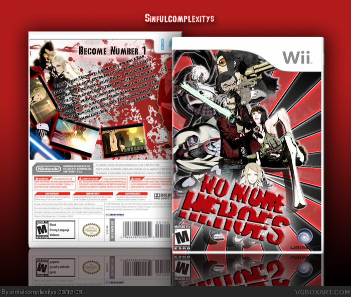
eh... i like it, but there's something about it that i don't. probably the embossed effects, and i think the design is pretty poor. Travis is right handed, and all the assassins in the background look squashed in there, and Sylvia is covered up too much by the logo. Not to mention the text on the back is too slanted and that bloke on the right is totally random. but its a nice try.
that effect on the title does not fit, ubisoft is a bit hard to read ´cause it got black font on black background. the text on the back could need some fixin` too
Wow this is quite a box...
I think the glow on the tagline doesn't really fit the theme. The tagline is probably the worst part of the box, maybe spend some more time thinking about what the game is about and think of a suitable tagline. But I really like the way you have layed out the screen borders and text, the screenborders are not like most so I like the way you have presentated it! I don't really like the logo maybe get a better one with a black or white glow or maybe add it in yourself! So I'd say 4.5/5 and a Fav!
 No More Heroes Box Cover Comments
O.....M.....G
EDIT: FIRST POST W00T!
Edited at 1 decade ago
[ Reply ]
Uh, well this is another new box. Comment and favs all welcome
@(o_o)@
[ Reply ]
#1, Thanks you beat me to my comment. Lol
[ Reply ]
Also, author fave.
[ Reply ]
Why do you emboss everything?!?
[ Reply ]
Front = awesome
But I think you should get rid of the Bevel and Emboss on the logo.
Edited at 1 decade ago
[ Reply ]
#5, I think there only about three. I think thats a bit of his style. Makes the box stand out quite nicely. Well done, and great improvement. + fav
Edited at 1 decade ago
[ Reply ]
Really cool and pretty stylish
[ Reply ]
cool
[ Reply ]
thanks for all the comments and favs @(>.<)@
[ Reply ]
Even though I think you overdid the layer effects, it looks great.
[ Reply ]
#11, Thanks, yeah I know O.o. I'll work on it. Any more idea's?
[ Reply ]
`
Besides the emboss, the back is a bit messy, it's all over the place. But it's a good box.
[ Reply ]
#13, messy? hmm i geuss i will work on that
[ Reply ]
#14, The emboss is a bit messy. Is there a Version 2 coming?
[ Reply ]
#15, version two hmm mabye i take it as the emboss has to go lol
[ Reply ]
eh... i like it, but there's something about it that i don't. probably the embossed effects, and i think the design is pretty poor. Travis is right handed, and all the assassins in the background look squashed in there, and Sylvia is covered up too much by the logo. Not to mention the text on the back is too slanted and that bloke on the right is totally random. but its a nice try.
[ Reply ]
#17, mehh yea it was an attempt
[ Reply ]
that effect on the title does not fit, ubisoft is a bit hard to read ´cause it got black font on black background. the text on the back could need some fixin` too
[ Reply ]
#19, i see wat you mean thanks i will be sure to work on that
[ Reply ]
I love that background.
Oh, and do the things wasa-bi said.
[ Reply ]
Wow this is quite a box...
I think the glow on the tagline doesn't really fit the theme. The tagline is probably the worst part of the box, maybe spend some more time thinking about what the game is about and think of a suitable tagline. But I really like the way you have layed out the screen borders and text, the screenborders are not like most so I like the way you have presentated it! I don't really like the logo maybe get a better one with a black or white glow or maybe add it in yourself! So I'd say 4.5/5 and a Fav!
[ Reply ]