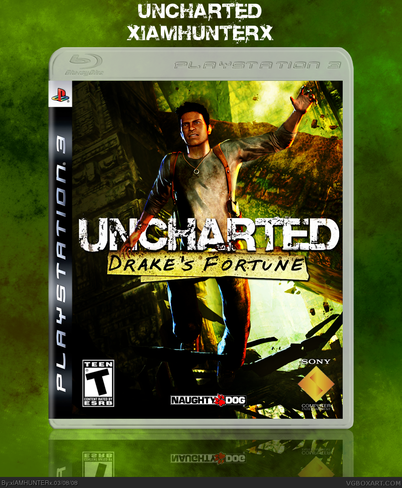
And I don't wanna hear any of that "just a wallpaper", "Drake looks constipated", or "overused picture" crap. For one, a helluva lot of editing went into that wallpaper - rendering Drake's arm over the logo was pretty tough as well. And due to the lack of material for the game, that was the only suitable art I could find.
Credit to Ross for the temp - back's coming up soon, but I just had to put up the front cause I loved it so much.
lol DRAKE LOOKS CONSTIPATED AND THIS IS JUST A WALLPAPER. ahhh no it's good. i would have made the background behind the box darker though. i like the texture
Was that on purpose? If so,
XDDDDDDDDDDDDDDDDDDDDDDDDDDDDDDDDDDDDDDDDDDDDDDDDDDDDDDDDDDDDDDDDDDDDD
If not,
XDDDDDDDDDDDDDDDDDDDDDDDDDDDDDDDDDDDDDDDDDDDDDDDDDDDDDDDDDDDDDDDDDDDDD
Nice update, I think having three piles of photos for screenshots (and maybe cutting down on each pile) would fill the space more on the back - a triangular arrangment next to the parchment.
Also, have the text staggered, or just the right way up. IMO, that would look better. :)
 Uncharted: Drake's Fortune Box Cover Comments
And I don't wanna hear any of that "just a wallpaper", "Drake looks constipated", or "overused picture" crap. For one, a helluva lot of editing went into that wallpaper - rendering Drake's arm over the logo was pretty tough as well. And due to the lack of material for the game, that was the only suitable art I could find.
Credit to Ross for the temp - back's coming up soon, but I just had to put up the front cause I loved it so much.
EDIT: Full view FTW.
Edited at 1 decade ago
[ Reply ]
No back =[ Dude looks sweet add a back so its more amazing. You make great box i know you can do it.
Edited at 1 decade ago
[ Reply ]
Cool, a back would be nice, I really love the choice of colors.
[ Reply ]
Looks good.. but as you say you're going to do a back later... I'll wait for that ;)
[ Reply ]
looks cool would be better with a back! 4/5
[ Reply ]
ALRIGHT, I'M WORKING ON THE BACK! SHEESH! XD
[ Reply ]
I love the colors.
[ Reply ]
Why thank you.
[ Reply ]
I can tell you changed the wallpaper. People were just saying that mine was just a wallpaper too. When I put alot of work into it.
Edited at 1 decade ago
[ Reply ]
So anyone have any suggestions or anything?
[ Reply ]
Dude, you bump your boxes so slickly! ;P
VERY NICE THIZZ IZ OMGZ0RZ MAT3RIAL!
5/5 +faved
[ Reply ]
Aw shit son.
LOL
[ Reply ]
(Drake looks constipated)*snicker*
[ Reply ]
lol DRAKE LOOKS CONSTIPATED AND THIS IS JUST A WALLPAPER. ahhh no it's good. i would have made the background behind the box darker though. i like the texture
[ Reply ]
Haha, thanks guys.
[ Reply ]
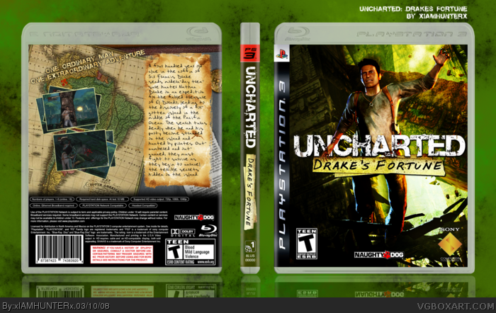
UPDATED WITH THE BACK! Worked for a really long time trying to get it to look right - Even made that burnt paper thing myself, which was a pain.
Hope it pleases you.
[ Reply ]
Man I picked a bad time to update this. =.=
[ Reply ]
This box is the shit.
[ Reply ]
you better not bump this one to death...
[ Reply ]
#19, :P
I'm going to, just cause you said that.
[ Reply ]
#19, :P
I'm going to, just cause you said that.
[ Reply ]
#19, :P
I'm going to, just cause you said that.
[ Reply ]
Was that on purpose? If so,
XDDDDDDDDDDDDDDDDDDDDDDDDDDDDDDDDDDDDDDDDDDDDDDDDDDDDDDDDDDDDDDDDDDDDD
If not,
XDDDDDDDDDDDDDDDDDDDDDDDDDDDDDDDDDDDDDDDDDDDDDDDDDDDDDDDDDDDDDDDDDDDDD
[ Reply ]
Hahaha, yeah, it was. :p
[ Reply ]
Nice update, I think having three piles of photos for screenshots (and maybe cutting down on each pile) would fill the space more on the back - a triangular arrangment next to the parchment.
Also, have the text staggered, or just the right way up. IMO, that would look better. :)
Edited at 1 decade ago
[ Reply ]
WOOT! Compliment from DMS! ^_^
Aight, I'll work on that later. Although, what do you mean by "have the text staggered"? o___O *dumb*
[ Reply ]
Well, Staggered text - using a small font size or large font size to emphasize on certain words (For example the tagline on my FF7 box).
[ Reply ]
Oh right. >___< Do you mean for the synopsis or the tagline?
(Sorry, little slow right now - doing geometry. XD)
[ Reply ]
*laughs uncontrolably*
[ Reply ]
@#28, tagline. "One ordinary man.." e.t.c
Edited at 1 decade ago
[ Reply ]
#30, Ahhhh. Now I gotcha.
[ Reply ]
Awesome.
[ Reply ]
Woot! Thanks.
[ Reply ]
Cant believe I didnt fav this. The back is great the front is alright, I dont really like the colors.
[ Reply ]
#34, Thanks man.
[ Reply ]