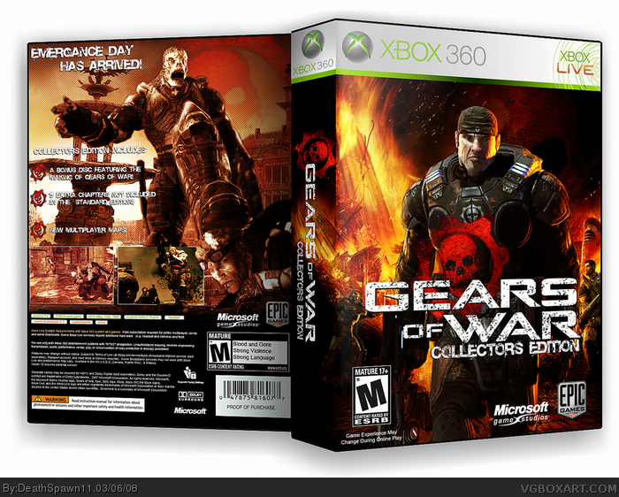
[ Box updated on March 7th, 2008 ] [ original ]
 Gears of War: Limited Collector's Edition Box Cover Comments
Comment on DeathSpawn11's Gears of War: Limited Collector's Edition Box Art / Cover.
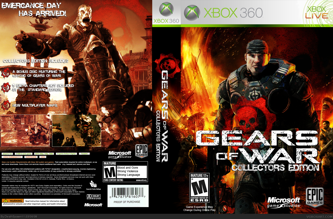
new box from me, custom template. probably gonna be posting in the forums soon along with the render of Marcus Fenix on the front. the bg behind Marcus isn't a wallpaper, it's edited. crits and comments would be friggen awesome.
EDIT: 3D coming in a while.
Edited at 1 decade ago
[ Reply ]
Lookin' good!
[ Reply ]
*wants that render*
*a lot*
[ Reply ]
Good, awesome render, but the box itself isnt your best. Looks rushed.
[ Reply ]
Quality of the marcus in full view is extreemly bad =(
I know this art and it has a giant resolution, so I don't get why it looks so bad =( Or this is a book cover snap?
[ Reply ]
#5, you might have the giant revolution, but I don't. I took a mag scan of it and rendered it and blurred it to take the half-tone magazine dots away. so thats why it looks bad.
[ Reply ]
#6, Hm... I know two versions of this Marcus art. First is just a render with black background. Second is used for Gears Of War book and it's presented as art with old box art as a background (something similar to your box). First one is easy to find in the web in middle res (wich is still big enough) and the second exist only as a preview version in low res. Wich one do you use?
Edited at 1 decade ago
[ Reply ]
#7, He scanned it from a magazine...
[ Reply ]
i must say this is a pretty nice box
[ Reply ]
I'll see.
Here is an illustration of what I was talking about:
This is the art from the book cover: link
This is the art from the high res render link
They looks almost the same, but second is not a scan ;)
DS, I can send the render to you, if you interested. Just PM me.
Edited at 1 decade ago
[ Reply ]
SEND IT TO ME TOOO PLEASEEEEE
[ Reply ]
#10, that would be awesome if you could send the render! =)
[ Reply ]
#12, Give me your e-mail in PM.
[ Reply ]
#11, is that render .png or .pnd?
[ Reply ]
#14, It's jpg. I mean it's not an art (it has black background), just a render of the Marcus.
[ Reply ]
UPDATE: changed the Marcus render. major cred to Mad Spike for it ^_^
3D coming next.
UPDATE2: 3D is up, but I accidentally made the case black >_< plz don't rate down for it, it shouldn't matter really.
Edited at 1 decade ago
[ Reply ]
nice.
[ Reply ]
Now IM commenting and the question is, are YOU happy?
[ Reply ]
Looks a LOT better in 3D + fav
[ Reply ]
It's "Emergence day" and not "Emergance day"
[ Reply ]
eh... i don't like it... i don't like how only half the flames on the front go onto the spine, it looks weird cos the top half just ends when everything else carries on. i dislike what you did with the colours on the back, it just makes it all look weird. this isn't your best 3.5/5
[ Reply ]
Not my favourite from yours but I think its still a nice job.
[ Reply ]