
[ Box updated on March 10th, 2008 ] [ original ]
 The Legend of Zelda: Twilight Princess Box Cover Comments
Comment on mousepad's The Legend of Zelda: Twilight Princess Box Art / Cover.
[ Box updated on March 10th, 2008 ] [ original ]
Comment on mousepad's The Legend of Zelda: Twilight Princess Box Art / Cover.
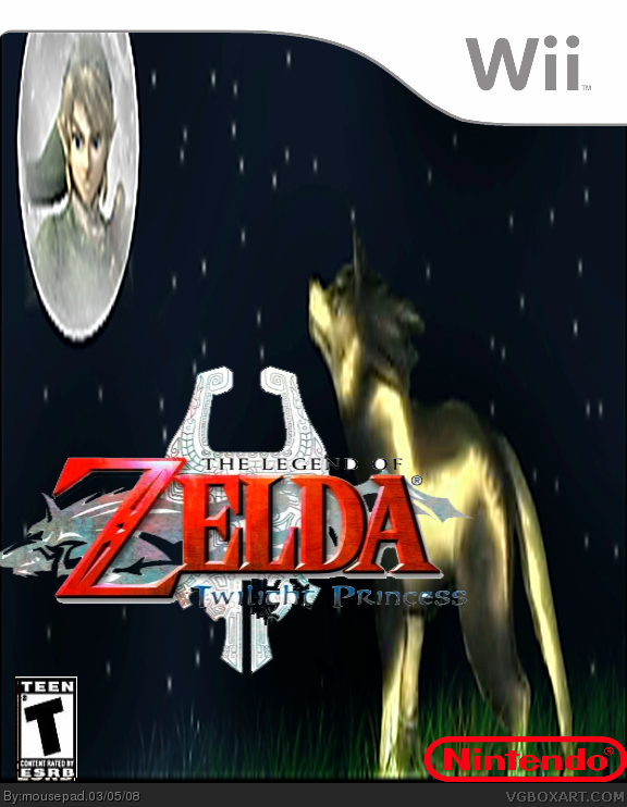
My first Box ever. Credit to Crayon man for the template.
[ Reply ]
Hello???
[ Reply ]
sigh... thanks for knocking off my box... at least you got the template right.
the background image is stretched, cant see some of the logo, the ESRB is stretched, the Nintendo logo is missing the white. What program did you use for this? Anyways... welcome to the site....
[ Reply ]
#2, You've not waited long at all, you shouldn't make comments like that.
[ Reply ]
#4, agree, specially when it's his(?) first box.. excuse me but i thought it was a satire at first or something, cause it looks kinda crappy even for first box..
[ Reply ]
#3, I used Gimp, Why do you ask?
#4, well SORRY!
#5, Yes I am Male, and i am sorry it looks crappy for a first. I should have used the forums, but I wasn't sure What to Do, SO I posted as a First. Sorry it is crappy!
Edited at 1 decade ago
[ Reply ]
Edited at 1 decade ago
[ Reply ]
#6, ok, GIMP is only ok if you learn how to use it or else it could make your work not good
[ Reply ]
#8, I am new to gimp, so It looks crappy.
PS. I will credit you for the template next time.
[ Reply ]
Indeed, post on the critiques thread or pm me if you have any wips, I don't know gimp very well, but I'll try my best. Welcome to vgboxart! ;)
Edited at 1 decade ago
[ Reply ]
#10, thank you!
[ Reply ]
#10 lol wips.
mousepad, everyone's been telling you this is crappy but nothing more, really, so i'll add on to those statements:
1)the nintendo logo is too big, and needs to be filled in with white.
2)the esrb logo needs to be wider, because it's too tall.
3) the wii template is not supposed to be so square
4) the images are stretched
the logo is very bad - if you wont cut out a new one, then put a white glow behind it. i believe in gimp it's the same as photoshop, so blur > gaussian blur then hue/saturation > lightness > 100
[ Reply ]
#12, I was just fixing it up these mistakes when you posted.
[ Reply ]
#13, it still looks the same...
[ Reply ]
#14, I have not updated it yet. My system crashed, but fortunately i backed it up.
EDIT: I updated
Edited at 1 decade ago
[ Reply ]
Cool, but Link should be less transparentimofied. (wow new word learning today 0.0)
Make him stand out and I'll be happy :)
[ Reply ]
#16, Ill try,. :)
[ Reply ]
#16, I Updated The Box, again.
PLz View in full.
Edited at 1 decade ago
[ Reply ]
Hello??? ANYONE HOME??
[ Reply ]
Updated Again.
does nobody like my work? Don't make Me Go on a posting spree for comments!
Edited at 1 decade ago
[ Reply ]
It's ok
[ Reply ]
#21, How do i change it?
[ Reply ]
#22, I Dunno
[ Reply ]
#23, ok
Edited at 1 decade ago
[ Reply ]
0/5
[ Reply ]
#25, WHy??
[ Reply ]
3/5
[ Reply ]
#27, thanks! does nobody realize this is a first?
[ Reply ]
#26, you told me mine was a 0/5 so im telling you that yours is a 0/5.
Edited at 1 decade ago
[ Reply ]
#29, not cool. Soooo not cool! That's such a n00by thing to do.
[ Reply ]
#30, At least a Legend Like you could say something.
[ Reply ]
#31, yes,actually.
[ Reply ]
#29, Thats Pathetic!
By the way,the box is a 3/5
Edited at 1 decade ago
[ Reply ]
#33, Thanks for the score!
[ Reply ]
I just realized somthin.Theres 2 master swords!
[ Reply ]
#35, I know
Edited at 1 decade ago
[ Reply ]
3 out of five prety good for a first go
[ Reply ]
#37, thanks. And could I ask, If you've Checked my other boxes, have I improved?
[ Reply ]
you have definetly improved
[ Reply ]
#39, thank you for saying so! I thought I was getting worse. :D
[ Reply ]
#36, If you know...
EDIT ONE OUT!
[ Reply ]
holy crap!!
you used to suck!!
just playin ;)
[ Reply ]
#42, I will admit, I used to suck. Now, I have Photoshop.
[ Reply ]
#6, I'm sorry if i was rude, but it doesn't look crappy at all now.. but the 1th version.. anyways, the box looks much greater now ( 4th version )
[ Reply ]