he's right, it's the server. chances are reed will delete it if he sees it. he's fairly quick to notice, so that's good.
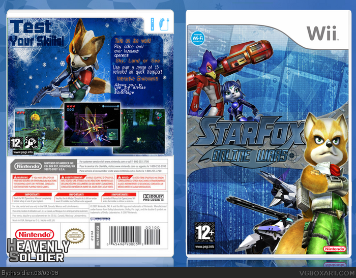
anyway, i like what you've done here! the only problems for me is that the nintendo logo is a bit too small, the text on the back is hard to read (a black glow behind the text should fix that) and the space below the tagline is a bit plain. maybe move fox closer to the edge and tilt him to the right, or something of that sort. overall i think this is great :)
#9, The Nintendo logo does need to be a bit bigger, my mistake #9. hsoldier, this is pretty good. I agree with the back text, I would use a better font, and not make it in italics. I also don't know why the background for the back has snowflakes floating around, and Fox on the front needs a better cutting out. Other than that, it's pretty sweet,you're definitely getting better.
the text on the back needs some gramatical work. other than that i really like the front. the "test your skill" caption is hard to read, doesn't really stand out. all in all not a bad box.
 Star Fox: Online Wars Box Cover Comments
i havent made a box in some time and i'd just bought star fox command so i thought i should make an online starfox for wii
[ Reply ]
thats so awesome and i love it but still i love the logo and for the wi it would be cool!!!!
[ Reply ]
thats so awesome and i love it but still i love the logo and for the wi it would be cool!!!!
Edit:how did it double post?
Edited at 1 decade ago
[ Reply ]
Very sweet, however I don't really like the text on the right hand side of the box.
[ Reply ]
no worries no.4
[ Reply ]
i have to try and stop double posting
Edited at 1 decade ago
[ Reply ]
#6, it's the server that does that.
[ Reply ]
focus on the box and only the box!
Edited at 1 decade ago
[ Reply ]
he's right, it's the server. chances are reed will delete it if he sees it. he's fairly quick to notice, so that's good.
anyway, i like what you've done here! the only problems for me is that the nintendo logo is a bit too small, the text on the back is hard to read (a black glow behind the text should fix that) and the space below the tagline is a bit plain. maybe move fox closer to the edge and tilt him to the right, or something of that sort. overall i think this is great :)
[ Reply ]
#9, The Nintendo logo does need to be a bit bigger, my mistake #9. hsoldier, this is pretty good. I agree with the back text, I would use a better font, and not make it in italics. I also don't know why the background for the back has snowflakes floating around, and Fox on the front needs a better cutting out. Other than that, it's pretty sweet,you're definitely getting better.
Edited at 1 decade ago
[ Reply ]
#10 except that it's small. compared to the pegi logo it's nonexistant.
and maybe it's cold on the back of the box haha
[ Reply ]
how come noone likes my text owell
[ Reply ]
the text on the back needs some gramatical work. other than that i really like the front. the "test your skill" caption is hard to read, doesn't really stand out. all in all not a bad box.
[ Reply ]