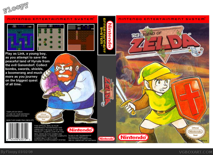
This was originally an update for my other box, but I liked it so much that I re-uploaded it as a different box. I think that this is easily my best box so far, and I'm very happy with it. Everything was cut out and placed by me. Credit to Erov for the template. Please comment. :)
It looks good i have to say. The people are cut out good the logo and Nintendo are to and the temp looks very good but the art is just to blotchy ya know. Try to go for art that is a little easier to use.
 The Legend of Zelda Box Cover Comments
This was originally an update for my other box, but I liked it so much that I re-uploaded it as a different box. I think that this is easily my best box so far, and I'm very happy with it. Everything was cut out and placed by me. Credit to Erov for the template. Please comment. :)
Edited at 1 decade ago
[ Reply ]
It looks good i have to say. The people are cut out good the logo and Nintendo are to and the temp looks very good but the art is just to blotchy ya know. Try to go for art that is a little easier to use.
[ Reply ]
#2, What do you mean by blotchy? That's the best art I could find, and I personally liked it. Thanks still. :)
[ Reply ]
awesome work
[ Reply ]
It's good, but that's not how most NES boxarts are really organized in the back. Yet it's not bad. 3/5.
Edited at 1 decade ago
[ Reply ]
link looks fat. has there ever BEEN a fat link? looks pretty good though
[ Reply ]
#6, Lol. That's how the render looked. :P
#5, I know, but I wanted to try something different.
Edited at 1 decade ago
[ Reply ]