I hear this game series is pretty good. therefor a good game deserves a good box :D also this box 4th box in 4 days, i'm aiming for 5/5 si'll have another tomarrow too.
Edit: also if you think the logo is a bit 'grungy' looking, its actually supposed to look like that.
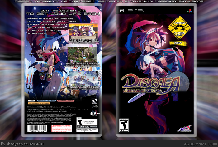
 Disgaea: Afternoon of Darkness Box Cover Comments
I hear this game series is pretty good. therefor a good game deserves a good box :D also this box 4th box in 4 days, i'm aiming for 5/5 si'll have another tomarrow too.
Edit: also if you think the logo is a bit 'grungy' looking, its actually supposed to look like that.
Edited at 1 decade ago
[ Reply ]
wow you're on a roll. i too have been interested in this series, i remember hearing about the first one back in like 2004 or something
Edited at 1 decade ago
[ Reply ]
the front is great but the back is even better this is awsome!
[ Reply ]
YES!
[ Reply ]
you are on a roll of a sudden, what's up? lol ;)
P.S. Mind telling me the font for the back tagline? XD
Edited at 1 decade ago
[ Reply ]
#5, hahah your the second person to ask that :D, i'll pm the link.
[ Reply ]
Awesome job Shady, maybe you should've tried to add some more text someplace on the back.
[ Reply ]
#7, yeah, but that little paragraph kinda summed up the game, so i figured, nah.
[ Reply ]
I hate when boxes like this get virtually ignored. I think this is fantastic, and I wanted to let you know.
It may help that my favorite color is purple :)
[ Reply ]
#9, Hahah, Thanks!
[ Reply ]
Fav, love that font, what's it called
[ Reply ]
#9, Agreed. This box is perfect. I have the original PS2 version, love the style of this game.
[ Reply ]
#12, I have to third on that statement, brilliant box.
[ Reply ]