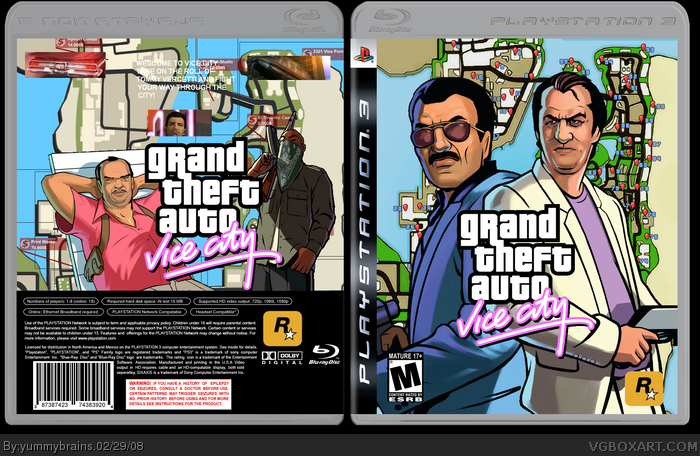
No, I didn't plan on posting to boxes today but I was so pleased with this box i decided to post it. Credit goes to Techne for the temp and PR for the 2 renders on the front.
I think this is one of my best boxes.
If you really like don't hesitate to fav it. Comments are appreciated. Thanks.
It's alright, but the game screens should generally be bigger, and the description text is almost unreadable. Also on the back the map as a background just doesn't fit for me...
 Grand Theft Auto: Vice City Box Cover Comments
No, I didn't plan on posting to boxes today but I was so pleased with this box i decided to post it. Credit goes to Techne for the temp and PR for the 2 renders on the front.
I think this is one of my best boxes.
If you really like don't hesitate to fav it. Comments are appreciated. Thanks.
[ Reply ]
Hmmmmmmmmmmmmmm...............4/5
[ Reply ]
#2, Care to Tell me about the ups and downs.
I'd appreciate it more than hmmmmmmm.
[ Reply ]
#3, well the only proublem i see is the rockstar logo looks small and same with ersb
[ Reply ]
yes i agree with #4 that's about all the flaws.
[ Reply ]
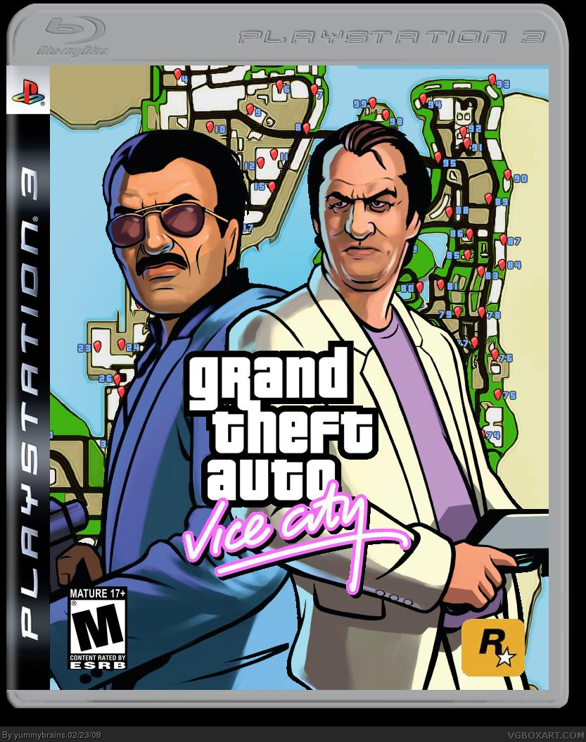
the cream-colored-coat guy is too small. because he is in front of the blue-jacket guy, he should be either bigger, or at least more porportionate.
[ Reply ]
Ok, i guess you're right.
[ Reply ]
"Where's Tommy?"
Change the bg and try adding tommy or lance, then this would be uber.
[ Reply ]
#8, I couldn't find any artwork for them to.
:(
[ Reply ]
Totally updated.
[ Reply ]
oooeh... that's really nice :D.
[ Reply ]
#11, ty
and btw best viewed in small.
Also, i used a guy off of san andreas because i couldn't find much artwork.
[ Reply ]
It's alright, but the game screens should generally be bigger, and the description text is almost unreadable. Also on the back the map as a background just doesn't fit for me...
[ Reply ]