![]() »
»
[ Box updated on February 27th, 2008 ] [ original ]
 Metal Gear Solid 4: Guns of the Patriots Box Cover Comments
Comment on Mad Spike's Metal Gear Solid 4: Guns of the Patriots Box Art / Cover.
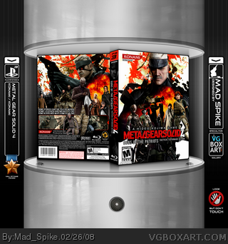
Metal Gear Solid 4 Guns Of The Patriots.
This one was extremly hard to finish. I never work be4 with so many character renders for a box. Here you can see all the main characters of MGS4.
It's not in the Blue Ray case, cos it's hard to make a BR case for my shiny showcase. And BR case looks smaller - I think it's not a good idea. I hope you are not gonna blame me for it.
I think this box has some MGS style and still it's something new :)
Comments and Faves are welcome :)
Edited at 1 decade ago
[ Reply ]
Incredible as always my friend. ^^d
[ Reply ]
#2, Thanks :D
[ Reply ]
Seriously, what's with the background? Is Snake on holidays in New Orleans or something?
[ Reply ]
#4, rofl
Edited at 1 decade ago
[ Reply ]
Oh my god! Monkey! Faved just because of the monkey.
[ Reply ]
Here we go again, another "Mad Spike? Quick, Fave!!"
[ Reply ]
looks fantastic, my only gripe would be that red and white grungy looking background, i just dont think it fit.
I'd prefer a PS3 case though.
Edited at 1 decade ago
[ Reply ]
#4, It's official MGS art.
[ Reply ]
#4, What are you even talking about? Sssh.
[ Reply ]
#8, They have a square form, so there is too many free space in my showcase. Another thing is they will be smaller. Later I'm gonna fix it. It just needs more time :)
[ Reply ]
#9 #10, could it be the fact that the background is red and white and looks like a Hawaiian shirt?
[ Reply ]
Simply amazing.
[ Reply ]
#11, okay, one question though, did you make that showcase thing in Photoshop?
[ Reply ]
.......
what they said :)
[ Reply ]
#12, Yeahhhhh, New Orleans is no where near Hawaii... :\
Stick to making geographical references to your own territory, kay?
[ Reply ]
#14, Yes. There is a lot of job with new reflections for Blue Ray case, also shadows, position.
Edited at 1 decade ago
[ Reply ]
WOW! Excellent box... and I'm so glad you didn't use the blu-ray case --- I hate them too (that's why I made my own PS3 DVD style template.. which some people don't like). Really like the way you put together the box -- nice idea of putting characters 'inside' snake on the front. Neat use of different size text on back too. I've never made a MGS Cover, as I've never been able to get it right.. great stuff m8!
Edited at 1 decade ago
[ Reply ]
Awesome. I don't really like how the characters are floating in mid-air, maybe add some kind of ground like here.
link
[ Reply ]
#16, Hawaii = shirt make
New Orleans = Mardi Gra
How could you not make the connection?
[ Reply ]
#7, Grow up, sheesh.
[ Reply ]
:)
/constructive comment/
[ Reply ]
#19, You talk about Raiden?
[ Reply ]
#20, Mardi Gras looks nothing like that. There's no connection to be made.
[ Reply ]
#23, I meant I don't like that on the front the characters are floating, that's a bit weird but I do really like your box. :)
[ Reply ]
#25, Ok, I understand. I will figure out something ;)
[ Reply ]
On the one hand, I like what you did with the character placement (although they seem to float in mid air), but why did you use the orange grungy wallpapers from MGS3 in the background?
Its still a great box, but not one of your best.
[ Reply ]
#27, I tried different colors. Black and green was too dark, so they blend with Snake. I tried just a white background, but it was too plain. This art contains white color wich is perfectly contrast with black shape of Snake. Red color fit title, Konami logo and PS3 logo, explosions. I think it was the best art for the back. But I must admit all of the arts are a bit too abstract and they looks the same for me :) Screenshots for the background was too dark and don't suit for an abstract contrast style of the front.
[ Reply ]
WICKED!!!! but the only thing i dont like about this is that.thats not the offical ps3 template
[ Reply ]
I completely understand, because when I saw the small version the orange seem to flow in very well with the explosions.
MGS boxes always use Yoji Shinkawa artwork, so I guess they feel odd with renders. Same problem I had when I made my box.
Anyway, I think if you can somehow tweak the floating characters it'll look great!
[ Reply ]
#30, Yes, I will :) Soon.
[ Reply ]
great, fav+ author fav+
[ Reply ]
That looks so damn tight.
[ Reply ]
*UPDATE*
I add legs when they was needed and add ground, so they are not just flying. Plus few other details.
[ Reply ]
Good one, but too colorful for MGS... 4/5
[ Reply ]
#35, War has changed (c)
[ Reply ]
Mad spike was your inspiration the Portable ops box?
You should make a box for that game too - it would suit this style perfectly.
Edited at 1 decade ago
[ Reply ]
#37, No, Vantage Point Movie poster.
I always wanted to do something in that style. I even made few boxes with the same style for few other games. But it suits just perfect for MGS. But sure thing, I know Portable Ops box and it was one of the reasons I decide to try this feature with MGS.
[ Reply ]
Two HoF in one day. This is a damn good day for me :) Thanks everyone :)
Please keep comment and fav it :)
[ Reply ]
The only thing wrong with it (and unfortunately keeping me from faving) is that the back really doesn't explain anything at all. Its just a tagline.
[ Reply ]
I enchant myself this to cover you are Numero 1
Edited at 1 decade ago
[ Reply ]
#24, have you ever seen the mardi gra? Almost everyone is wearing hawaiian shirts, dumbass.
[ Reply ]
Absolutely stunning and beautiful. You are amazing.
[ Reply ]
#42, ...No.
[ Reply ]