Well here's my box I made this using almost 0 material and 90 percent of this material was scanned by me using my new scanner. Hope you all like it I'm rather plesased on how it turned out in the end. Favs and comments are appreaciated as always.
Nice one! Looks real!.... hold on a sec.... gonna have to raid my cupboard for an original GBC game! --------- Blimey... just blew away 2 years of dust off my Pokemon Gold Version and your box looks just as good!! Brilliant m8!! ;)
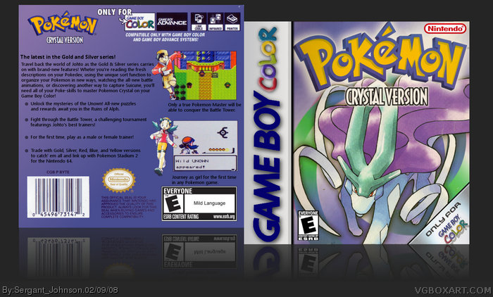
this looks good, but i don't see why everyones making it seem awesome. don't get me wrong, it is great, but the front is the same as the official front, and the back is just a gradient, text, and some screenshots. i have'nt played any pokemon in many years, so if i'm wrong about anything i just said please tell me
#18 - the front is very similar to the official, but thats because of the lack of material im guessing. this apparantly is the official (link) soo its not exactly the same. now the back is what i agree with you on, but i think that's how pokemon boxes are usually, so it looks official.
ok thanks for clearin most of that up. and yeah, the backs of gameboy pokemon games are never well made, and i agree with you why thats the reason it looks good
My Pokemons bring all the nerds to the yard, and they're like, "You wanna trade cards?" "Darn right, I wanna trade cards, I'll trade you this, but not my Charizard!".
#41 and #40, Ok both of you listen and listen good. It's not offcial I spent alot of time on this and I don't care what you say cause until you get some self respect and learn to respect other peoples works I don't want to hear SHIT from you ok. This is called a re-make. The point of a Re-make is to replicate the style of box using the same style/limited artwork. SO GO AWAY!!!
#43, Little bit uncalled for, although I can't blame you too much after the patronizing way they presented their claims, like they have breaking news on their hands when a lot of us realized that it's a remake of the official box ages ago and don't mind.
You are a complete imbecile if you say that this "is just the official box". For one thing, there's a completely different color scheme. Also, he put in the "only on Game Boy Color" thing, the logos are in different places, this one doesn't have the "Gotta catch 'em all!" thing, and the subtitle is in a different place.
Considering that this game centers around the legendary dogs and it's near impossible to find art for them, I think he did an admirable job.
EDIT: And by the way, fudgetroid, don't be a dolt. Those weren't "opinions".
#47, So you say that "This is the exact thing as the official box with very minor changes. This is not Hall of Fame matieral." is not per se an opinion?
the only difference i see on the front is you removed the "Part of the Gold and silver series" from it. and the back could use some Flava. I still like it. it's still way better than mine.
#53, No, but the thing after that is. When reading the whole sentence, the first part you just mentioned is shown to be an opinion, and not a statement.
Whether or not it took the artist lots of hard work or not doesn't matter. The -fact- is that it has the exact same layout, image (Even the background blue/green swirl) and color scheme of the official.
I find it despicable that this is in the HoF when it's literally a recreation of the official box. Is that all it takes? No originality, no thought or effort, just placing images in the right place to match an official box?
Thanks for saving my breath #46! Its the same... the only for gameboy is new to the design.. they have removed one screenshot and added the pictures of the characters.. I am so mad that this gets in the HOF! Its the same.. All credit goes to Nintendo Gamefreaks Designers 2001! I had the box in my hands while doing this comment..
 Pokemon Crystal Box Cover Comments
looks really nice, i'm sure you did too much work! 5/5!
[ Reply ]
Well here's my box I made this using almost 0 material and 90 percent of this material was scanned by me using my new scanner. Hope you all like it I'm rather plesased on how it turned out in the end. Favs and comments are appreaciated as always.
[ Reply ]
lol, it looks official.....too official
it's that good >_>
[ Reply ]
HAHA thanks alot DS11 this took almost my whole day today.
[ Reply ]
Yeah, this is really nice, simple too.
looks a lot like what a GBC cover, especially a Pokemon cover, would look like.
[ Reply ]
It's a gorgeous box art but I think if you can that you should try and avoid typos like on this.
[ Reply ]
Yeah I do have to be more careful about typo's I always end up making them.
[ Reply ]
Excellent job considering the lack of material.
[ Reply ]
It does look really official. Nice job :)
[ Reply ]
Thanks LK I made alot out of a little material and I guess it worked out haha.
[ Reply ]
#10, Indeed. Considering the little material, you did well :) I especially love the simplicity of this. +fav
[ Reply ]
<Comment>
I do really like it. It looks real to.
[ Reply ]
Agrees*
[ Reply ]
<Response>
Thanks Mojo. Hahaha.
Edited at 1 decade ago
[ Reply ]
sweet
[ Reply ]
Nice one! Looks real!.... hold on a sec.... gonna have to raid my cupboard for an original GBC game! --------- Blimey... just blew away 2 years of dust off my Pokemon Gold Version and your box looks just as good!! Brilliant m8!! ;)
Edited at 1 decade ago
[ Reply ]
#16, HAHA Thanks Marker I really strived hard to get the most out of Gimp to do this.
[ Reply ]
this looks good, but i don't see why everyones making it seem awesome. don't get me wrong, it is great, but the front is the same as the official front, and the back is just a gradient, text, and some screenshots. i have'nt played any pokemon in many years, so if i'm wrong about anything i just said please tell me
[ Reply ]
#18 - the front is very similar to the official, but thats because of the lack of material im guessing. this apparantly is the official (link) soo its not exactly the same. now the back is what i agree with you on, but i think that's how pokemon boxes are usually, so it looks official.
Edited at 1 decade ago
[ Reply ]
ok thanks for clearin most of that up. and yeah, the backs of gameboy pokemon games are never well made, and i agree with you why thats the reason it looks good
[ Reply ]
Yeah I scanned a background and a suicine pick from the offcial guide so it may be close but it is NOT the same.
[ Reply ]
ok. lol i know this isn't really a good place, but could you rate my dead rising box i just updated it
[ Reply ]
OMG this is the official!
[ Reply ]
No it isnt so shut the FUCK up I'm tired of people accusing that. Its not the offcial so screw off and read the posts above first.
[ Reply ]
#23, Why are you acting inept with your ability to consider the others' posts?
Edited at 1 decade ago
[ Reply ]
#25, Im not inept and what the hell are you talking about he called it offcial and I responded defending my boxart.
[ Reply ]
#26, I wasn't saying that to you.
Edited at 1 decade ago
[ Reply ]
this is awesome, this game was too although Gold > Crystal > Silver :D
[ Reply ]
#27, haa my bad E_g it was late whe I posted that I wasn't thinking
Edited at 1 decade ago
[ Reply ]
It looks verry much like the official one.
[ Reply ]
My Pokemons bring all the nerds to the yard, and they're like, "You wanna trade cards?" "Darn right, I wanna trade cards, I'll trade you this, but not my Charizard!".
Thank you, thank you! Faved.
Edited at 1 decade ago
[ Reply ]
#31, HAHA that was pretty funny Iron Man.
[ Reply ]
nice job must of been impossible to find material
[ Reply ]
looks very official.
[ Reply ]
#34 Almost to offcial lol
[ Reply ]
#33, Not really, he just scanned it.
[ Reply ]
This is how my Pokemon cristal box looks like.
[ Reply ]
why is everyone so pleased by this box?
it's the official box nothing more.
Frontside: link
Backside: link
Edited at 1 decade ago
[ Reply ]
#38, Ummm not really but whatever E_G will deal with you.
[ Reply ]
#38, I don't get it either.
[ Reply ]
How did this get into The Hall of Fame? This is the exact thing as the official box with very minor changes. This is not Hall of Fame matieral.
[ Reply ]
"How did this get into The Hall of Fame?"
Um, the required number of people faved it? :\
[ Reply ]
#41 and #40, Ok both of you listen and listen good. It's not offcial I spent alot of time on this and I don't care what you say cause until you get some self respect and learn to respect other peoples works I don't want to hear SHIT from you ok. This is called a re-make. The point of a Re-make is to replicate the style of box using the same style/limited artwork. SO GO AWAY!!!
Edited at 1 decade ago
[ Reply ]
#43, They should respect you when you flame on them for just pointing out an OPINION? GTFO yourself hypocrit.
And yes, this IS the official box (atleast the front).
[ Reply ]
#44, exept from some logos is on other places...
[ Reply ]
#43, Little bit uncalled for, although I can't blame you too much after the patronizing way they presented their claims, like they have breaking news on their hands when a lot of us realized that it's a remake of the official box ages ago and don't mind.
Edited at 1 decade ago
[ Reply ]
You are a complete imbecile if you say that this "is just the official box". For one thing, there's a completely different color scheme. Also, he put in the "only on Game Boy Color" thing, the logos are in different places, this one doesn't have the "Gotta catch 'em all!" thing, and the subtitle is in a different place.
Considering that this game centers around the legendary dogs and it's near impossible to find art for them, I think he did an admirable job.
EDIT: And by the way, fudgetroid, don't be a dolt. Those weren't "opinions".
Edited at 1 decade ago
[ Reply ]
#47, So you say that "This is the exact thing as the official box with very minor changes. This is not Hall of Fame matieral." is not per se an opinion?
[ Reply ]
"Wheter you're reading the fresh descriptions on the back of my box"
(\__/)
(='.'=)
('')_('')
And what's a Uknown? XD
Edited at 1 decade ago
[ Reply ]
Unknown is a type of Pokemon. They basically useless, and learn one attack. There are 26 forms of them, each to represent a letter.
[ Reply ]
the only difference i see on the front is you removed the "Part of the Gold and silver series" from it. and the back could use some Flava. I still like it. it's still way better than mine.
[ Reply ]
#51, Ummm no I didnt remove anything from the front.
[ Reply ]
#48, Saying "This is the official" is not an opinion.
[ Reply ]
#53, No, but the thing after that is. When reading the whole sentence, the first part you just mentioned is shown to be an opinion, and not a statement.
[ Reply ]
the front looks just like the official one.. and i don't understand how you used a whole day on this box...
[ Reply ]
Whether or not it took the artist lots of hard work or not doesn't matter. The -fact- is that it has the exact same layout, image (Even the background blue/green swirl) and color scheme of the official.
I find it despicable that this is in the HoF when it's literally a recreation of the official box. Is that all it takes? No originality, no thought or effort, just placing images in the right place to match an official box?
[ Reply ]
#56, Your words are so true, couldn't agree more...
[ Reply ]
Thanks for saving my breath #46! Its the same... the only for gameboy is new to the design.. they have removed one screenshot and added the pictures of the characters.. I am so mad that this gets in the HOF! Its the same.. All credit goes to Nintendo Gamefreaks Designers 2001! I had the box in my hands while doing this comment..
Edited at 1 decade ago
[ Reply ]