The front is okay although im not too keen on the SA3 logo.
The spine should be just white without the background.
I actually like the back although the text could be better.
and ULTIMATE FAIL!!!!!!
NO TAILS?!??!?!?
Dont get me wrong, im not exactly a huge Tails lover or anything BUT Tails really should be somewhere on the front!!
I mean, you put 2nd-rate characters like Amy and Silver on the front but no Tails?! Disgraceful!!
Also ESRB rating should be bigger (Or maybe rated Teen instead)
Oh one more thing, The characters are badly placed on the front. Sonic should be the star of the game and be the most eye-catching. It seems that Shadow is bigger than Sonic and therefore, gets the most attention.
The update is better but i dont know... it still feels like Shadow is the main focal point.
I suggest making Sonic bigger, putting him in the centre (maybe find a different pose) and then make Shadow in the background with all the other characters.
#9, Shadow looks like the main focus beacsue it's his color Blue is a color that looks far away and black looks close up. that's the only reason htere's no fixing that.
 Sonic Adventure 3 Box Cover Comments
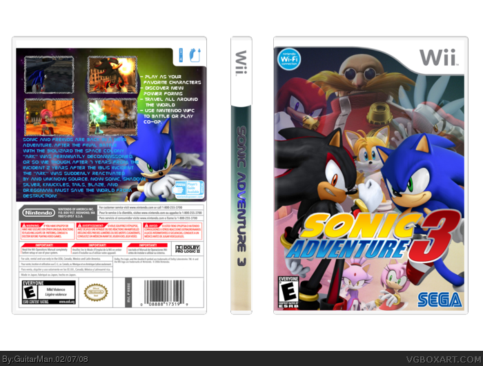
Ok Guys here's my Sonic Adventure 3 Box.
Credit:
Logo:KoppaDasher
Template: Techne
[ Reply ]
I like this!
I just don't like the font.
[ Reply ]
#2, i tried to do a 3-D art style similar to the SA2 Box
[ Reply ]
Wow...this is really nice.
[ Reply ]
i agree with #2. font doesnt look too good, and those borders dont really either.
[ Reply ]
The front is okay although im not too keen on the SA3 logo.
The spine should be just white without the background.
I actually like the back although the text could be better.
and ULTIMATE FAIL!!!!!!
NO TAILS?!??!?!?
Dont get me wrong, im not exactly a huge Tails lover or anything BUT Tails really should be somewhere on the front!!
I mean, you put 2nd-rate characters like Amy and Silver on the front but no Tails?! Disgraceful!!
Also ESRB rating should be bigger (Or maybe rated Teen instead)
Oh one more thing, The characters are badly placed on the front. Sonic should be the star of the game and be the most eye-catching. It seems that Shadow is bigger than Sonic and therefore, gets the most attention.
[ Reply ]
#5, the borders i made myself from a swril thing i had.
#6, Tails is dead, he fell in a lake an bear ate him ponit is he's not there. XD JK JK
i'll make Sonic Bigger and put Tails when i get a chance
[ Reply ]
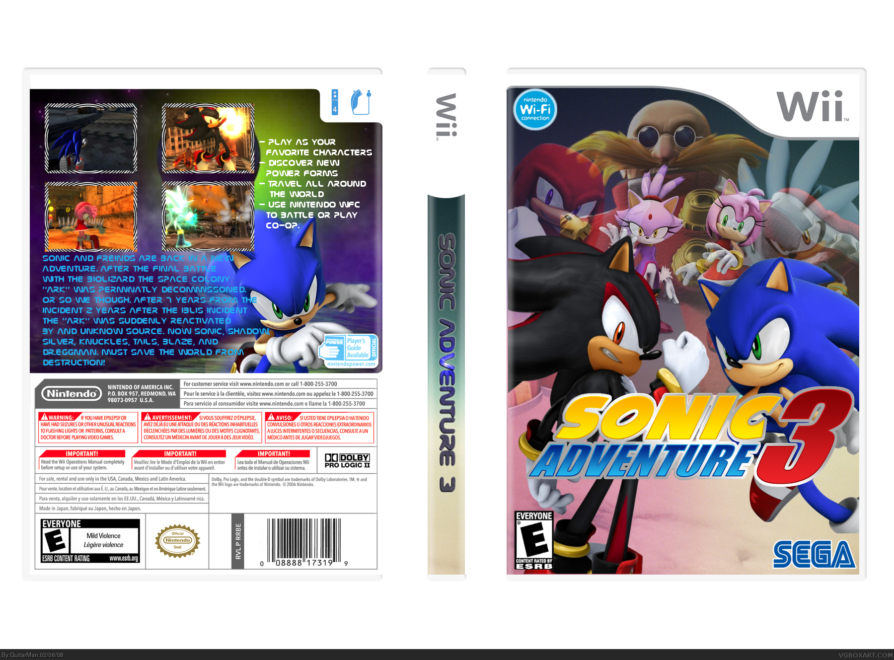
ok here's an update with tails and Sonic is Bigger.
[ Reply ]
The update is better but i dont know... it still feels like Shadow is the main focal point.
I suggest making Sonic bigger, putting him in the centre (maybe find a different pose) and then make Shadow in the background with all the other characters.
[ Reply ]
#9, Shadow looks like the main focus beacsue it's his color Blue is a color that looks far away and black looks close up. that's the only reason htere's no fixing that.
[ Reply ]
Actually, I like it the way it is personally.
[ Reply ]
I like it. 'nuff said.
[ Reply ]
I fav this. Nearly perfect. 9.6/10, IMO.
[ Reply ]
#13, No need to bump an older box.
[ Reply ]
Can you post a link to that Sonic pic of the front. That is freaking awesome.
[ Reply ]