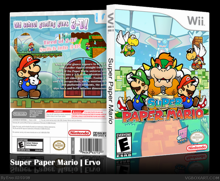
The front is frickin' cool but I'd say that the back have some distracting thing. I don't really like the thing you put behind the text (dunno how to call it), it just looks odd and it doesn't fit the game. And those screenshots borders are original but it doesn't really "help" the user to see the screens themselves well. The overall is pretty cool though...
 Super Paper Mario Box Cover Comments
The hell are those screen borders?
[ Reply ]
#1, they were flames that Bowser was blowing :D
My latest box, thanks to Ayron for help!
[ Reply ]
Great job on the box dude!:D
[ Reply ]
I like it!!
[ Reply ]
I like the front but the back seems like it needs more.
[ Reply ]
i was starting to get sick of teh super paper mario boxes but i like that you did something different with the front design
[ Reply ]
The front is frickin' cool but I'd say that the back have some distracting thing. I don't really like the thing you put behind the text (dunno how to call it), it just looks odd and it doesn't fit the game. And those screenshots borders are original but it doesn't really "help" the user to see the screens themselves well. The overall is pretty cool though...
[ Reply ]
The back was a real challenge, but i guess i can do better :)
[ Reply ]
lovely front.
[ Reply ]
It's so so...lighthearted! can't get enough of it :D
[ Reply ]
Uber cool!
[ Reply ]
Why is the pirhana plants eating trees?
[ Reply ]
Hey, Ervo I think you should get a professional job in Box design, because you seem to be really good at it.
[ Reply ]
#13, stop it with the damn bumping. Gawd.
[ Reply ]
this box is great a instant fav i love the bowser on the cover how every thing on the back is placed
[ Reply ]