Nicely put together box... although I have to admit I'm not too keen on green and orange colour scheme on the front... the back is better. Probably green is too much like night-vision these days?? I think a radial gradient would have looked better? Anyway... good of you to try something different! Nice work! ;)
 Soul Calibur 2 Box Cover Comments
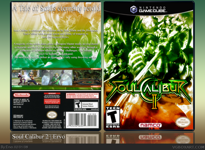
Here's my latest box. Wanted to try a different color than normally and i guess it looks good! I hope you like it too :)
[ Reply ]
Great box. My only question is to why Link is on the back and you have a Legend of Zelda screenshot back there. Still a great box, though.
[ Reply ]
#2, because Link is one of the characters in this game!
[ Reply ]
i don't really like green-red gradients, but it's pretty good to be honest ^^
[ Reply ]
nice box, but on the back, "the next; you'll have to use throwing attacks" should'ent it be then next;
[ Reply ]
Nicely put together box... although I have to admit I'm not too keen on green and orange colour scheme on the front... the back is better. Probably green is too much like night-vision these days?? I think a radial gradient would have looked better? Anyway... good of you to try something different! Nice work! ;)
[ Reply ]
I LOVE the front. Though you might wanna fix the upper front of the temp, easy fix though :) Awesome work.
Edited at 1 decade ago
[ Reply ]
I agree with MARKER. The front looks lovely. Just try shrinking down the teen rating. It's too big. Good job! Link pwns, btw. 5/5 +fav
[ Reply ]
I agree with MARKER to. Looks sweet though.
[ Reply ]
I want to see a Link render on the front.
4.5/5
[ Reply ]