ok:
-image is stretched out and blurry
-logo is stretched and blurry
-nintendo logo is cut out badly and not filled in
-esrb logo is blurry
-template is choppy
-same as above for the game chip exept everything is sqwashed and blurry
-very good idea
-not excecuted good
2/5
EDIT: not trying to be an ass, nice try though
EDIT2: oh and this came out A LOT better than your other boxes even though its not very good
-remove the chip it looks bad
-remove the thick black line around the box
-i would say just remove the whole image in the backround
- refind the image backround on the box and re-add it so that it is not stretched
-re-add yoshi and DO NOT stetch him out
-find a better esrb logo
-find a better nintendo logo
ok do those things and then we will see how it looks
Why do you not see what is wrong with it. There is huge black around the box that doesn't serve a purpose. Why around the background. The ESRB and Nintendo logo are on the wrong sides and the images are very blurry. All in all i think it is was clear and clean it would be cool.
 Super Yoshi Galaxy Box Cover Comments
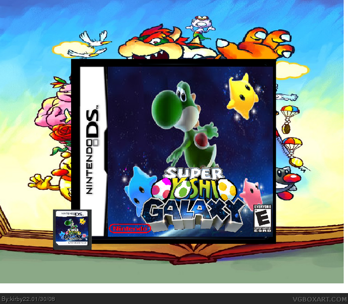
my next box. i think it came out fairly well if you ask me.
credit to Marker for the awsome logo
credit to deviantart for yoshi pic
credit to yoshiart for background
if you think i should make it bigger to get rid of that white bar i will. tell me what you think.
[ Reply ]
ok:
-image is stretched out and blurry
-logo is stretched and blurry
-nintendo logo is cut out badly and not filled in
-esrb logo is blurry
-template is choppy
-same as above for the game chip exept everything is sqwashed and blurry
-very good idea
-not excecuted good
2/5
EDIT: not trying to be an ass, nice try though
EDIT2: oh and this came out A LOT better than your other boxes even though its not very good
Edited at 1 decade ago
[ Reply ]
well thats in full! sorry, how do i unblur it! i really like this, and it was mt best, someone how do i unblur it?
[ Reply ]
no, not it full, all those things i said were in normal veiw, sorry.
[ Reply ]
so is there a way to make it unblurry? because i think this would be a decent boxart if it wasnt blurry.
[ Reply ]
ye, its really blurry in both views. im not too sure as to what you can do, maybe better quality images? but its still nice, just not good quality.
Edited at 1 decade ago
[ Reply ]
ok this is what you can do to make it better:
-remove the chip it looks bad
-remove the thick black line around the box
-i would say just remove the whole image in the backround
- refind the image backround on the box and re-add it so that it is not stretched
-re-add yoshi and DO NOT stetch him out
-find a better esrb logo
-find a better nintendo logo
ok do those things and then we will see how it looks
[ Reply ]
damn!
[ Reply ]
i will try. TRY. Thats the keyword. remember i am a sucky boxartist.
[ Reply ]
#9, dont give up! and btw can i have the logo? i have something in mind
[ Reply ]
ask marker. but CREDIT HIM for logo and ME for idea.
[ Reply ]
i knew you could do it!
[ Reply ]
When i look at this i say why?
Why do you not see what is wrong with it. There is huge black around the box that doesn't serve a purpose. Why around the background. The ESRB and Nintendo logo are on the wrong sides and the images are very blurry. All in all i think it is was clear and clean it would be cool.
[ Reply ]
Did you even ask him if you could use the yoshi galaxy image cause I asked him and he said yea but I decided not to. And the logo isnt so good.
[ Reply ]
what are the red dots in the squares next to our names and the little circles next to (0) next to reply??
[ Reply ]
#15, Your ranking
[ Reply ]
#16, how do you get them up?
[ Reply ]
#17, Iguess making more boxes and getting favs
[ Reply ]
it does not matter what side the esrb is on! im trying to fix it up.
[ Reply ]
if you did it on paint nice work 4/5
if you did it anyvhere else not bad 3/5
[ Reply ]
#20, what he said :/
[ Reply ]