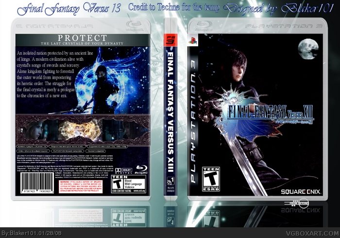
Here is my Final Fantasy Versus 13 box.
This is my last box for a while, I really hope you like it, I worked really hard on this.
Credit Techne for the temp. :)
thanks for using my slogan bar on the back. so many people have, and no one gives credit. and yours is bad quality.
the front seems empty with the large empty black spaces, and the moon seems out of place and it's also blurry. the back doesnt seem to flow. the colours seem to stand out against eachother, if you know what i mean. (the border grill thing around the images on the back) try adjusting some colours of certain areas.
 Final Fantasy Versus XIII Box Cover Comments
Here is my Final Fantasy Versus 13 box.
This is my last box for a while, I really hope you like it, I worked really hard on this.
Credit Techne for the temp. :)
Edited at 1 decade ago
[ Reply ]
thanks for using my slogan bar on the back. so many people have, and no one gives credit. and yours is bad quality.
the front seems empty with the large empty black spaces, and the moon seems out of place and it's also blurry. the back doesnt seem to flow. the colours seem to stand out against eachother, if you know what i mean. (the border grill thing around the images on the back) try adjusting some colours of certain areas.
Edited at 1 decade ago
[ Reply ]
Not too bad but pretty choppy/blurry. It's got a good design but it doesn't feel complete.
[ Reply ]
too dark
[ Reply ]