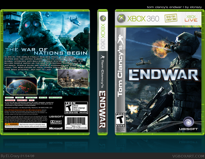
I wanted to like this box, I really did. But there are too many minor, MINOR flaws in it. For starters, you let the Ubisoft lines bleed out into the template. Also, the Clancy sidebar isn't transparent enough. Also, the spine doesn't look too much like a Clancy game spine should- the new ones don't have the logo for the game on their, it just says the title.
Sorry if the last two are too nitpicky, but I'm vewyyy sensitive about Tom Clancy materials. If it's any consolation, the back pwns. The only thing I don't like about it is the placement of the text. Other than that, it's great.
 Tom Clancy's EndWar Box Cover Comments
Good though I don't like the red around the logo, otherwise this is quite well....AWESOME.
[ Reply ]
Mainly just a box with me practicing blending, but I liked how it turned out, so I posted it.
Enjoy! =D
#1, thanks! :)
The logo is actually official. I got it off the official box on GSpot.
Edited at 1 decade ago
[ Reply ]
I wanted to like this box, I really did. But there are too many minor, MINOR flaws in it. For starters, you let the Ubisoft lines bleed out into the template. Also, the Clancy sidebar isn't transparent enough. Also, the spine doesn't look too much like a Clancy game spine should- the new ones don't have the logo for the game on their, it just says the title.
Sorry if the last two are too nitpicky, but I'm vewyyy sensitive about Tom Clancy materials. If it's any consolation, the back pwns. The only thing I don't like about it is the placement of the text. Other than that, it's great.
[ Reply ]
I think it's sweet. To be honest though I'm pretty bored by that font you use so much ELCrazy.
[ Reply ]
#4, E_G. I don't think he uses the same font, but he always puts a thick stroke on his text, which does get very boring. Butttt you could be right.
HAHA I WAS WRONG:P
But really Elcrazy.. you put thick strokes on EVERATHANG!
Edited at 1 decade ago
[ Reply ]
#4, I agree. to be honest. But I couldn't find a suitable font :p
#5, LMAO.
Edited at 1 decade ago
[ Reply ]
this is actually really good. i dont see those little flaws though... +fav
[ Reply ]
#7, thanks
[ Reply ]
DDDAAAYYYUUUMMMNNNN
[ Reply ]
#9, lol thanks (:
[ Reply ]
whoa thats pretty nice ^.^
btw nice blending xD~
[ Reply ]
damn, that's great. I would like to see a screenshot at the middle though. It looks laking.
[ Reply ]
#12, yeah but I think resizing the screenshots to put one more in would look weird. Thanks though -D
[ Reply ]
soooo nice!
[ Reply ]
#14, thanks (:
[ Reply ]