This is a good first though.
- Make the ESRB bigger.
- Make the main logo bigger.
- The template and logo are kinda choppy.
That's about it. For a first, 3.5/5.
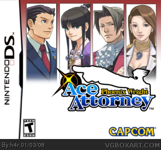
Perfect. Capcom lost consistency here. The first had the official art, then the second and third and Apollo Justice had the four panels. They should have had all three have the same cover style, not just switch it after one. I agree though, make everything bigger, and add some gray pinstriped behind each character in their panels. Then it will be wonderful. Hell I might print it out and stick it in front of my current case! Don't let me down! :)
 Phoenix Wright: Ace Attorney Box Cover Comments
first boxart i've made. please be gentle >_>
[ Reply ]
not bad. the white irritates me.
[ Reply ]
i'm not sure what to do about the white. the sequels generally fill that spot with their name but i've got nothing to stick in this one.
[ Reply ]
how about you make the logo larger so it fills up some of the space.
[ Reply ]
#4, I agree.
This is a good first though.
- Make the ESRB bigger.
- Make the main logo bigger.
- The template and logo are kinda choppy.
That's about it. For a first, 3.5/5.
Edited at 1 decade ago
[ Reply ]
not too bad at all. Actually pretty cool. keep it up and welcome ;)
[ Reply ]
Good, Good. Just the like the PW Boxart style. Just make that logo a tad bigger :]
[ Reply ]
Perfect. Capcom lost consistency here. The first had the official art, then the second and third and Apollo Justice had the four panels. They should have had all three have the same cover style, not just switch it after one. I agree though, make everything bigger, and add some gray pinstriped behind each character in their panels. Then it will be wonderful. Hell I might print it out and stick it in front of my current case! Don't let me down! :)
[ Reply ]
Pretty good!
*sigh* I wish they would of used the box art-style from the first game on all 5 games...
[ Reply ]