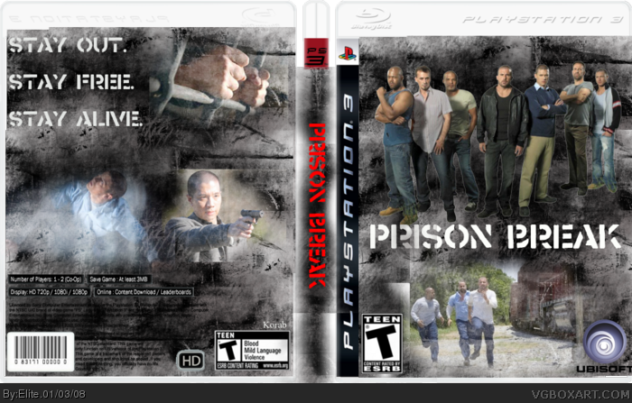
Hmmm... the front is pretty cool, but there are some problems:
Front
- ESRB too big.
Back
- The bottom right screenshot isn't blended as well as the others.
- It should have an actual description.
- Try to use screens that actually would work for a game.
You should do the characters like cartoons, cause then it looks like game. Because when it's the real actors it's not a game. And like the others said, there is no information about the game, just a slogan. But the other things, the effects and so, is very good. 4/5.
 Prison Break Box Cover Comments
1st post
its nice but it gives no information about the game. the front is nice. and uh... iz... nice?
Edited at 1 decade ago
[ Reply ]
oh ok thank will try to do better next time.
Edited at 1 decade ago
[ Reply ]
Why does it say "Korab" on the back?
[ Reply ]
thats my name i put on stuff i make on the net.
[ Reply ]
Hmmm... the front is pretty cool, but there are some problems:
Front
- ESRB too big.
Back
- The bottom right screenshot isn't blended as well as the others.
- It should have an actual description.
- Try to use screens that actually would work for a game.
3.5/5
[ Reply ]
I'm thinking about taking that template down. No one's giving credit for it.
[ Reply ]
#6, good idea.
[ Reply ]
Sorry About that #6
Credit to Star89er for the template
[ Reply ]
nice i like the idea
[ Reply ]
Bad idea and bad box. The back has not enough text and the whole thing is blurry.
[ Reply ]
why does everyone keep using Lodo's background... it's getting annoying, and should be used for textures and stuff.
[ Reply ]
You should do the characters like cartoons, cause then it looks like game. Because when it's the real actors it's not a game. And like the others said, there is no information about the game, just a slogan. But the other things, the effects and so, is very good. 4/5.
[ Reply ]
like da whole idea but on da bck u could ov add som text n mabye som better pics.
[ Reply ]