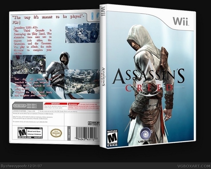
M logo is cut bad on top left corner
screen shots on back dont like right all smashed together
text on spine is badly layed out should be long ways ex: ASSASSINS CREED
not ASSASSINS
CREED
theres a little white pixels from the spine on the cover text on back doesnt work well
I really like the front. If you can, maybe you should add a glow tot he logos. As for the back:
- Get rid of the assassin symbol, it's jsut random.
- Add another screenshot.
- Add borders tot eh screenshots.
- Make the text a different color so that it's more noticable.
HEY! cheezypoofs, now im gonna be your stalker, front cover is a li'l too, dumb, add more characters, and mabey woth a 5/5, until then, 4/5, i may not be one of the best box artists on this site, but im still improving, so if people compleatly think im hopless, think again, if you've got time to worry, then create, right?
 Assassin's Creed Box Cover Comments
a quickie. took me about an hour. well to me this would take the wii controls to the next level if this were a wii exclusive. go ahead and criticize.
[ Reply ]
the front and side are nice, but I don't like the back. The screenshots are just put it there.. doesnt look good, and bottom looks empty
[ Reply ]
M logo is cut bad on top left corner
screen shots on back dont like right all smashed together
text on spine is badly layed out should be long ways ex: ASSASSINS CREED
not ASSASSINS
CREED
theres a little white pixels from the spine on the cover text on back doesnt work well
[ Reply ]
#2, the back i was a bit concerned with. the images i didnt know where to put because the wii template on the back is so darn cramped.
[ Reply ]
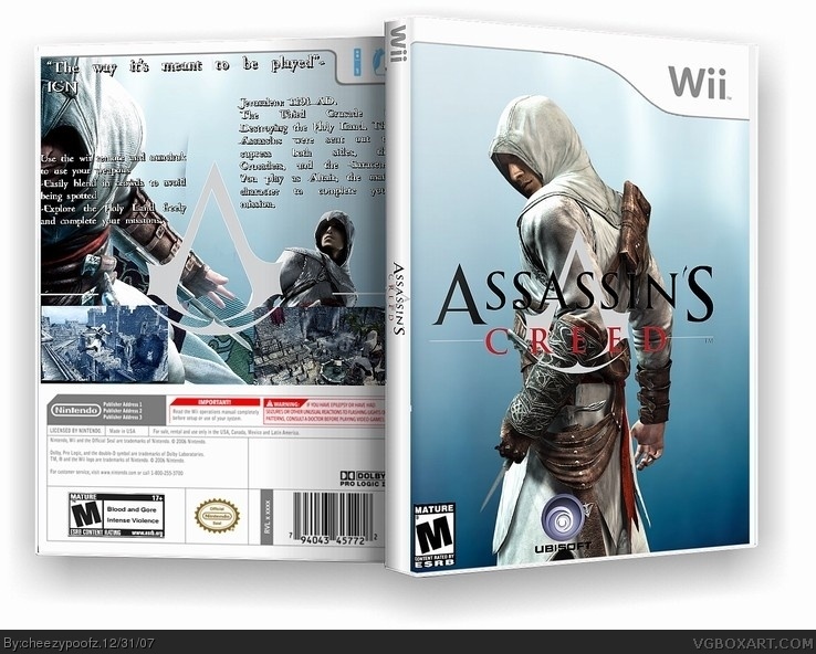
ok i fixed the back
removed the render.... too busy.
rearranged the screens and text
[ Reply ]
I really like the front. If you can, maybe you should add a glow tot he logos. As for the back:
- Get rid of the assassin symbol, it's jsut random.
- Add another screenshot.
- Add borders tot eh screenshots.
- Make the text a different color so that it's more noticable.
3/5. It's very nice.
[ Reply ]
#6, i put the assassin's symbol to make it more stylish.
[ Reply ]
dp, deleted by me! it rhymes
Edited at 1 decade ago
[ Reply ]
version 3. i changed the font color, deleted the crred emblem. added 'nother image.
EDIT: btw. my last box of '07. i got approx. 3 hrs and 8 mins left! happy 2008! and im going the the outback bowl in tampa tomorrow!
Edited at 1 decade ago
[ Reply ]
please comment.
[ Reply ]
I think you still need screenshot borders, and the screens should all be the same size and placed less randomly.
[ Reply ]
where can i get borders?
[ Reply ]
HEY! cheezypoofs, now im gonna be your stalker, front cover is a li'l too, dumb, add more characters, and mabey woth a 5/5, until then, 4/5, i may not be one of the best box artists on this site, but im still improving, so if people compleatly think im hopless, think again, if you've got time to worry, then create, right?
Edited at 1 decade ago
[ Reply ]
#13, i agree that youre improving. but you put unnecessary stuff on the box thing
[ Reply ]