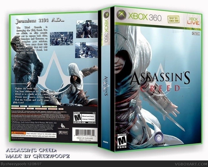
finally done. took me all day to finish. if your wondering what font i used on the back its the fable 2 font. it seemed fitting. well i hope you like. chenquieh
EDIT: Ladykiller imspired me to make a back. i figured a back would kill it, but it turned out great. i feel good about this.
Front looks quite ok but i dont like the back
Screens are without the frame,i dont like the font and the image is quite strange..
And that back image of Altair is getting too much on the sys reqs which are lower.
Hope i helped ya.
Cheerz and come to mine boxes!
well, you should not have had the same background image as the background of the box, because it makes it look odd. It would have been better with a black-white gradient or something. It looks more like a template than a box in some parts of it. Otherwise, it's alright, front is kind of bland, nothing really special about it, also that picture of altair is overused, and the screens on the back of the box are stretched horizontal, make them a little taller. Also, there is not a variety of text on the back, I would suggest a few bullet points of information aswell as your paragraph there. make sure the pics and the text work together and look spiffy. A good designer should be able to tell what's wrong in general with his box, and a good artist can fix it :) put those two together, then you have a good boxartist. So work on those things, maybe add some effects or image blending on the front there. Or take all this info and use it to make a better new box, which is what I always do :D
 Assassin's Creed Box Cover Comments
finally done. took me all day to finish. if your wondering what font i used on the back its the fable 2 font. it seemed fitting. well i hope you like. chenquieh
EDIT: Ladykiller imspired me to make a back. i figured a back would kill it, but it turned out great. i feel good about this.
Edited at 1 decade ago
[ Reply ]
Front looks quite ok but i dont like the back
Screens are without the frame,i dont like the font and the image is quite strange..
And that back image of Altair is getting too much on the sys reqs which are lower.
Hope i helped ya.
Cheerz and come to mine boxes!
[ Reply ]
#2, i really dont appreciate you advertising your own boxes on mine.
[ Reply ]
well, you should not have had the same background image as the background of the box, because it makes it look odd. It would have been better with a black-white gradient or something. It looks more like a template than a box in some parts of it. Otherwise, it's alright, front is kind of bland, nothing really special about it, also that picture of altair is overused, and the screens on the back of the box are stretched horizontal, make them a little taller. Also, there is not a variety of text on the back, I would suggest a few bullet points of information aswell as your paragraph there. make sure the pics and the text work together and look spiffy. A good designer should be able to tell what's wrong in general with his box, and a good artist can fix it :) put those two together, then you have a good boxartist. So work on those things, maybe add some effects or image blending on the front there. Or take all this info and use it to make a better new box, which is what I always do :D
Edited at 1 decade ago
[ Reply ]
#4, i added a light effect to the front so the logo would show up better. ill update it in a sec..
[ Reply ]
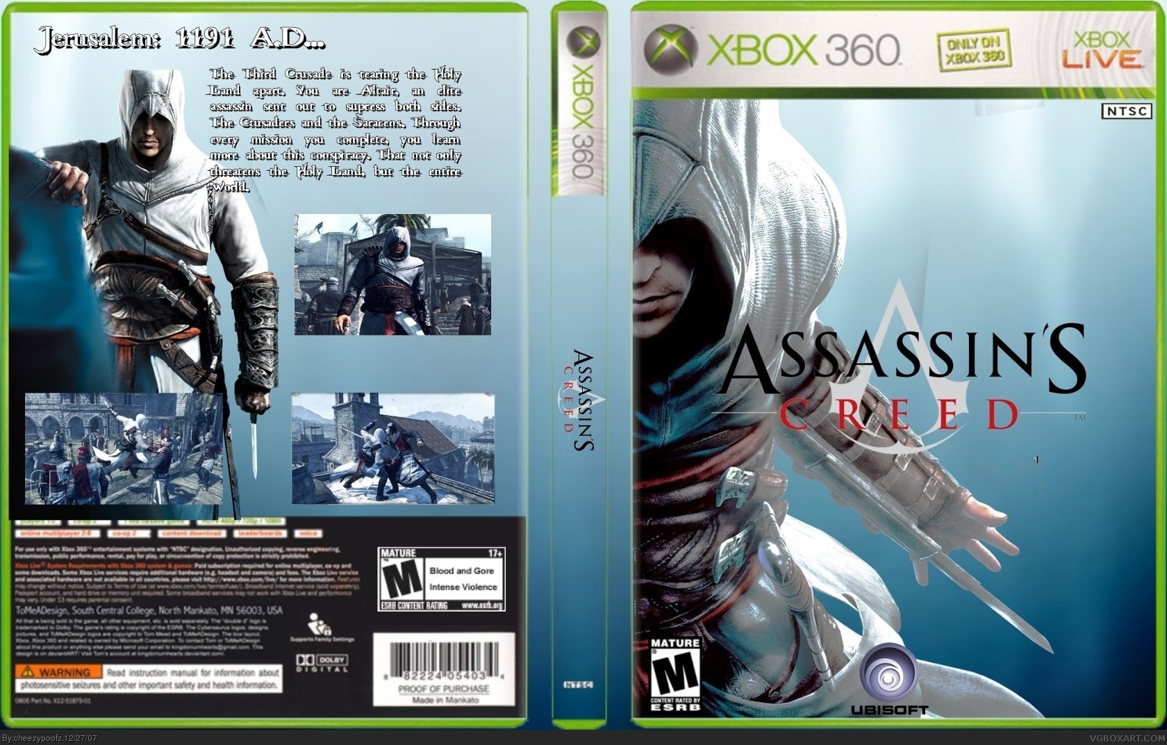
UPDATE: revamped back.c. filled in between the front back and spine. i hope you think this is better.
VIEW in full to see ESRB logo on back.
Edited at 1 decade ago
[ Reply ]
nevermine about the logo.
[ Reply ]
Good, but the template is cut badly. Fix for fave.
Edited at 1 decade ago
[ Reply ]
#8, where's it cut badly? all round? certain place?
[ Reply ]
#9, all curved spots.
[ Reply ]
#10, updated.
[ Reply ]
much better
[ Reply ]
#12, thanks for fave
[ Reply ]
version 4! i 3d'ed it!
[ Reply ]
WHat the hell is up with the spine man
[ Reply ]
#15, i really dont know. i think the animation is wrong. ill fix it
[ Reply ]
Ewwww @ 3D...
[ Reply ]
You used my temp, but didn't credit me. That's the second time this week that someone did that...
Edited at 1 decade ago
[ Reply ]
#18, oh my bad. cred goes to star89er
[ Reply ]
the background seems cluttered, and the pics are a little weird without a border... overall 7/10
[ Reply ]
What is with the spine?!?!
[ Reply ]