Really nice for a first ! The front is Ok. So is the back. Here's some tips :
-make the screenshots more visible.
-center the logo on front
-get a better font. More readable one.
-don't hide the tagline. Here, it's hiding by Hayden's head.
the front, as i said before, is pretty good. i'm glad to see you listened to my criticism.
here are some tips for the back:
- make the text a bit more visible, that can be done by using another font[ type of letters :P ] or moving the letters more apart.
- make the screenshots a tad more visible, try an subtly outer glow, or even a border [ search google. perhaps you'll find something ]
- Never hide someone's head unless it's used for artistic purposes, like a really dramatic picture.
- Stick to one colour scheme, that'll make the box flow alot more, and it'll be easier on the eyes ;)
- move the back esrb a bit up, so that it doesn't touch the proof of purchase.
good luck and good job ^^'
-Ayron
p.s.
faved for pure effort.
p.s.s.
Center the logo on the front, it's a bit to the right. if you use photoshop, use the 'ruler' tool.;)
I suggest making the caption bigger. And the character in the back looks really sliced off in a bad way. Otherwise really nice start. Lookin' forward to more boxes from you ;)
 Dark Sector Box Cover Comments
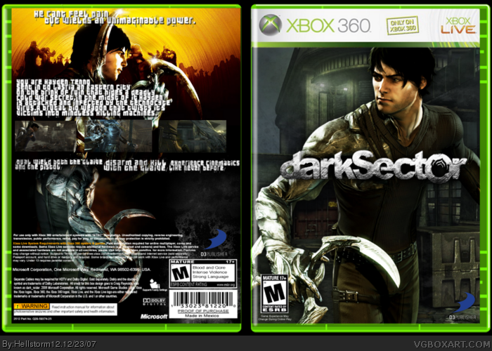
credit to dark raider for his template.please go easy on me,it is my first box.
[ Reply ]
for a first box it's impressive, but the text on the back is impossible to read.
[ Reply ]
#2, thanks man.
[ Reply ]
Really nice for a first ! The front is Ok. So is the back. Here's some tips :
-make the screenshots more visible.
-center the logo on front
-get a better font. More readable one.
-don't hide the tagline. Here, it's hiding by Hayden's head.
4.5/5 for a first !
[ Reply ]
#4, thanks,you guys are some very nice critics.
[ Reply ]
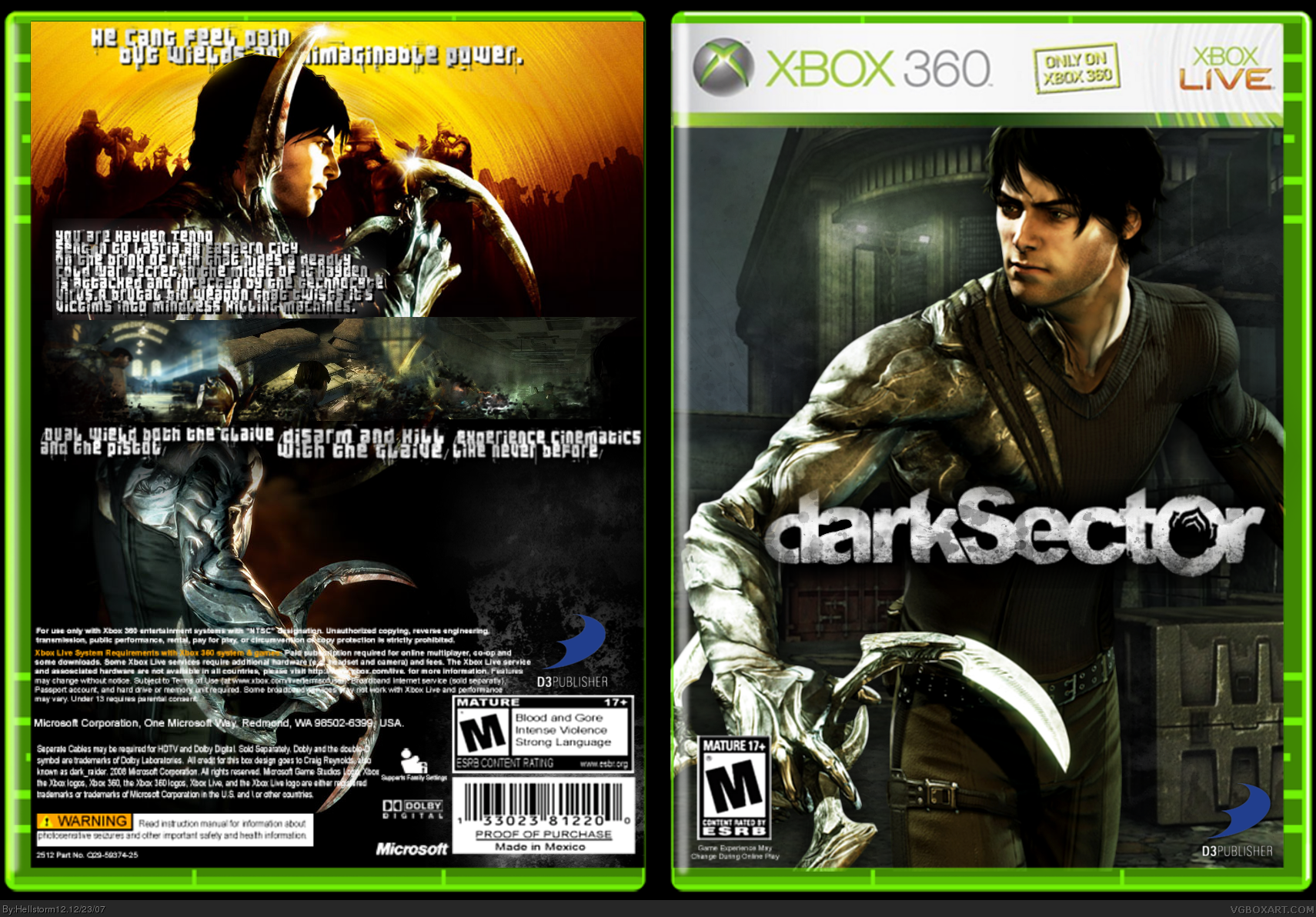
the front, as i said before, is pretty good. i'm glad to see you listened to my criticism.
here are some tips for the back:
- make the text a bit more visible, that can be done by using another font[ type of letters :P ] or moving the letters more apart.
- make the screenshots a tad more visible, try an subtly outer glow, or even a border [ search google. perhaps you'll find something ]
- Never hide someone's head unless it's used for artistic purposes, like a really dramatic picture.
- Stick to one colour scheme, that'll make the box flow alot more, and it'll be easier on the eyes ;)
- move the back esrb a bit up, so that it doesn't touch the proof of purchase.
good luck and good job ^^'
-Ayron
p.s.
faved for pure effort.
p.s.s.
Center the logo on the front, it's a bit to the right. if you use photoshop, use the 'ruler' tool.;)
Edited at 1 decade ago
[ Reply ]
pretty good first!
I suggest making the caption bigger. And the character in the back looks really sliced off in a bad way. Otherwise really nice start. Lookin' forward to more boxes from you ;)
[ Reply ]
updated,added a bevel effect to the logo.
[ Reply ]