
[ Box updated on December 23rd, 2007 ] [ original ]
 Command & Conquer 3: Tiberium Wars Box Cover Comments
Comment on Ban_Me's Command & Conquer 3: Tiberium Wars Box Art / Cover.
[ Box updated on December 23rd, 2007 ] [ original ]
Comment on Ban_Me's Command & Conquer 3: Tiberium Wars Box Art / Cover.
T-Minus 10...
Credit to my buddy Ross for the 360 template. This box is also dedicated to him, as its his birthday in a few days and I'm not gonna be here to celebrate it. Sorry I won't be able to see your masterpiece, dude, but happy birthday anyway, you handsome man. :P
[ Reply ]
Thanks for all the comments, everyone.
[ Reply ]
#2, stop acting like an ass. If you want comments, ask. (Although we'd prefer ti if you didn't)
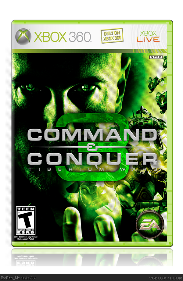
The box is ok but the picture choice wasn't great. 4/5
[ Reply ]
I agree with #3.
[ Reply ]
About the "quit being an ass" part, or the picture choice part?
Edited at 1 decade ago
[ Reply ]
#5, both. The picture actually isnt bad, the logo just covers up certain parts of the image. i actually give this a 4.5/5
[ Reply ]
:P
Just call me Mr. Ed.
[ Reply ]
#7, whats Mr. Ed mean?
[ Reply ]
#8, Mr. Ed was that show about the horse (named Mr. Ed).
Although I guess it would've made more sense if Mr. Ed was about a donkey... :\
[ Reply ]
#6, yeah. The picture is only bad because of where he put the logo.
[ Reply ]
Well, I did what I could about the logo... Which was pretty much shrinking it down. It looked off placed anywhere but the middle.
[ Reply ]
I would take the scan lines and cut them away from all the machines and people and have it on the background only. Makes your eyes focus on the real image.
[ Reply ]
it aint bad
[ Reply ]
awesome, though I would really like to see an equally great back to go along with it ;)
P.S. cool sig
Edited at 1 decade ago
[ Reply ]
#14, Haha, thanks. I'm stamping it on all my boxes from now on.
[ Reply ]
cool i like this box alot
[ Reply ]