#3, did you even bother to look at it for more than 5 seconds? Okay, sorry, that sounded harsh.
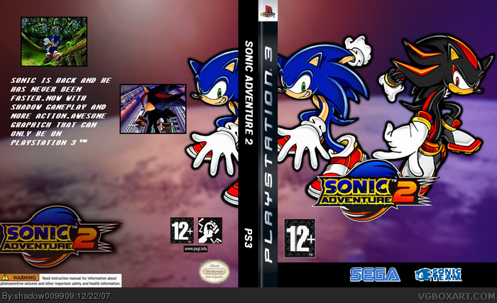
There's a black bar at the bottom on the front.
PEGI is crap.
The main logo is too small.
Not enough screens on the back.
Bad font choice.
You need the legal info on the back.
The Sonic on the back is the same as on the front.
The seal of quality is choppy.
Bad description.
Boring spine.
The spine needs the red PS3 logo at the top instead of poorly typing "PS3" on the bottom/
 Sonic Adventure 2 Box Cover Comments
I dislike the back...
[ Reply ]
yes,the cover is more good but it took me a lot of time
[ Reply ]
i love it fav
[ Reply ]
#3, did you even bother to look at it for more than 5 seconds? Okay, sorry, that sounded harsh.
There's a black bar at the bottom on the front.
PEGI is crap.
The main logo is too small.
Not enough screens on the back.
Bad font choice.
You need the legal info on the back.
The Sonic on the back is the same as on the front.
The seal of quality is choppy.
Bad description.
Boring spine.
The spine needs the red PS3 logo at the top instead of poorly typing "PS3" on the bottom/
1.8/5
[ Reply ]
same sonic on the front. logo on back and front. this may be your 'best', but it's definetley not the 'best'
[ Reply ]
just wait to see my newest
[ Reply ]
i'm sorry, but this is just not very good. i'm hoping you'll improve
[ Reply ]
that only can be on the ps3...and dreamcast...and gamecube...
[ Reply ]