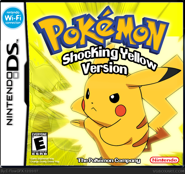
EDIT: I UPDATED THE BOX, I REMOVED THE MEWTWO AND I HAD TO ADD 700 PIXELS TO THE SIZE IN ORDER TO UPDATE IT, SO ENJOY FOR THOSE WHO DIDNT LIKE THE MEWTWO
i liked this one alot. tobad i didnt see the original with Mewtwo. lol but yeah, i liked it alot. there was a rumor here at my skool that a new GBA game called Pokemon Lightning yellow was gonna be released, but didnt. but if this was real, i wuld sooooooooo buy it. 5/5 love it. just hate pikachu in ssbm. great work! :D
+yellow background + Pokemon logo + subtitle (which is realllyyyy choppy) = 15 faves
[/SYNTAX ERROR::irrationalequation/]]
Bassiiiccallyy what I'm saying is that this isn't that good. It's pretty obvious this took 45 minutes. The render is going over the template, you can see where it cuts off at the top (next to the Pokemon logo), it's wayyyy too plain for a front-only box, and it's just... Bleh.
I get frustrated when a box like this gets a ton more attention than a box like RB's Galaxy box.
#1, Hey I'm putting a poll on the Gamefreak website to try and get a game like this created by them is there anyway that i could possibly use this picture as an image for my poll? who knows it may even become the name and case of the game

 Pokemon: Shocking Yellow Box Cover Comments
i got the idea from the fire red, leaf green box, just on the DS platform, took me like 45 mins to make.
ENJOY!!
[ Reply ]
Sweet looks official! 5/5 + mt fave dawg!
[ Reply ]
#2, thanks man, nice avatar i noticed u changed it
Edited at 1 decade ago
[ Reply ]
very very nice! And I am here to stay and improve at using gimp!
[ Reply ]
#4, iight, thats good to know, comment on my other boxes, thanks BTW
[ Reply ]
Remove the mewtwo and i will like it. Maybe do a back.
[ Reply ]
#6, its supposed to be the villain, i can remove it and send it to u,LoL
[ Reply ]
#7, I agree. No Mewtwo. I was gonna say that and I was just like, ahh wutaver!
[ Reply ]
#8, iight let me remove it
EDIT: I UPDATED THE BOX, I REMOVED THE MEWTWO AND I HAD TO ADD 700 PIXELS TO THE SIZE IN ORDER TO UPDATE IT, SO ENJOY FOR THOSE WHO DIDNT LIKE THE MEWTWO
Edited at 1 decade ago
[ Reply ]
ooh, spiffy :D good job :D
[ Reply ]
#10, thanks, have u seen my other boxes? i would appreciate it if u do
[ Reply ]
and comment them...LoL
[ Reply ]
#4, how bout' you post that on one of your boxes 'cause that seems wayy out of the blue
Edited at 1 decade ago
[ Reply ]
#13, lol, comment on the box, maybe a possible fav? =p
[ Reply ]
This looks surprisingly good. Sweet.
[ Reply ]
#15, thanks, u think its my best one?
[ Reply ]
looks official dude ! Nice job !
[ Reply ]
#17, thanks, and good looks on that fav
[ Reply ]
#18, you're welcome , the only flaw here in that the wifi logo is too huge. Make it smaller.
[ Reply ]
iight, when i get my comp back, this one has no photoshop
[ Reply ]
ppl how about sum comments and not just faving, i wanan know wut ya think about the box
[ Reply ]
no comments?
[ Reply ]
yO ALM5252 give me a comment atleast
[ Reply ]
i liked this one alot. tobad i didnt see the original with Mewtwo. lol but yeah, i liked it alot. there was a rumor here at my skool that a new GBA game called Pokemon Lightning yellow was gonna be released, but didnt. but if this was real, i wuld sooooooooo buy it. 5/5 love it. just hate pikachu in ssbm. great work! :D
[ Reply ]
#24 you can see the earlier box by clicking on "version 1" which is just under the box.
I actually thought the Mewtwo was a nice touch... guess no one else agreed =/
[ Reply ]
#25, me too, but i gotta go with the majority, the majority said mewtwo is OUT, and #24 thanks for the comment
[ Reply ]
i liked the mewtwo. epecially the way he looks. but yeah. everyone wanted it out. i like the box anywayz.
[ Reply ]
#27, YEA so did i
[ Reply ]
no other comments?
[ Reply ]
#29 you'd think taht would have sunk in after almost two weeks....
[ Reply ]
#30, what? i dont get you...explain
[ Reply ]
wow this pwns, only 5 more
and BTW i just got those 2 favs so thats why im commenting
[ Reply ]
link
+yellow background + Pokemon logo + subtitle (which is realllyyyy choppy) = 15 faves
[/SYNTAX ERROR::irrationalequation/]]
Bassiiiccallyy what I'm saying is that this isn't that good. It's pretty obvious this took 45 minutes. The render is going over the template, you can see where it cuts off at the top (next to the Pokemon logo), it's wayyyy too plain for a front-only box, and it's just... Bleh.
I get frustrated when a box like this gets a ton more attention than a box like RB's Galaxy box.
[ Reply ]
#33, um this is how an offical pokemon box art looks like, and i dont doubt that i got it from planet renders, did i say that i rendered it? no!
i always say, if it looks like an offical box it deserves attention
[ Reply ]
Official boxes don't have the flaws that I mentioned. Besides, no back = not official looking.
[ Reply ]
#35, official looking cover though, and i dont see where the render is overlapping
[ Reply ]
Good, but I like the other one by linnus was better ;)
[ Reply ]
well thanks...i think...LoL
[ Reply ]
Cool. The Wifi logo is TOO big, and the logo needs to merge better. 4.9/5.
[ Reply ]
#39, wi-fi isnt to big... and what do u mean by the logo needs to merge better?
[ Reply ]
#1, Hey I'm putting a poll on the Gamefreak website to try and get a game like this created by them is there anyway that i could possibly use this picture as an image for my poll? who knows it may even become the name and case of the game
[ Reply ]
Also wanted to say great art by the way!
[ Reply ]
@Karrigor, Thank you :] And yea! You can submit my art :] I'll appreciate it :p
[ Reply ]