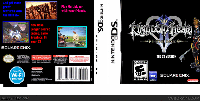
You all ewmwbered my 1st box dont you? The worst box ever. I´ve tried to be the 1st one to make all his boxes on paint. Never on GIMP. And look what happened :O. I got better on my 2nd box. I hope u like it
Oh and I give credit to link
(Spanish Site)
It helped me with the Screenshots
HERE IT IS!"
#4, indeed. the problem is that the esrb logo are extremely big the wi fi logo is sticking off of the box the spine is rather weird try to get a background for the back 2/5 keep trying
It's not very much better. The only thing that has improved at all is the box dimensions. I'll try and give you some constructive critisism.
Everything is WAY to big, REALLY squished and HORRIBLY cut out. The wifi logo is sticking out the bottom of the box. The discription on the back has REALLY bad grammar and font is bad. The screenshots are random sizes. Oh, and one more thing. NEVER, and I repeat, NEVER USE PAINT! EVER! Right now I'll give it a 1.5/5.
6. What is your darn problem with Paint? If I want I can use it. And, Look im a total begginer. OK? So, dont go say like its my 500th time doing boxes! EVERYONES THINKING I GOT LIKE 5 YEARS ON THIS. I only got 2 weeks ok? So, this is my 2nd box. I tried hard on this a whole week. You can say it sucks but not I cant use paint. I tried really hard on this and i would like you to at least say. Its a little better than the last one!
#12, sorta... Paint is not forbidden but is STONGLY disadvised! Don't use it. If you do, learn how to make a good box because this isn't much better. And seriously, stop acting like a butt! It's annoying when you say things like post #12.
#12, you can if you really want to. And by all means, if you really want to burn our eyes off, keep going. Sorry, here's some REAL constructive criticism:
1. cuting out pictures correctly is pretty much the most important thing in making boxarts look professional. In paint, when you put you're picture onto the box, move it carefully, making sure not to make the image any different. place it where you want, and take the eraser tool and cut out all the white bits around the image. That's all I can think off when you're using paint, so sorry if this doesn't work for you perfectly :\ btw, you should be zoomed in about 6x or even 8x if you want to. It should be pretty close.
2. Backgrounds should NOT just be one solid color. It should also not be a bunch of pictures placed together with a title on it. Both of those are a big no-no. find the biggest pictures you can find. If it's too small, do NOT make it larger. Find large images on google image search, that's where I find mine... but back to backgrounds, use large pictures, and in paint, make sure to put the title, ESRB and dev logos on LAST so they always stay up on top. using a background, then having one (maybe two or more) images like characters (probably what you want to use are characters) and place them on your box so it WORKS with the title and the template.
3. Titles are a verry important part of a boxart. It represents any sence in the piece. You NEED to cut out your titles all the way, try to be as careful and persise as possible, it is OK to cut into the title a bit, just make sure that you don't have any white or excess whatever color in your picture. Also, like I said before, titles should be placed last! you want to see all of it. Also 'The DS version' is not what would be on the front. Put something like 'Kingdom Hearts II final mix DS' which sounds much more proffesional than 'the DS version'
4. Screenshots on the back of boxes aren't THAT TERRIBLY important, but it should be delt with, or it might throw off you're whole box. make them equal size, and give some form to them, make a very simple pattern, or even put them all in a row. If you put any screenshots, you should have any # between 2-3 :P four is kinda pushing it.
5. Back text can also throw off a whole box. you should have text that relates to the topic/box. I know that paint doesn't have a lot of fonts, but find the most appropriate, and use it wisely. The font size is a LOT smaller than you think. Take an actual box and hold it arms lentgh away from you. You will see that the text is very small, and there is usually a lot of it. So, you should have smaller text and use more of it.
6. Box dementions are also a HUGE HUGE HUGE part of the box. It gives it form. you NEED to obey the boundaries of your template. if anything is popping out of it, delete the excess, or resize the pic that's popping out and place it better. Reffering to your box, the wi-fi logo should be on the front of the box, look at a DS box like mario kart or metroid prime hunters. These will have the wi-fi logo on the front, near the top left corner.
7. The side of the box, where all you do is place the title, is refered to as the spine. Never use accronims (saying like Kingdom Hearts 2 is KHII) that is a big no-no, anywhere on the box. use the full name, and refrain from mentioning the name on the back or side of the box anyway. secondly, the title needs the be centered on the spine, and the text needs to be facing the back of the box. Again, look at an actual box spine, you will be able to read it in the direction if you layed the box down on it's side with the front up. It should not be just text (sometimes this is OK) but it should be a smaller version of the logo, or have some sort of design. (Look at the legend of zelda twilight princess for wii, and you'll see that they used text, but had some little embroiderment (little symbols) on the sides.
8. Always compare your box arts to real life boxes, and list the differences, and make them similarities. Also, spending a week on a box is a very good thing, but most of that time should be redoing things for you, mostly because you're just starting out.
9. keep a good spirit! You're only as good as you think you are (sometimes this is not true, but it helps none-the-less) always have a good attitude and don't only post boxes, look at other people's boxes too. You can get great inspiration from looking at really good boxes, or even not so great ones. If you see something wrond with someone else's box, don't make that mistake on your's!
well, I think i've talked enough, hope this helped, and good luck with your next one and all of your other ones in the future!
EDIT: looking back... this is my best post ever.... so be grateful!!! lol jk, but I do hope you read this and take it to heart.
Paint is not forbidden, it's just not recommended. If he wants to use Paint, let him. Just know that your boxes won't be as good as you hope, though. Keep trying :)
oh and cheezyproofs have u finally notice u were wrong all the time when u said paint is forbidden? lol I WIN. JK no offense just wanted to show the truth
 Kingdom Hearts II DS Version Box Cover Comments
You all ewmwbered my 1st box dont you? The worst box ever. I´ve tried to be the 1st one to make all his boxes on paint. Never on GIMP. And look what happened :O. I got better on my 2nd box. I hope u like it
Oh and I give credit to link
(Spanish Site)
It helped me with the Screenshots
HERE IT IS!"
KHII DS VERSION
[ Reply ]
Oh sorry. iN ewmwbered
*remembered
[ Reply ]
next time use the edit button
[ Reply ]
well, you noticed I got a little better didn´t you?
[ Reply ]
#4, indeed. the problem is that the esrb logo are extremely big the wi fi logo is sticking off of the box the spine is rather weird try to get a background for the back 2/5 keep trying
Edited at 1 decade ago
[ Reply ]
It's not very much better. The only thing that has improved at all is the box dimensions. I'll try and give you some constructive critisism.
Everything is WAY to big, REALLY squished and HORRIBLY cut out. The wifi logo is sticking out the bottom of the box. The discription on the back has REALLY bad grammar and font is bad. The screenshots are random sizes. Oh, and one more thing. NEVER, and I repeat, NEVER USE PAINT! EVER! Right now I'll give it a 1.5/5.
Edited at 1 decade ago
[ Reply ]
oh, and dont use impact font
[ Reply ]
6. What is your darn problem with Paint? If I want I can use it. And, Look im a total begginer. OK? So, dont go say like its my 500th time doing boxes! EVERYONES THINKING I GOT LIKE 5 YEARS ON THIS. I only got 2 weeks ok? So, this is my 2nd box. I tried hard on this a whole week. You can say it sucks but not I cant use paint. I tried really hard on this and i would like you to at least say. Its a little better than the last one!
[ Reply ]
#8, ok please calm down adn cant you just appreciate %5?
[ Reply ]
#8, Take a look at this box, and you'll see what my problem with Paint is.
[ Reply ]
#10, im well aware of that. i assume thats why paint is strictly forbidden to be used for boxes?
[ Reply ]
who said its forbidden? who? NONE.
I can make boxes with paint if I want.
[ Reply ]
#12, sorta... Paint is not forbidden but is STONGLY disadvised! Don't use it. If you do, learn how to make a good box because this isn't much better. And seriously, stop acting like a butt! It's annoying when you say things like post #12.
[ Reply ]
#12, you can if you really want to. And by all means, if you really want to burn our eyes off, keep going. Sorry, here's some REAL constructive criticism:
1. cuting out pictures correctly is pretty much the most important thing in making boxarts look professional. In paint, when you put you're picture onto the box, move it carefully, making sure not to make the image any different. place it where you want, and take the eraser tool and cut out all the white bits around the image. That's all I can think off when you're using paint, so sorry if this doesn't work for you perfectly :\ btw, you should be zoomed in about 6x or even 8x if you want to. It should be pretty close.
2. Backgrounds should NOT just be one solid color. It should also not be a bunch of pictures placed together with a title on it. Both of those are a big no-no. find the biggest pictures you can find. If it's too small, do NOT make it larger. Find large images on google image search, that's where I find mine... but back to backgrounds, use large pictures, and in paint, make sure to put the title, ESRB and dev logos on LAST so they always stay up on top. using a background, then having one (maybe two or more) images like characters (probably what you want to use are characters) and place them on your box so it WORKS with the title and the template.
3. Titles are a verry important part of a boxart. It represents any sence in the piece. You NEED to cut out your titles all the way, try to be as careful and persise as possible, it is OK to cut into the title a bit, just make sure that you don't have any white or excess whatever color in your picture. Also, like I said before, titles should be placed last! you want to see all of it. Also 'The DS version' is not what would be on the front. Put something like 'Kingdom Hearts II final mix DS' which sounds much more proffesional than 'the DS version'
4. Screenshots on the back of boxes aren't THAT TERRIBLY important, but it should be delt with, or it might throw off you're whole box. make them equal size, and give some form to them, make a very simple pattern, or even put them all in a row. If you put any screenshots, you should have any # between 2-3 :P four is kinda pushing it.
5. Back text can also throw off a whole box. you should have text that relates to the topic/box. I know that paint doesn't have a lot of fonts, but find the most appropriate, and use it wisely. The font size is a LOT smaller than you think. Take an actual box and hold it arms lentgh away from you. You will see that the text is very small, and there is usually a lot of it. So, you should have smaller text and use more of it.
6. Box dementions are also a HUGE HUGE HUGE part of the box. It gives it form. you NEED to obey the boundaries of your template. if anything is popping out of it, delete the excess, or resize the pic that's popping out and place it better. Reffering to your box, the wi-fi logo should be on the front of the box, look at a DS box like mario kart or metroid prime hunters. These will have the wi-fi logo on the front, near the top left corner.
7. The side of the box, where all you do is place the title, is refered to as the spine. Never use accronims (saying like Kingdom Hearts 2 is KHII) that is a big no-no, anywhere on the box. use the full name, and refrain from mentioning the name on the back or side of the box anyway. secondly, the title needs the be centered on the spine, and the text needs to be facing the back of the box. Again, look at an actual box spine, you will be able to read it in the direction if you layed the box down on it's side with the front up. It should not be just text (sometimes this is OK) but it should be a smaller version of the logo, or have some sort of design. (Look at the legend of zelda twilight princess for wii, and you'll see that they used text, but had some little embroiderment (little symbols) on the sides.
8. Always compare your box arts to real life boxes, and list the differences, and make them similarities. Also, spending a week on a box is a very good thing, but most of that time should be redoing things for you, mostly because you're just starting out.
9. keep a good spirit! You're only as good as you think you are (sometimes this is not true, but it helps none-the-less) always have a good attitude and don't only post boxes, look at other people's boxes too. You can get great inspiration from looking at really good boxes, or even not so great ones. If you see something wrond with someone else's box, don't make that mistake on your's!
well, I think i've talked enough, hope this helped, and good luck with your next one and all of your other ones in the future!
EDIT: looking back... this is my best post ever.... so be grateful!!! lol jk, but I do hope you read this and take it to heart.
Edited at 1 decade ago
[ Reply ]
#12, Yeah. I agree with VGMaster. We're trying to give you some good advice, and you're basically acting like a... what's that word... a jackass.
[ Reply ]
#14, (regarding last sentence) or to...
KINGDOM HEARTS!
[ Reply ]
yes... take this to kingdom heart :P
[ Reply ]
#12, yeah if you say you can do on this site, than youre a rulebreaker and a very independant person.
[ Reply ]
-.-
Look guys I don´t want to mess this up but..
Let me do it my own way..
That the ONLY thing I want..
[ Reply ]
and yeah i think Kirbylove has some goods idea but I already saw like 100 boxes so good.
[ Reply ]
#18!!! IT'S NOT AGAINST THE RULES!!! Don't you listen? You are allowed to use Paint. But use it if you know how to do well with it.
[ Reply ]
Oh and I kinda am a Big Fan of VGMaster.
INCREDIBLE BOXES
LOL!
Well. Im going to update.
Making new box for the Chain of Memories BOx
[ Reply ]
#22, wow thanx.
[ Reply ]
#22, im not looking forward to it... sorry
[ Reply ]
Paint is not forbidden, it's just not recommended. If he wants to use Paint, let him. Just know that your boxes won't be as good as you hope, though. Keep trying :)
[ Reply ]
thnkz. FINALLY
[ Reply ]
oh and cheezyproofs have u finally notice u were wrong all the time when u said paint is forbidden? lol I WIN. JK no offense just wanted to show the truth
[ Reply ]
Ehh... I liked that first box (the stetched one) even better than this one...
Seems like you didn't improve... Keep trying
[ Reply ]