Hey there, it's me...yeah I know i posted my contest box far too early...but I have a busy week ahead so I might be off for a few days.
This box was a hella lot of work, over 200 layers. The layout was the most difficult of all. I hope you like it!
I love the color scheme and it's really well made, but I dislike the arrangement of the back somewhat. My main disliking is that the synopsis looks squashed by being crammed into a small space.
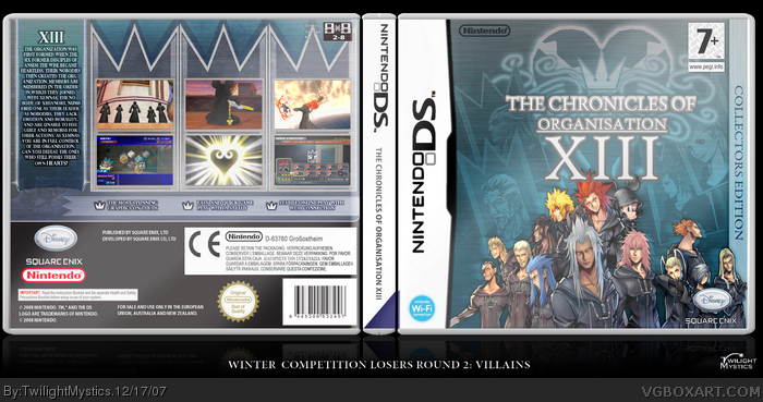
Well, to get more obvious, an explanation why I made that "weird" layout of the PEGI and DEV logo's. First, I intended to put the PEGI logo at the leftside of the front, but it covered one of the organisation members. And the nintendo logo didn't look nice at that place too. Also I slammed that nintendo logo up there because you see that quite often on official PAL and NTSC/JAP DS boxarts.
Thanks guys
#22, Well I thinks it suits the game, I thought of a simple and plain back first. Then I thought that a plain back would be boring....this is what eventually came out!
 The Chronicles of Organisation XIII Box Cover Comments
this is nice! i adore the back ecpecially! 4/5
[ Reply ]
Hey there, it's me...yeah I know i posted my contest box far too early...but I have a busy week ahead so I might be off for a few days.
This box was a hella lot of work, over 200 layers. The layout was the most difficult of all. I hope you like it!
[ Reply ]
I agree this is very cool. Tho a 4/5 is not right. I'd say 5/5!
Is that really how you spell Organization?
[ Reply ]
#1, why a 4/5? There are flaws. Please more specific!
[ Reply ]
#4, He gives everything a 4 or 3. Great box.
[ Reply ]
I meant there are no flaws I'm aware of!
#5,Thanks :D
[ Reply ]
Wait... why are the PEGI and Nintendo logos at the top? I DON'T LIKE IT!!!
[ Reply ]
Wait... why are the PEGI and Nintendo logos at the top? I DON'T LIKE IT!!!
[ Reply ]
#7, I dont get that either, but i think the box looks fantastic..although, Mickey isn't in the Organization XIII. +Fav for Greatness!
[ Reply ]
I Think since its a CE box you should get rid of the rating and the dev logos on the front.
[ Reply ]
I love the color scheme and it's really well made, but I dislike the arrangement of the back somewhat. My main disliking is that the synopsis looks squashed by being crammed into a small space.
[ Reply ]
nice.
Nice render on the front.
[ Reply ]
awesome
unique and original
you never cease to amaze and surprise me twilight.
P.S. do you mind sharing the temp? if not that's fine.
keep it up man ;)
[ Reply ]
Oh! I would like it too! PLEEEAASSEEE?
[ Reply ]
You guys are leaches.
[ Reply ]
#15, myeahhh!
[ Reply ]
#15, Qui? Moi? Mais non!
[ Reply ]
#4, "stabile" is supposed to say "stable" on the back where it says "stabile online play" i think. sweet box though!
[ Reply ]
Very nice!
#3, thats how it is in Europe and Australia.
#15, Share and share alike.
[ Reply ]
Awesome :o
[ Reply ]
Well, to get more obvious, an explanation why I made that "weird" layout of the PEGI and DEV logo's. First, I intended to put the PEGI logo at the leftside of the front, but it covered one of the organisation members. And the nintendo logo didn't look nice at that place too. Also I slammed that nintendo logo up there because you see that quite often on official PAL and NTSC/JAP DS boxarts.
[ Reply ]
I do not like the back at all. It looks like it doesn't fit the game for me...
[ Reply ]
that's awesome.
[ Reply ]
Thanks guys
#22, Well I thinks it suits the game, I thought of a simple and plain back first. Then I thought that a plain back would be boring....this is what eventually came out!
Edited at 1 decade ago
[ Reply ]
#24, whatever, I do not like it... that's my opinion.
[ Reply ]
#25, ooooooookay ;|
Anyway, I really like the whole box, front and back.
I find the back stylish. =D
[ Reply ]
Nice job on the box...I like it! It's awesome and very creative. =D
[ Reply ]
I think its very well made, and I especially like your custom made temp.
[ Reply ]
#27, Well at first I though that this idea was not executeable. But I tried to do my best with just 2 pieces of art.
[ Reply ]
For the people who want my DS template...I'm perfecting it now, and who still want's it should PM me.
[ Reply ]
I can't believe this isnt in the hall, People need to get the Faving because this is Great!
[ Reply ]
ABSOLUTE FAV!
NICE NICE NICE!
[ Reply ]
#31, Good call resurrecting this one.
[ Reply ]