[ Box updated on December 19th, 2007 ] [ original ]
 Kingdom Hearts II: Final Mix+ Box Cover Comments
Comment on Blaker101's Kingdom Hearts II: Final Mix+ Box Art / Cover.
[ Box updated on December 19th, 2007 ] [ original ]
Comment on Blaker101's Kingdom Hearts II: Final Mix+ Box Art / Cover.
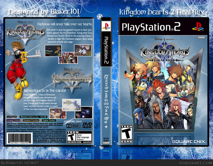
This is my Kingdom Hearts II Final Mix+ box.
I worked so hard on this and I really hope you like it. :)
[ Reply ]
Really kewl this is HOF material
[ Reply ]
nice one ;)
[ Reply ]
isnt this techne's temp? nice one
[ Reply ]
I really like it....but I don't like the choice of font on the spine, and the logos and crown thing are badly cut out. Maybe you should fix that, I guess then it's more worthy to be in the HOF.
[ Reply ]
Thanks people! :)
[ Reply ]
noice, i love how you did the cover.
[ Reply ]
ohhh my god I just noticed on the front in full view it looks jacked up the silver thing is messed up badly the green is off.
[ Reply ]
The backs okay, but as for the front...
and you didn't really make the thing on the front, you took it from the official site.
link
[ Reply ]
#9, i was going to say the same thing. also the bush smudges you put on it are aack.
[ Reply ]
#9, ohhh... That's lame. I'm upset.
[ Reply ]
It's all pretty badly cut too.
[ Reply ]
You killed the front image. You have big smudges like Shady said and its not that well cut out anyways. The back is empty and you use the logo twice?!?!. Could use a lottt more work. Don't be in a rush to post your boxes. I wait a couple weeks.
[ Reply ]
Very nice indeed. Faved. The crown would make an excellent slip case.
[ Reply ]
Logo to small.
[ Reply ]
That's because the picture came from the website. >:(
[ Reply ]
Please fix the front green paint thing. That is so annoying
[ Reply ]
#17, ???
[ Reply ]
this is great, but that smudge totally ruins it. Also, Goofy is kinda hidden. Why not render him so he appears to be coming out of the card, like Riku and Sora are.
[ Reply ]
#9, Just saw the link *removed from favourites*
[ Reply ]
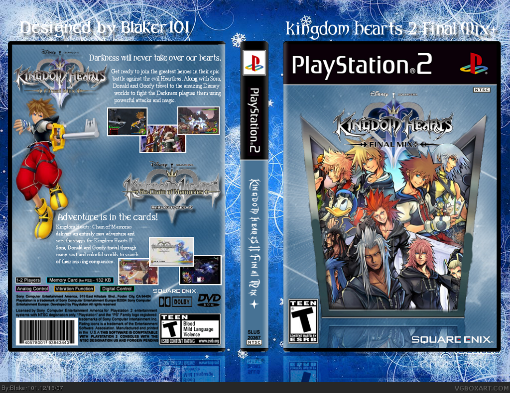
I tried to fix it as best as I can.
I hope its better.
Edited at 1 decade ago
[ Reply ]
how is it teen it's a kids game not a teen game!
[ Reply ]
i agree wirh #22,Kingdom hearts is an awesome game. a T or an M rating dosent make it any more cooler...its just a letter after all
[ Reply ]