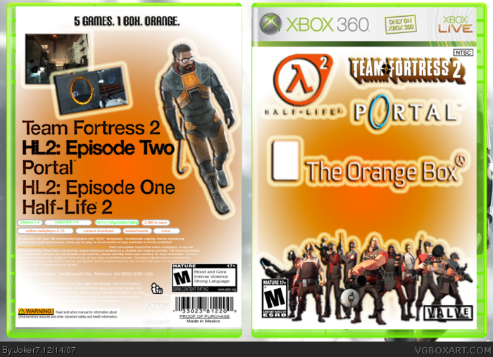
Well... all the logos on the front looks bad.
The back is overall kinda plain. You should add more screenshots or characters.
The glows around everything look stupid.
The front only shows Team Fortress 2 characters.
It's rated T-M.
Sorry, but this could be a lot better. 3/5
Very very plain on the back. Spend a lot more time on your boxes. I usually spend a while just going over the box looking for mistakes and thinking of ways to make it better. Try to fill the back up a little more. The info at the bottom is white and so its the background. Make it black with white font or black font on the white images. I really dislike the glow around everything and what is with the big white rectangle in front of the orange box logo?
 The Orange Box Box Cover Comments
Orange box. Worked on this awhile. Hope you like.
[ Reply ]
Well... all the logos on the front looks bad.
The back is overall kinda plain. You should add more screenshots or characters.
The glows around everything look stupid.
The front only shows Team Fortress 2 characters.
It's rated T-M.
Sorry, but this could be a lot better. 3/5
[ Reply ]
Thanks. Anyone else?
[ Reply ]
Very very plain on the back. Spend a lot more time on your boxes. I usually spend a while just going over the box looking for mistakes and thinking of ways to make it better. Try to fill the back up a little more. The info at the bottom is white and so its the background. Make it black with white font or black font on the white images. I really dislike the glow around everything and what is with the big white rectangle in front of the orange box logo?
Edited at 1 decade ago
[ Reply ]