[ Buy Resident Evil 5 at Amazon ] By Ervo 48 on December 4th, 2007 No Printable Available [ Box updated on December 5th, 2007 ] [ original ] Resident Evil 5 Box Cover Comments Comment on Ervo's Resident Evil 5 Box Art / Cover. Cancel Reply Ervo 48 [ 1 decade ago ] I hope ya like it. I think this is one of my best :D [ Reply ] vidboy10 34 [ 1 decade ago ] DAAAAAAAAAAAAAAMN +FAV =D [ Reply ] Ayron 47 [ 1 decade ago ] the back is a tad busy, but the front makes it better. improve the back a bit, and you'll get a fav. [ Reply ] Ervo 48 [ 1 decade ago ] #3, what should i do with it? [ Reply ] TrevOwnz 42 [ 1 decade ago ] Looks pretty cool. [ Reply ] Star89er 34 [ 1 decade ago ] It seems more like a box for Umbrella Chronicles. [ Reply ] shadysaiyan 42 [ 1 decade ago ] #5, yup [ Reply ] Ayron 47 [ 1 decade ago ] #4, Perhaps try to use less pictures.. it's a bit busy. [ Reply ] Chibi Cloud 25 [ 1 decade ago ] I would try using a different font. That's what keeps the back busy, in my opinion. The front is great. [ Reply ] Star89er 34 [ 1 decade ago ] Also, get rid of that logo in the corner. That'll make it look less busy. Edited at 1 decade ago [ Reply ] Ladykiller 42 [ 1 decade ago ] the front just wowed me.... The back is quite nice too...and would do very well with a nice tagline ;) P.S. I really like your shift from 3D to 2D design for this one. Really nice my friend :) Edited at 1 decade ago [ Reply ] TwistedTinkerToy 43 [ 1 decade ago ] It's good but the front shows the umbrella from Umbrella Chronicles and this is an RE5 box. [ Reply ] ELCrazy 50 [ 1 decade ago ] Nice job, man :) [ Reply ] Ervo 48 [ 1 decade ago ] I FRIGGIN KNOW IT HAS UC ARTWORK. I wanted to do something different because most of RE5 boxes here have the same picture of Chris in the front. I'll check if i can do something with the back. [ Reply ] Ervo 48 [ 1 decade ago ] Better now? [ Reply ] Dersnap 41 [ 1 decade ago ] #15, Yes :P More faves. Nao. [ Reply ] Darex 1 [ 1 decade ago ] Looks great! [ Reply ]
 Resident Evil 5 Box Cover Comments
I hope ya like it. I think this is one of my best :D
[ Reply ]
DAAAAAAAAAAAAAAMN +FAV =D
[ Reply ]
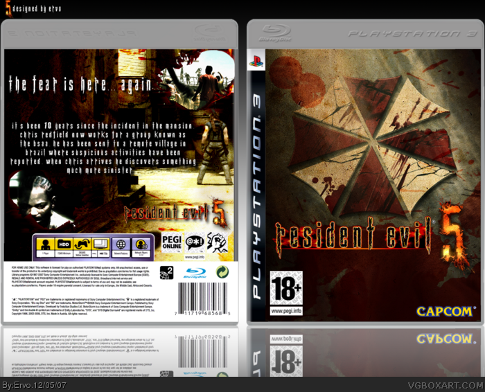
the back is a tad busy, but the front makes it better.
improve the back a bit, and you'll get a fav.
[ Reply ]
#3, what should i do with it?
[ Reply ]
Looks pretty cool.
[ Reply ]
It seems more like a box for Umbrella Chronicles.
[ Reply ]
#5, yup
[ Reply ]
#4, Perhaps try to use less pictures.. it's a bit busy.
[ Reply ]
I would try using a different font. That's what keeps the back busy, in my opinion. The front is great.
[ Reply ]
Also, get rid of that logo in the corner. That'll make it look less busy.
Edited at 1 decade ago
[ Reply ]
the front just wowed me....
The back is quite nice too...and would do very well with a nice tagline ;)
P.S. I really like your shift from 3D to 2D design for this one. Really nice my friend :)
Edited at 1 decade ago
[ Reply ]
It's good but the front shows the umbrella from Umbrella Chronicles and this is an RE5 box.
[ Reply ]
Nice job, man :)
[ Reply ]
I FRIGGIN KNOW IT HAS UC ARTWORK. I wanted to do something different because most of RE5 boxes here have the same picture of Chris in the front. I'll check if i can do something with the back.
[ Reply ]
Better now?
[ Reply ]
#15, Yes :P
More faves. Nao.
[ Reply ]
Looks great!
[ Reply ]