Like seriously dude, not to be mean at all, but do you not know how to use my template? (again)
The back isn't proportioned with the front/spine and on the spine you have the box details showing.
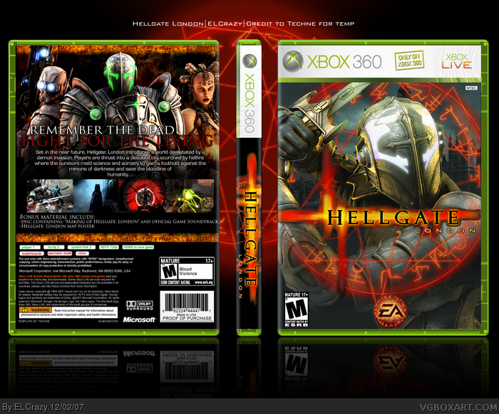
Back is nice, but try something different with the front. The whole "hellish" symbol around the knight has been done to death. It was cool when Mad spike first did it, but since then every Hellgate box has used that idea more or less.
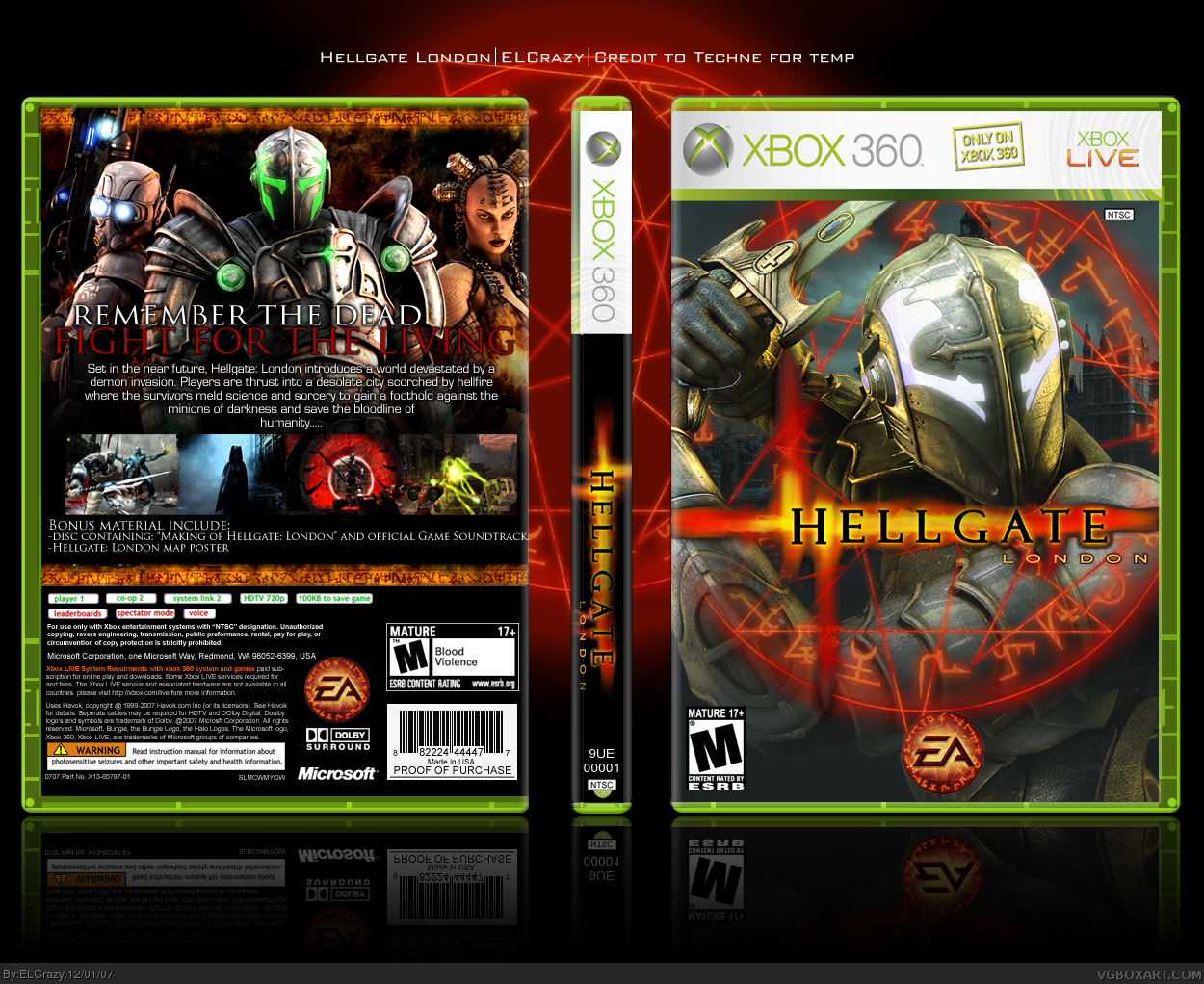
Now this is the perfect example where a spine truly compliments the whole box. I see you started paying attention to the background aspect as well my friend, perfect choice :)
My only complaint is that while the back is dark-ish the front doesn't agree with it in that it has a grey-ish background.
 Hellgate: London Box Cover Comments
YAY it's uploaded.
Finally.
[ Reply ]
Hurray!! :D
faved.
[ Reply ]
Nice job
[ Reply ]
Thanks guys =D
[ Reply ]
kool.
[ Reply ]
Hurray! Free cheers for ELCrazy! Ah it turned out fantastic!
[ Reply ]
#6, lol thanks man
Thanks Ervo =D
Can't wait to see your box!
[ Reply ]
You could stop pwning any time you want.
Thanks for making everyone else look back, dicknose.
[ Reply ]
#8, I can't, it's too fun :D
LMAO jkjk. Thanks for the fav :)
[ Reply ]
Like seriously dude, not to be mean at all, but do you not know how to use my template? (again)
The back isn't proportioned with the front/spine and on the spine you have the box details showing.
[ Reply ]
#10, Shit, sorry man, I got it rushed.
To be honest, I'm not too sure how to use the PSD version, as they are so many details :p
Can you send me the one that you provided in the LK Resource thread? (the png version)
[ Reply ]
really, really great hof box:)
[ Reply ]
#12, Thanks man :)
[ Reply ]
There's a PSD version? What's the difference?
[ Reply ]
#14, The PSD version has all the little details in seperate layers and such.
[ Reply ]
Back is nice, but try something different with the front. The whole "hellish" symbol around the knight has been done to death. It was cool when Mad spike first did it, but since then every Hellgate box has used that idea more or less.
[ Reply ]
I love, nothing more to say. 5/5 +Fav :)
BTW, I'm leaving the site, just making a few last favorites and comments, that's all. Bye everybody.
[ Reply ]
#16, Yeah, but I tried a different background, but I didn't think that'll make a difference :p Thanks though :)
#17, thanks man, and farewell! =D
[ Reply ]
Thanks TCM for the fav! :)
[ Reply ]
I forgot to comment it. Awesome :)
[ Reply ]
#20, lmao thanks :)
[ Reply ]
Thanks for the favs, dell and Destroyer :)
[ Reply ]
#15, ...Why would you use the PSD version, then? It seems like that'd be too much of a hassle... :\
[ Reply ]
#23, I don't have the PNG version. Do you have it? If you do, please PM it to me. Thanks :)
[ Reply ]
Now this is the perfect example where a spine truly compliments the whole box. I see you started paying attention to the background aspect as well my friend, perfect choice :)
My only complaint is that while the back is dark-ish the front doesn't agree with it in that it has a grey-ish background.
[ Reply ]
#24, Sure thing.
[ Reply ]
Updated with temp and editing changes.
[ Reply ]
#27, but you got rid of the NTSC log at the top and on the back it now says it's Tenn and the front says Mature. Those are very good changes.
[ Reply ]
#28, Shit, wait I'll change those.
[ Reply ]
updated.
[ Reply ]
I like
[ Reply ]
#31, thanks :)
[ Reply ]
Even though I was quite critical of this box earlier, I really like the quality and it looks extremely nice on a bright monitor.
+fav
[ Reply ]
here's a fav, on the house. however i'd like it if you moved the EA logo to the right corner.
[ Reply ]
WOAH HOF,
and thanks for the faves, Greg and dms! :D
[ Reply ]
gratz ELc.
[ Reply ]
Woah, finally! This was definatly deserving of the HoF. Congrats.
[ Reply ]
finally, i really like this box, congratulate
[ Reply ]
thanks #36-38 (:
[ Reply ]
Gratz.
[ Reply ]
thanks mate (:
[ Reply ]