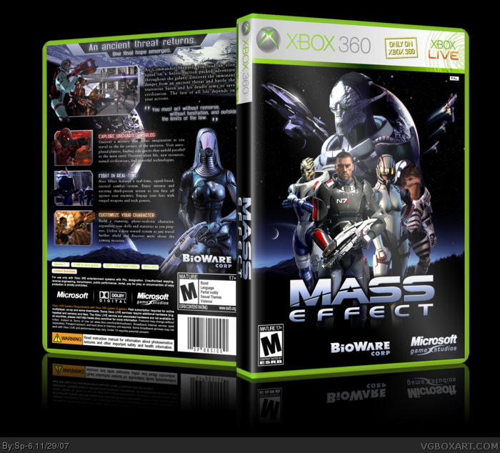
I think you did a really nice job. My only nitpicks, and they're rather minor, is that there is a bit too much black and the planet looks like it's coming out of his back.
#8 thanks a lot, i appreciate it
#9 at first i was making mario galaxy box, but it turned out to mass effect:D
#10 i agree, but i dont have better planet. limited resources:)
#12 i tried several fonts and this was the least queer:)
On a box this awesome, i just have to do a bit of nit-picking. :P
The character's on the front seem to get cut off at the legs, i'd say if you had made it more of a fade, rather than an almost sudden stop, it may look a bit better.
#35, Nahhh I aint being selffish its just that it would be kewl if only a few people had their own template you know. Just like what I did with my psp one. But I gave it away to everyone a month later
I actually think you should do a Smackdown 2008 box, SP. Seeing your NHL box made me confident that someone can actually do a sports box well. I think I could see you doing a Smackdown box, and doing it extremely well.
Im doing a Ac box but it wont be done till another week and it is so different than the others too. But right now im working on uncharted drake's fortune for the 360
 Mass Effect Box Cover Comments
so, what do you think?:)
[ Reply ]
I think that you did an awesome job :)
[ Reply ]
I think it's one of the best boxes I've ever seen. :D
[ Reply ]
the front not to speilshel but the back looks realy offical =D i give you a 4.5/5
[ Reply ]
Wow. this is really good. :D
[ Reply ]
#2, #3, #5 thank you, im glad you like it
#4 you are too generous:D
Edited at 1 decade ago
[ Reply ]
In full view it looks great! Good job :D
[ Reply ]
Fantastic job, my friend.
[ Reply ]
This must be in the Hall. No mario galaxy´s box ¬¬
[ Reply ]
I think you did a really nice job. My only nitpicks, and they're rather minor, is that there is a bit too much black and the planet looks like it's coming out of his back.
Again, awesome job.
[ Reply ]
#8 thanks a lot, i appreciate it
#9 at first i was making mario galaxy box, but it turned out to mass effect:D
#10 i agree, but i dont have better planet. limited resources:)
#12 i tried several fonts and this was the least queer:)
Edited at 1 decade ago
[ Reply ]
I personally would've liked a better font choice for the paragraph text on the back.
design wise, however, this is marvelous :)
[ Reply ]
yet again m8 fukin awsome ;) your one of the best on the site imo keep up the amazing work.
(FAVED)
[ Reply ]
Pretty damn awesome.
[ Reply ]
i believe it's amazing.
seriously,wow?
[ Reply ]
Pretty much the best ME box here and one of the best boxes ever.
[ Reply ]
#13-16 Thank you very much, buddies:)
[ Reply ]
Faved, of course.
[ Reply ]
0_0
On a box this awesome, i just have to do a bit of nit-picking. :P
The character's on the front seem to get cut off at the legs, i'd say if you had made it more of a fade, rather than an almost sudden stop, it may look a bit better.
But still, an incredible box, +fav
[ Reply ]
#18 and i thank you, of course:)
#19 i agree with you, but i had to do that, because krogan had a beautiful ign logo on his leg:)
thank you all for your criticism, i want to know what to do better next time...
Edited at 1 decade ago
[ Reply ]
Better than the official ;)
[ Reply ]
its in the HOF =D
Edited at 1 decade ago
[ Reply ]
that was quick, thanks to all:)
[ Reply ]
#23, yeah, third box added to HoF this hour xD
[ fb1,me,you ]
roflmao..xD
great stuff ^^
[ Reply ]
well done m8ty , deffo deserved HOF ;)
[ Reply ]
I love how you arranged back cover
[ Reply ]
MY boy sp-6 and this awesome box. HEy sp-6 are you and me the only people that have your awesome temp.
[ Reply ]
#27, I have it too. I got it first WAYYYY before you had it.
Edited at 1 decade ago
[ Reply ]
i think i sent it only to elcrazy, jevangod and ladykiller (in this order:)
[ Reply ]
#28, Doesnt seem like you use it much. #29 thats kewl just the four of us have it. We should keep it that way
[ Reply ]
#29, Can you send it to me too? >___>
[ Reply ]
#30,
> <
.._..
..U..
That's me, sticking my tongue out at you!
[ Reply ]
#30, I used it quite a lot.
And I got the reflection right =D
[ Reply ]
#33, So, "quite a lot" means "twice", now?
[ Reply ]
#34, Thrice actually.
It's four (300) but I updated it with a different template.
And jevangod, anyone can have the template, as long as Sp-6 is content with it. What you said sounded quite selfish.
[ Reply ]
#35, Nahhh I aint being selffish its just that it would be kewl if only a few people had their own template you know. Just like what I did with my psp one. But I gave it away to everyone a month later
[ Reply ]
#36, Oh, but the thing it will let other members feel left out, and that's bad, unless they are trolls, then that's a different thing.
[ Reply ]
Hey, Sp-6, make another box! I love your work. XD
[ Reply ]
Do an AC box! I would favorite that so hard!
[ Reply ]
I actually think you should do a Smackdown 2008 box, SP. Seeing your NHL box made me confident that someone can actually do a sports box well. I think I could see you doing a Smackdown box, and doing it extremely well.
[ Reply ]
#40, The last thing I want is another Smackdown VS. Raw 2008 box.
[ Reply ]
#41, Well, I really don't want to see another Assassin's Creed box.
[ Reply ]
Im doing a Ac box but it wont be done till another week and it is so different than the others too. But right now im working on uncharted drake's fortune for the 360
[ Reply ]
#43, ......that'll definitely cause Sony fanboys to riot =D
[ Reply ]
It'll cause ME to riot.
[ Reply ]
What? We're rioting? W00t!
[ Reply ]
Hes not going to riot. IF he does I dont really care anyway
[ Reply ]
nice fav
[ Reply ]
Hey, where'd you get that render of Garrus on the front? o__O
[ Reply ]
Oh wow
[ Reply ]
I never resized i Horribly misspelled Special in my Comment...
[ Reply ]