Although, I don't really like how on the back desciption it says "Who tries to begain his HONOR", now, I'm not sure if you mis-spelled "Regain" or mis-spelled "Begin", but you should fix that.
o my god..
seriously, what did i do to deserve this?
i've been a loyal and constructive member for a long time.
i've tried to improve, took all of your comments into consideration, and this is what i get?
a mere 5 other members commented on this..
this has been going on longer, but i though i'd just go on, and one day it'll just end.
but this has gone too far.
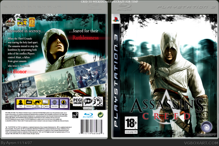
seriously, i don't know why everyone thinks this is the best thing since bread and butter, i mean, it's awesome don't get me wrong, but come on it's not THAT amazing. first of all the logo is way too low, the game is rated 16+ not 18+, and you are really starting to overuse these dropshadows on text. they aren't meant to make things more visible, just to make things look nicer, but in this case when you overuse them it gets kinda annoying. if you had a ubisoft logo on the front with the white text is would look better. also the way the back is arranged looks kinda lame, the text is too close to Altair and things are scattered round randomly. you should also use a better font, because you always seem to be using Times New Roman or whatever for games that don't suit it, try a more sci-fi font.
#35, if you've paid close attention, you wouldn't have said that.
first of all,it is 16+. ok, i didn't know.
2- where would you place the logo? on top of altair? come on.
3- there was no drop shadow involved in the entire making of the box.
4- i can change the ubisoft logo, i thought it was visible enough.
5- if you played close enough attention to the back, the main sentence is "shrouded in secrecy....feared for their ruthlessness
two parts, plus, if you'd think reasonably, nothing on the back can be organized in another way.
6- nothing is scattered around randomly, the title is fixed around altair, and the text is to the left of him.
7- the font is Riven, the first slight-dark-ages-themed font i used on ANY box.
sci-fi wasn't used because of the grunge text, if you'd read the first post, you would've known.
thanks anyways.
You really need to pay more closer attention Vengeance. Where else would Ayron put the logo? On top of Altair? I mean, come on. Be real. The game is rated 16+. I checked. There's no need to point out small mistakes. I think your starting to imagine things. There were no drop shadows involved. Its called strokes. The back looks fine to me. I don't understand why you think the arrangement of the back is lame. Mind explaining your reasons more?
1. i didn't say above Altair, but there's plenty of space on his chest.
2. sorry, i meant strokes. whatever they're called, but i see lots.
3. i know, but it still looks lame and the first part of it is too close to his head.
4. you probably could've stretched the text into a few long lines and put it at the top. the awards look random up there, they usually are at the bottom of the back or sometimes the front.
5. whatever the font's name is, it's still generic and boring, and i'm sure there's lots of interesting medieval fonts.
that good enough, or do you want me to make a box as an example?
I agree with Vengeance, nice box but not teh awesomeness as some people think. for one thing, grunge does not fit anywhere into the game, the logo is a bit low and should be raised. the text is kinda randomly placed, and the ubisoft logo is too close the the sides of the box. it's nice but definitely not, "teh shit"
3.5/5
#52, i know it's not offensive, but i've heard it like 5 times now.
who cares if it fits the game? imo, it does.
can't you see the link between an assassin and a dark theme?
#54, as i stated before, an assassin lives in the dark, lurking in the shadow to strike his opponent.
i thought a grunge-theme was applicable, and can you blame me for experimenting?
Truly an awe inspiring box,and I let the typo slip by for this one time because your parents deleted the file by accident. Casting aside the slight error this box definitly deserves 10/5 <---not a typo + FAV
and I hope to see this box back in the HOF.(Hall of Fame)
#58, roflmao, thanks alot dude.
i do not believe this will ever make HoF though.. considering the lack of members viewing the box since it's not on the homepage.
Thanks for the mighty fine english comment, jolly-hoho! xD
Well, its perfect, i dont have anything else to say, the shaders and that stuff looks great and fit perfectly together it doenst like the original cover. Great job keep going!
i dont think im gonna like Assassins Creed but i have to say Ayron but alot of effort into this box all you haters can go fall in a ditch somewhere id like to see you do better!!!!!! Keep up the good work Ayron im rootin for ya buddy ^_^
 Assassin's Creed Box Cover Comments
ok, this is yet another let's-just-hope-people-recognise-the-effort-and-concept experimental box.
great credit to a great artist and mate, ELCrazy, for inspiration and help.
i used a new colour-scheme, because this green fits in better with the partly-grunge type stylé i used.
i also thought the vertical grunge-type lines fitted quite nicely.
hope you like it, and please.. please don't ignore this box.. i've been ignored way too much up to now.
thanks in progress.
-Ayron
[ Reply ]
Oh... my... god... 5/5 +Fav! Nice one dude!
Although, I don't really like how on the back desciption it says "Who tries to begain his HONOR", now, I'm not sure if you mis-spelled "Regain" or mis-spelled "Begin", but you should fix that.
Edited at 1 decade ago
[ Reply ]
Awesome. I love the Ubisoft logo. 5/5 +fav. Probably your best.
[ Reply ]
woah....sweet 5/5+fav
[ Reply ]
Dude, that's amazing.
You're best work yet +fav
[ Reply ]
I've decided that this is my favorite box.
[ Reply ]
woah,thanks for the great support you guys.
p.s. it should be 'regain'. ..stupid typo.
[ Reply ]
#7, Yup, I love that art btw.
[ Reply ]
This needs more comments!!
[ Reply ]
#9, it'll never get more.
ignored artist, remember? :P
[ Reply ]
there is one from me: breathtaking
(found this term in dictionary and fits this box perfectly:)
fav
[ Reply ]
#11, Thanks alot..
i agree, breathtaking is a nice word :P
[ Reply ]
#12, Especially when it's used to describe your box xD
[ Reply ]
o my god..
seriously, what did i do to deserve this?
i've been a loyal and constructive member for a long time.
i've tried to improve, took all of your comments into consideration, and this is what i get?
a mere 5 other members commented on this..
this has been going on longer, but i though i'd just go on, and one day it'll just end.
but this has gone too far.
-Ayron
[ Reply ]
Shmexy
[ Reply ]
Thanks techne ;)
[ Reply ]
i think im genna cry....
*starts to cry*
*sniffs*
*falls on floor*
this is the most amazing thing ive seen in my life!
[ Reply ]
#17, thanks alot liam, glad you like it.
[ Reply ]
#15, oh-so true. :)
#17, it's the most amazing thing you've ever seen? I think that's puchin' it... although, it is great, it's not the best ever.
[ Reply ]
where is everyone getting this art!!?!?!!?
[ Reply ]
where is everyone getting this art!!?!?!!?
[ Reply ]
#20, a very very good friend gave it to me.
[ Reply ]
It's fantastic. I love it.
[ Reply ]
#23, ty mate ^.^
[ Reply ]
Dudeman. No problem. You deserve a lot better than this... You're one of the best on the site.
[ Reply ]
#22, I guess you're not allowed to show anyone,or give awaY?
[ Reply ]
#25, definetly not,allthough,i'm not considered to be.
and #26, no,sorry,i'm not.
[ Reply ]
Um... You kind of are... I'd classify you among the top ten artists on this site.
[ Reply ]
#28, lol, that kinda shocked me. xD
[ Reply ]
This game rocks my balls of, so hard that they are right now lying beside me and shaking of fear.
But this box's good too, nice colour. 4/5.
[ Reply ]
#30, errm thanks i guess.
i didn't want to know your opinion about the game though.
[ Reply ]
That's best box from you :)
[ Reply ]
#32, wow, thanks dude xD
it's a bummer that it gets ignored this easily though..
thanks mate ;)
[ Reply ]
This, is, AWESOME!! 5/5 And if you leave, well... *cracks knuckles*
[ Reply ]
seriously, i don't know why everyone thinks this is the best thing since bread and butter, i mean, it's awesome don't get me wrong, but come on it's not THAT amazing. first of all the logo is way too low, the game is rated 16+ not 18+, and you are really starting to overuse these dropshadows on text. they aren't meant to make things more visible, just to make things look nicer, but in this case when you overuse them it gets kinda annoying. if you had a ubisoft logo on the front with the white text is would look better. also the way the back is arranged looks kinda lame, the text is too close to Altair and things are scattered round randomly. you should also use a better font, because you always seem to be using Times New Roman or whatever for games that don't suit it, try a more sci-fi font.
4/5
[ Reply ]
#35, if you've paid close attention, you wouldn't have said that.
first of all,it is 16+. ok, i didn't know.
2- where would you place the logo? on top of altair? come on.
3- there was no drop shadow involved in the entire making of the box.
4- i can change the ubisoft logo, i thought it was visible enough.
5- if you played close enough attention to the back, the main sentence is "shrouded in secrecy....feared for their ruthlessness
two parts, plus, if you'd think reasonably, nothing on the back can be organized in another way.
6- nothing is scattered around randomly, the title is fixed around altair, and the text is to the left of him.
7- the font is Riven, the first slight-dark-ages-themed font i used on ANY box.
sci-fi wasn't used because of the grunge text, if you'd read the first post, you would've known.
thanks anyways.
[ Reply ]
You really need to pay more closer attention Vengeance. Where else would Ayron put the logo? On top of Altair? I mean, come on. Be real. The game is rated 16+. I checked. There's no need to point out small mistakes. I think your starting to imagine things. There were no drop shadows involved. Its called strokes. The back looks fine to me. I don't understand why you think the arrangement of the back is lame. Mind explaining your reasons more?
[ Reply ]
#36, #37,
1. i didn't say above Altair, but there's plenty of space on his chest.
2. sorry, i meant strokes. whatever they're called, but i see lots.
3. i know, but it still looks lame and the first part of it is too close to his head.
4. you probably could've stretched the text into a few long lines and put it at the top. the awards look random up there, they usually are at the bottom of the back or sometimes the front.
5. whatever the font's name is, it's still generic and boring, and i'm sure there's lots of interesting medieval fonts.
that good enough, or do you want me to make a box as an example?
Edited at 1 decade ago
[ Reply ]
#38, that's your opinion, and i respect it.
i won't ,however, change the box. because this is my personal preference.
[ Reply ]
WOW,GREAT WORK MAN,this is a heaps good cover n i really like it 5/5 +fave
[ Reply ]
#40, Thanks alot dude.
[ Reply ]
Pretty cool.
[ Reply ]
#42, Thanks trev.
[ Reply ]
&Favs
[ Reply ]
#44, Lol, ty =]
[ Reply ]
I agree with Vengeance, nice box but not teh awesomeness as some people think. for one thing, grunge does not fit anywhere into the game, the logo is a bit low and should be raised. the text is kinda randomly placed, and the ubisoft logo is too close the the sides of the box. it's nice but definitely not, "teh shit"
3.5/5
[ Reply ]
well, thanks anyways DS11.
[ Reply ]
ehhhhhhhhhhhh this is ok
[ Reply ]
#48, err, i guess.. what's wrong about it in your opinion?
[ Reply ]
The style of the box doesnt fit the game AT ALL. Why are all of you saying this is so great?
[ Reply ]
#50, maybe because it's my personal view on the art?
[ Reply ]
#50, no offense, but I agree.
[ Reply ]
#52, i know it's not offensive, but i've heard it like 5 times now.
who cares if it fits the game? imo, it does.
can't you see the link between an assassin and a dark theme?
[ Reply ]
#53, no, it's important to fit the game. It's like to make a Stranglehold box with Medieval theme on the box. Or something like that...
[ Reply ]
#54, as i stated before, an assassin lives in the dark, lurking in the shadow to strike his opponent.
i thought a grunge-theme was applicable, and can you blame me for experimenting?
[ Reply ]
-sigh-
16 favs..
too close to be true.;)
I just want to thank everyone for comments, Criticism and favs ^^
[ Reply ]
lol! thanks 'beatthem' xD
cya on school on monday ;)
[ Reply ]
Truly an awe inspiring box,and I let the typo slip by for this one time because your parents deleted the file by accident. Casting aside the slight error this box definitly deserves 10/5 <---not a typo + FAV
and I hope to see this box back in the HOF.(Hall of Fame)
[ Reply ]
#58, roflmao, thanks alot dude.
i do not believe this will ever make HoF though.. considering the lack of members viewing the box since it's not on the homepage.
Thanks for the mighty fine english comment, jolly-hoho! xD
[ Reply ]
Well, its perfect, i dont have anything else to say, the shaders and that stuff looks great and fit perfectly together it doenst like the original cover. Great job keep going!
Edited at 1 decade ago
[ Reply ]
#60, Thanks alot :D!
how much do i need for HoF? 20?..?
[ Reply ]
i faved it my friend =)
[ Reply ]
congrats too:)
[ Reply ]
Congrats on this achievement!!!
[ Reply ]
zomgbot? is this for real? my third HoF finally came looking around the corner!
thanks #62-64
Edited at 1 decade ago
[ Reply ]
omfg this is hof aaaarrrrrrggggghhhhhhhhh!!!!!!!!!!
Blah blah blah!
HOHOHO, Green giant!
im the laughing cow, ghehehe!
POP goes the weasle!!!
POOP!
that is, if reed puts it in
*looks at front page*
OMFG!!!
Edited at 1 decade ago
[ Reply ]
#66, puts it in HoF?
go the the mainsite mate ^^
green giant-laughing cow-moronic sheep and prayer mantis!
[ Reply ]
Con-gra-tiu-la-chon
[ Reply ]
#68, Dan-keuh-sch-eu-hn! XD
w00t, german! :P
[ Reply ]
#66-67 Thx guys! Now I have to start looking for my balls again!
As I dropped them while laughing and rolling on the floor!
Fahren Gunther!! Fahren die Pantzer!
Du bist ein blödhund Gunther!! Feuer auf dem blöde Juden!!
thats German too....
[ Reply ]
#70, gunther?ROFLMAO!
damn.. my balls ;)
[ Reply ]
You want me too translate that?
Edited at 1 decade ago
[ Reply ]
me likey :)
[ Reply ]
#72, no thanks.. XD
thanks #73.
Has anybody realized there's been 3 boxes added to the HoF in this hour?
[ Reply ]
Holy hell it's true!! The Hall Of Fame has to get a clean sweep very soon...otherwise it is gonna be even more crowded.
Edited at 1 decade ago
[ Reply ]
#75, zomg! it's 4 now o.o'
HoF-madness!
[ Reply ]
Atta baby.
[ Reply ]
#77, ROFL!!!! XD
finally, my third HoF ^.^'
-Hofgasmz-
[ Reply ]
#31, And that is a problem? *sigh*
[ Reply ]
#79, well, it's not.
it's just that it was quite unusual to start about a game..
anyways,idc.
sorry 'bout it.
[ Reply ]
#80, Because it would feel kinda empty so just say "Nice box".
[ Reply ]
Congrats man =D
[ Reply ]
#82, ty ^.^'
finally my 3rd hof
[ Reply ]
Congratulations! A truly amazing box.
[ Reply ]
#83, NOW will you accept that you're an above mediocre artist?
[ Reply ]
#84, thanks man ;)
#85, errm.. perhaps? xD
Edited at 1 decade ago
[ Reply ]
You got more HoF boxes than me.
No fair :(
Nah, I'm kidding. ^_^
[ Reply ]
#87, Roflmao.
please dó consider that 2/3 doesn't truly belong in there. ;)
[ Reply ]
i dont think im gonna like Assassins Creed but i have to say Ayron but alot of effort into this box all you haters can go fall in a ditch somewhere id like to see you do better!!!!!! Keep up the good work Ayron im rootin for ya buddy ^_^
[ Reply ]
#89, Thanks alot man ^.^'
[ Reply ]
OOOHHH! Just realized! I'm getting AC on my Birthday, so can you please PM me a printable version Ayron?
[ Reply ]
#91, i don't really have one..
if you give me the dimensions,i'd see what i can do
[ Reply ]
amazing fav, the black effect around the sides reminds me of my uncharted box a did with the leaves.
[ Reply ]