![]() »
»
[ Box updated on November 14th, 2007 ] [ original ]
 The Lord of the Rings: The Fellowship of the Ring Box Cover Comments
Comment on alldreamsfalldown's The Lord of the Rings: The Fellowship of the Ring Box Art / Cover.
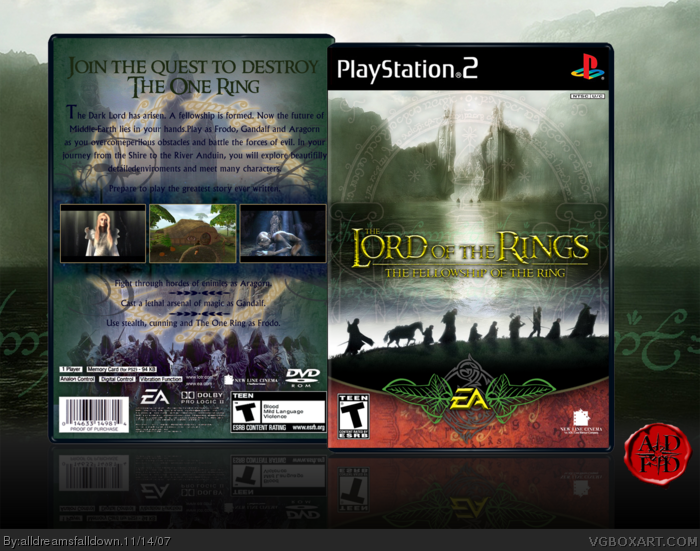
My second Lord of the Rings box to go with my Return of the King one.
Coming soon: The Two Towers.
[ Reply ]
I think this is really good, well done 4.5/5 +Fave. Btw i love the EA logo
Edited at 1 decade ago
[ Reply ]
the front is great, but there's something about the back that i don't like... i don't know.
[ Reply ]
#2, Why do people give boxes 4/5's and then favorite 'em? If it's one of your favorites then give it a 5/5. Awesome box btw I too love the EA logo. Faved.
[ Reply ]
The front is lovely. But the back looks too classic. And it looks plain too.
[ Reply ]
#4, I dont know why i didnt give it 5/5 I cant see much wrong with it, so I change my rating to 5/5
[ Reply ]
Why can't I do backs as good? :(
Edited at 1 decade ago
[ Reply ]
#7, You made awesome backs on your others. You should try to be more regular.
[ Reply ]
Awsome. It's kick a*s. Fave and 5/5.
[ Reply ]
great job, the front is really nice:)
[ Reply ]
Really, mega, awesome, but you need better borders around the screens on the back x
[ Reply ]
I love the front. The back is ok but I think it'd look more official if the description has smaller text but more of it and if you can, have more transparent reflections. If you make some improvements I'd favorite it.
[ Reply ]
awesome... 5/5
fav
[ Reply ]
Secksay...
[ Reply ]
More artistic than comercial. I love it.
Edited at 1 decade ago
[ Reply ]
This is good. I especially love your take on the background...definitely one of the best bg's I've seen yet. The box itself is equally impressive, both front and back. I have 2 minor suggestions for the back: consider decreasing/eliminating the yellowish screenshot border/outerglow/stroke(whatever) to make it blend better with the blue part, the teen esrb on the back also looks stretched. Otherwise, I'm really digging the feel of this box. +fav
[ Reply ]
I really like the update fav+1
[ Reply ]
The "arthouse" designer strikes again.
[ Reply ]
That's a lot better ! faved
[ Reply ]
GAH FIVE MORE
[ Reply ]
How did I miss this?
LotR is so epic.
Edited at 1 decade ago
[ Reply ]
I dunno, but I think ADFD has me to thank for the three most recent faves. :P
[ Reply ]
I do. Thanks. That thread really works :)
[ Reply ]
Yer welcome.
Edited at 1 decade ago
[ Reply ]
you ROCK![ guitar hero reference ]
gratz man ^^
[ Reply ]
Hall of Fame!
And all thanks to me giving you the 20th fav! Congrats, man... ^_^
[ Reply ]
Grats.
[ Reply ]
I take full credit for this getting in the Hall. ;P
[ Reply ]
What the hell HOF?? When this happen? Thanks guys. This server is making me miss this stuff.
[ Reply ]