This is a good first but here are some suggestions:
Cut out the logos better.
Get a better picture.
The Sony logo is a diamond, thats the PS logo.
Add descriptors for the ESRB on the back. (Example, violence, suggestive themes)
Use screenshot borders.
Use a better font and font color.
For now, 2/5. Keep trying though.
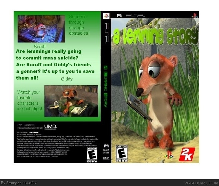
 A Lemming Story Box Cover Comments
Alright, this is my first box.
I hope you like it.
And thanks for any comments
[ Reply ]
Well, it's your first, so I'll go easy on you. Because we all sucked at one point or another.
To be honest, this is really kind of bad. The logo is bland at best, and the dev logos look odd. The Sony one is out of place.
The ESRB logo is too close to the side, and the one on the back should have rating reasons.
The pic on the front looks stretched to me.
The text on the back looks really bad and the back overall feels pretty lacking.
And the captions aren't so great.
But I think you have potential to be a good artist. We all do.
Welcome to the site. :)
[ Reply ]
This is a good first but here are some suggestions:
Cut out the logos better.
Get a better picture.
The Sony logo is a diamond, thats the PS logo.
Add descriptors for the ESRB on the back. (Example, violence, suggestive themes)
Use screenshot borders.
Use a better font and font color.
For now, 2/5. Keep trying though.
[ Reply ]
This is good but you should use the old lemmings from the computer game.
[ Reply ]