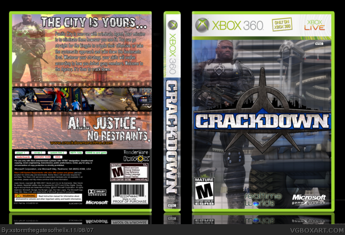
i well, really don't like it.
the front is a bit bright, and the back is weird...
the movie-line seems out of place[ and doesn't suit the feel of the game imo ]
also, the render on the top lefthand corner seems out of place....
Okay, this is basically a revamp of the Crackdown box I did on my other account. I know I should just update it on my alt, but I think that account got perma-banned... Yeah.
It's better than your previous box IN technique. NOT in style/detail.
The overall design is decent at best and could be improved upon. Some suggestions:
technique wise: decrease the size of the m logo a bit. The real time worlds logo in the front should have less outer glow. I don't like the transparency of the guy on the back. Caption font is fine, but pick a better/more readable text font next time. link text is too close to another text element, separate them. and I see you put another m info on the back since it has a different quality than the rest of the back info.
style/design wise: HA! that's muh seekrit. seriously, you'll develop your own style as you make more boxes ;) I'll only suggest that the soldier in front doesn't FEEL right. and the almost repeated image on the back isn't good technique/style wise.
hope that helps, you're getting better and I'm looking forward to more boxes from you. see...you just took 5 min of my time writing this paragraph...ayyy...keep it up ;)
 Crackdown Box Cover Comments
i well, really don't like it.
the front is a bit bright, and the back is weird...
the movie-line seems out of place[ and doesn't suit the feel of the game imo ]
also, the render on the top lefthand corner seems out of place....
[ Reply ]
Okay, this is basically a revamp of the Crackdown box I did on my other account. I know I should just update it on my alt, but I think that account got perma-banned... Yeah.
[ Reply ]
I agree with #2, the M on the back also looks kind of redish. 3.5/5
[ Reply ]
Alrighty, I'll try to fix it.
[ Reply ]
Thanks for not crediting me.
[ Reply ]
Oh, frack... Sorry. <___>
CREDIT TO ROSS FOR THE AMAZING TEMP
Sorryyyy!
[ Reply ]
It's better than your previous box IN technique. NOT in style/detail.
The overall design is decent at best and could be improved upon. Some suggestions:
technique wise: decrease the size of the m logo a bit. The real time worlds logo in the front should have less outer glow. I don't like the transparency of the guy on the back. Caption font is fine, but pick a better/more readable text font next time. link text is too close to another text element, separate them. and I see you put another m info on the back since it has a different quality than the rest of the back info.
style/design wise: HA! that's muh seekrit. seriously, you'll develop your own style as you make more boxes ;) I'll only suggest that the soldier in front doesn't FEEL right. and the almost repeated image on the back isn't good technique/style wise.
hope that helps, you're getting better and I'm looking forward to more boxes from you. see...you just took 5 min of my time writing this paragraph...ayyy...keep it up ;)
Edited at 1 decade ago
[ Reply ]
Haha, thanks. The only reason I used the font that I did was because it was called Agency FB. How can you NOT use that for a Crackdown box?
Anyway... Thanks for the comment. I'll try to change those things tomorrow.
[ Reply ]
deleted comment.
Edited at 1 decade ago
[ Reply ]
What are you talking about?! I didn't effing steal this template! Ross gave it to me! He said it was his!
[ Reply ]
deleted comment.
Edited at 1 decade ago
[ Reply ]