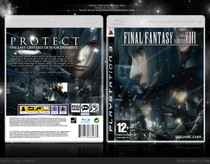
Wow...not a huge fan of the back and the screenshot outer glows but the front pawns. I think you should be using the official logo though so it'll look more proffesional. Ah...reminds me of my old FFVersus box. 4/5
The dark theme of the game? Hm...I thought the official logo was actually pretty darn dark and matched the nice blue color scheme. You sure you weren't looking at the "Final fantasy XIII" logo? I think it'd be fine if you put it in, but its your box and if your current logo works for you, then stay with it. And as for the screenshot borders, I just think they stick out a bit too much. Maybe pick just a slightly lighter blue and reduce opacity?
I have mixed feelings about it... I like it, but at the same time, it doesn't seem right.
I love the way you've put the shine on the "O" in "Protect", but I think the screenshot layout needs improving and a more suitable font for the description, perhaps?
one of the soldiers in the front is cut off, I also think you should've included the official logo. The screenshot layout is wee bit plain for my taste though. overall, still great.
 Final Fantasy Versus XIII Box Cover Comments
I just HAD to do a Final Fantasy versus XIII box. The art is simply gorgeous.
And yeah, A LOT of effort was put into this baby.
[ Reply ]
Wow...not a huge fan of the back and the screenshot outer glows but the front pawns. I think you should be using the official logo though so it'll look more proffesional. Ah...reminds me of my old FFVersus box. 4/5
Edited at 1 decade ago
[ Reply ]
#2, Thanks but I was thinking and the official logo would ruin the dark theme of the game. And what can I do with the screenshots? I'm not sure :p
[ Reply ]
Yea i have to agree with destined reality, the back is really good.
[ Reply ]
The dark theme of the game? Hm...I thought the official logo was actually pretty darn dark and matched the nice blue color scheme. You sure you weren't looking at the "Final fantasy XIII" logo? I think it'd be fine if you put it in, but its your box and if your current logo works for you, then stay with it. And as for the screenshot borders, I just think they stick out a bit too much. Maybe pick just a slightly lighter blue and reduce opacity?
[ Reply ]
#5, I'll try that thanks =)
[ Reply ]
Damn dude......damn. *bows* +fav
[ Reply ]
HAHA thanks.
[ Reply ]
I have mixed feelings about it... I like it, but at the same time, it doesn't seem right.
I love the way you've put the shine on the "O" in "Protect", but I think the screenshot layout needs improving and a more suitable font for the description, perhaps?
[ Reply ]
#9, Yeah. The screenshot thing is quite hard, but I'm coming up with a way.
[ Reply ]
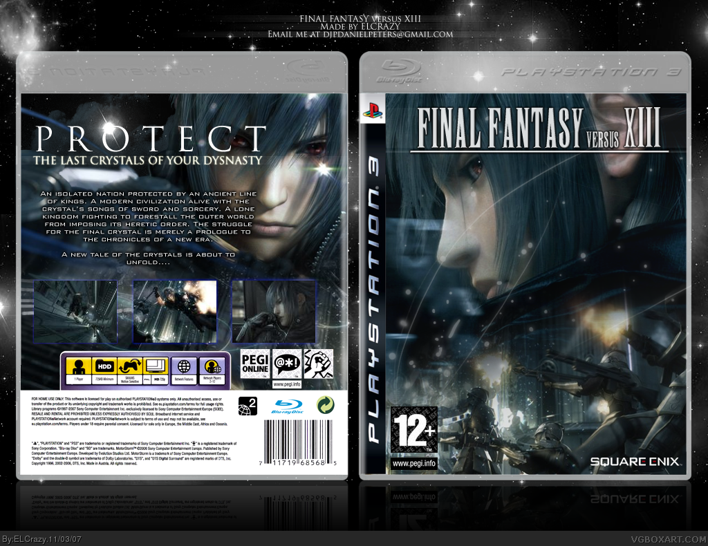
Updated.
I hope it's better this time.
[ Reply ]
one of the soldiers in the front is cut off, I also think you should've included the official logo. The screenshot layout is wee bit plain for my taste though. overall, still great.
[ Reply ]
Thanks.
Can anyone provide me with the official logo? I tried cutting out but it look terrible.
[ Reply ]
Elegant
[ Reply ]
Nice but I can't barrely see the screens.
[ Reply ]
Looks great. I like it.
[ Reply ]