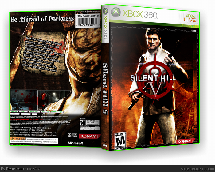
Phew, thought i'd never finish this, i'm really looking foward to this game, looks really scary, anyways this box has more work on it than you think, if you look closely on the front you can see all the pics, this box was originally a front only but i threw the back together at the last minute, enjoy!
#3, i agree. i don't like how you always slant your text, aswell. to be honest this doesn't look like you took your time with it, the M rating and Konami logo are touching the edge, and there's only two screens... the logo could be bigger aswell. Why don't you use Feed's logo? He did give it you...
and why does everyone put the barcode at the top? it's not meant to go there... it goes at the bottom next to the copyright info... >_>
 Silent Hill 5 Box Cover Comments
Phew, thought i'd never finish this, i'm really looking foward to this game, looks really scary, anyways this box has more work on it than you think, if you look closely on the front you can see all the pics, this box was originally a front only but i threw the back together at the last minute, enjoy!
[ Reply ]
Oooooo... Very stylish. Favedddd.
[ Reply ]
Only complaint I have is the back text. It feels kinda simple for a deep and psychological game like Silent Hill.
[ Reply ]
Very nice Brett, my only problem is the typo at the top 'Affraid' is should be Afraid, still its a very stylish box.
[ Reply ]
pretty good
[ Reply ]
#3, i agree. i don't like how you always slant your text, aswell. to be honest this doesn't look like you took your time with it, the M rating and Konami logo are touching the edge, and there's only two screens... the logo could be bigger aswell. Why don't you use Feed's logo? He did give it you...
and why does everyone put the barcode at the top? it's not meant to go there... it goes at the bottom next to the copyright info... >_>
Edited at 1 decade ago
[ Reply ]