Front is awesome, but the back isn't very mario-ish...It should have more of Mario and friends anticing...antiqueing...
(cookie to whoever gets the reference)
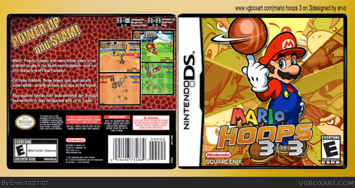
#13, yeah, i can clearly see a line through the pebbles, which means he used like 4 times the same picture.
i also believe a more gold-ish theme as used in the front would work.
 Mario Hoops: 3 on 3 Box Cover Comments
Hope ya like it. Yeah, i know the front is busy :D
[ Reply ]
Really nice! Especially the front! :)
[ Reply ]
#2, thanks a lot! And thanks for the fave :)
[ Reply ]
Very nice, but it takes a while for the normal person until you see that it's Nintendo characters "hidden" in the front. 4/5.
[ Reply ]
Cute ! Me likey :)
[ Reply ]
dude sweet, only thing is the text on the back is kind of plain and not very mario-ish. but thats nothing. faved anyway.
[ Reply ]
interesting front cover design
[ Reply ]
#4, i think you mean the Square Enix characters? (Black Mage, White Mage, Ninja and Moogle)
[ Reply ]
Perhaps you should credit Koopa for the Bowser Jr....?
Anyway, very stylish. I think this could be your Hall box.
[ Reply ]
#9, i got Bowser Jr. from official wallpaper. Thanks for the comment!
[ Reply ]
front is great, but the back isn't as good as could be.
+fav anyway
[ Reply ]
Pretty tight.
[ Reply ]
#11, Really? I like the back design... The basketball pebbles are a nice touch...
[ Reply ]
Front is awesome, but the back isn't very mario-ish...It should have more of Mario and friends anticing...antiqueing...
(cookie to whoever gets the reference)
[ Reply ]
#14, Futurama!
[ Reply ]
#13, yeah, i can clearly see a line through the pebbles, which means he used like 4 times the same picture.
i also believe a more gold-ish theme as used in the front would work.
[ Reply ]