#1: Isn't everybody?
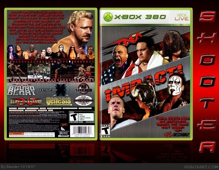
Well, the box is pretty good, but the T logo is squashed and too far in the corner. Also, the Midway logo is choppy, and the text you used has white spots all over it. Lastly, it wasn't really necessary to edit your temp.
#4, the midway logo isn't choppy, and the text doesn't just have white spots all over it. I beveled them to give them a 3d effect. As far as the temp goes it's the original temp I just changed the way XBOX 360 looked. Is that a bad thing?
The template kills the box seeing as the back doesn't have a spine. The right side of the back template should look like the left side of the front template. Seriously you guys must not try hard. Can you look at this box and not tell the template looks really f'ed up.
its decent, but needs improvement:
the Template,Midway cutout,hard to read summary and IGN rating, plus your name on the side realy made it worse not to mention somethign that isnt needed is badly cut out.
But still decent 2/5
EDIT: oh and lmao is it me or does Angle look like a rabbit (front top right)
Cool box mate i like it 5/5 +fav. I agree with you it's too much negativity on here. That's why I'm just a spectator. I post my work other places. Once again great job.
#12 im not being a hater, I think this one of top wrestling boxes on VG, my only real problem was how u put a badly cut out Skooter on the side (on one of my mario bros box i did the same thing), its better then my wrestling boxes,I just like to give my thoughts outloud.
 TNA iMPACT! Box Cover Comments
My latest box. It took me about a week to make this. If you like it Fav it please. I'm trying to get atleast one box in the hall.
[ Reply ]
Wrestling/10
[ Reply ]
I think it's pretty decent.
[ Reply ]
#1: Isn't everybody?
Well, the box is pretty good, but the T logo is squashed and too far in the corner. Also, the Midway logo is choppy, and the text you used has white spots all over it. Lastly, it wasn't really necessary to edit your temp.
[ Reply ]
#4, the midway logo isn't choppy, and the text doesn't just have white spots all over it. I beveled them to give them a 3d effect. As far as the temp goes it's the original temp I just changed the way XBOX 360 looked. Is that a bad thing?
[ Reply ]
#5, It is because the font doesn't fit.
[ Reply ]
#6, O I get it cause i used the PS3 font? Sorry I like to experiment I get tired of the norm all the time.
[ Reply ]
Actually, the Midway logo IS choppy.
[ Reply ]
#8, If you say so. You did help me make it. (End Sarcasm)
[ Reply ]
The template kills the box seeing as the back doesn't have a spine. The right side of the back template should look like the left side of the front template. Seriously you guys must not try hard. Can you look at this box and not tell the template looks really f'ed up.
[ Reply ]
its decent, but needs improvement:
the Template,Midway cutout,hard to read summary and IGN rating, plus your name on the side realy made it worse not to mention somethign that isnt needed is badly cut out.
But still decent 2/5
EDIT: oh and lmao is it me or does Angle look like a rabbit (front top right)
Edited at 1 decade ago
[ Reply ]
#10, #11, LOL
[ Reply ]
These are real comments! link Now I see what C4 was saying it's too many haters on here.
Edited at 1 decade ago
[ Reply ]
Cool box mate i like it 5/5 +fav. I agree with you it's too much negativity on here. That's why I'm just a spectator. I post my work other places. Once again great job.
[ Reply ]
#12 im not being a hater, I think this one of top wrestling boxes on VG, my only real problem was how u put a badly cut out Skooter on the side (on one of my mario bros box i did the same thing), its better then my wrestling boxes,I just like to give my thoughts outloud.
[ Reply ]
sweet
[ Reply ]
i am a fan of that cover i wouldnt mind having that
[ Reply ]