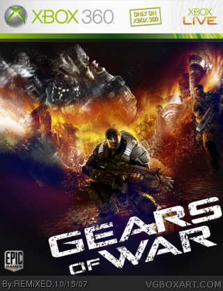
Some of the image is overlapping the template that you made look to squared and don't forget there isn't a ESRB and the Epic logo is on the wrong side.
I just remembered why the box looks so squished so there might be a second super improved version! Thanks for all the comments guys! I think I might stick around here!
 Gears of War Box Cover Comments
My first ever piece of box art. Made for a competition on the Epic forums.
I don't even have this game!
Edit. Go full view please! Looks lots better!
Edited at 1 decade ago
[ Reply ]
Some of the image is overlapping the template that you made look to squared and don't forget there isn't a ESRB and the Epic logo is on the wrong side.
[ Reply ]
Yeah I guess so. I was just going for the prettiest I could get, not accuracy. Thanks though!
[ Reply ]
The image looks fantastic, but the GoW logo doesn't look so good. Along with the Missing ESRB, etc., etc.
Good fo a first.
[ Reply ]
Thanks!
[ Reply ]
great first. some suggestions: box looks a lil squished and a logo/esrb logo would make it look more official.
Edited at 1 decade ago
[ Reply ]
I'm faving it, because this is the best firt box I've ever seen.
[ Reply ]
#7, I've seen better.
And by better, I mean this good, without the previously mentioned flaws.
[ Reply ]
This is your first box and it's got a fave from me, and that's hard to come by (I only have, what like 15?). I guess I just like the art so much.
[ Reply ]
apart from having no microsoft and esrb logo this rocks
oh and welcome its me yummybrains
Edited at 1 decade ago
[ Reply ]
I just remembered why the box looks so squished so there might be a second super improved version! Thanks for all the comments guys! I think I might stick around here!
[ Reply ]
#11, with a first box like this i doubt it
[ Reply ]
What does that mean?
[ Reply ]
wow this is better than alot of the crap i see on here, even from people who have been posting for a long time
[ Reply ]
#12, didnt mean to say that
[ Reply ]