sorry fot multi-upload.
i REALLY wanted to do this one.
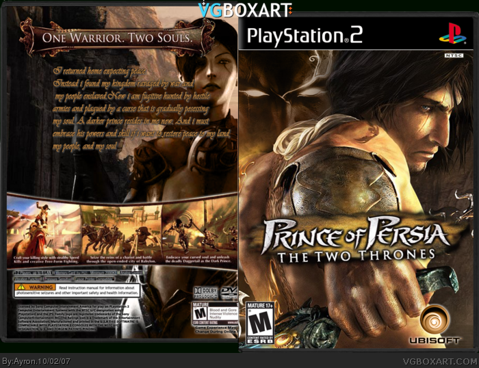
Rendered logo/some other stuff myself.
color edited ubisoft logo
etc.
I love the front, personally.
i wanted to go for the double personality look, as if the darker prince is looking over his shoulder.
Hope you like it,
comments are appreciated.
 Prince of Persia: The Two Thrones Box Cover Comments
sorry fot multi-upload.
i REALLY wanted to do this one.
Rendered logo/some other stuff myself.
color edited ubisoft logo
etc.
I love the front, personally.
i wanted to go for the double personality look, as if the darker prince is looking over his shoulder.
Hope you like it,
comments are appreciated.
-Ayron
[ Reply ]
I request permission to use that Ubi logo. It's secksy.
[ Reply ]
#2, i'll give it to you tomorrow, can't send now,srry.
what'do you think about the box?
[ Reply ]
Text on the screen shots are to small to read and the Summary on the back doesn't look very good. But once again, nice job on the cover. haha
[ Reply ]
#4, zomg o.o
[ Reply ]
I think it looks great, but the font on the summary just looks too... Bleh.
[ Reply ]
cool!
5/5
[ Reply ]
#7, thanks.
#6, yeah, i'll find another one soon.
[ Reply ]
Text on the back could be better. Maybe center it ( i dunno if ya understand me:I) and it will be good. Great job on the front!
[ Reply ]
#9, i understand.
thanks.x]
[ Reply ]
looks very nice
[ Reply ]
I love it. Great job! :)
The only problem is the text. It somehow doesn't fit right.
[ Reply ]
#12, i know.
i've always been better at fronts..
i suck at backs.
thanks elcrazy.
[ Reply ]
It looks great. It even looks better than the official box. Good job! I really like this one.
[ Reply ]
#14, thanks.
[ Reply ]