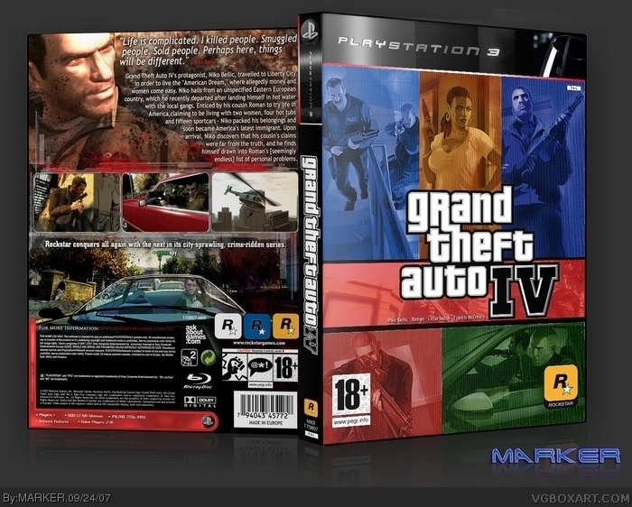
Since console-covers.com is down for a few days... thought I'll post another of my covers. This time, GTAIV with my PS3 template. As everyone does the 'same' GTA cover --- I've made mine slight different, as the front is based on the DVD movie cover of "Smokin' Aces" -- R1 version I think :) Not my best... but as all you GTA4 cover makers will know, not many great artwork available (esp. hi-res ones). Anyway --- I guess you could say it's different! LOL
#12, I agree, I don't really like it much at all. MARKER, I know you can do much better style-wise. For quality, I guess it's good, but I'm not one to fav just because I like 50% of it (The back)
EDIT: #15, Not liking the style isn't constructive? I said it was good quality wise, but I don't like the style.
Okay, now we know FOR SURE that someone is deliberately trying to get all of MARKER's boxes in the Hall of Fame. I wish I could say congrats, but I just know some are faving so it can get in the Hall.
The front really isn't great, but at least MARKER wasn't afraid to try something different. Everyone else is just using the same style for GTA boxes over and over again. Congrats, MARKER.
 Grand Theft Auto IV Box Cover Comments
I don't like the front all that much but it is realllly good. I love the back a lot. You are sure amazing at boxart.
[ Reply ]
Since console-covers.com is down for a few days... thought I'll post another of my covers. This time, GTAIV with my PS3 template. As everyone does the 'same' GTA cover --- I've made mine slight different, as the front is based on the DVD movie cover of "Smokin' Aces" -- R1 version I think :) Not my best... but as all you GTA4 cover makers will know, not many great artwork available (esp. hi-res ones). Anyway --- I guess you could say it's different! LOL
[ Reply ]
I really like this one.
[ Reply ]
i love the back.
[ Reply ]
Nicely done.
On the front you should have used the black border to separate all the pictures.
I have no complaints on the back.
[ Reply ]
all of your boxes are excellent. Youve realy made an ompact on this site. Fav+
[ Reply ]
And this has only 6 comments why?
This box is amazing. The front is okay, but the back is just-wow.
[ Reply ]
this is a good attempt but to be honest it would have been better if you had stuck to Rockstar's layout.
[ Reply ]
Whats with the red and green? Check out my GTA IV box man and comapre. Your back totally beats mine but the front, I'm not sure:
link
Fav'ed for effort anyway
[ Reply ]
congratulations MARKER, on a Full HoF-count. 71/71 ;)!
[ Reply ]
I think this pretty much proves you guys will throw anything into the hall these days...
[ Reply ]
What are the names doing under the logo? It doesn't really make sense... Anyway, best GTA box I've seen in a while.
[ Reply ]
#12, I agree, I don't really like it much at all. MARKER, I know you can do much better style-wise. For quality, I guess it's good, but I'm not one to fav just because I like 50% of it (The back)
EDIT: #15, Not liking the style isn't constructive? I said it was good quality wise, but I don't like the style.
Edited at 1 decade ago
[ Reply ]
#12, #14 I think you could post something more constructive about the box.
[ Reply ]
Okay, now we know FOR SURE that someone is deliberately trying to get all of MARKER's boxes in the Hall of Fame. I wish I could say congrats, but I just know some are faving so it can get in the Hall.
[ Reply ]
The front really isn't great, but at least MARKER wasn't afraid to try something different. Everyone else is just using the same style for GTA boxes over and over again. Congrats, MARKER.
[ Reply ]
I like the template but thats about it, theirs something about the front that puts me off and the back is a bit plain.
btw why is thiers 3 rock star logos on the back?
[ Reply ]