I like the style, but those round symbols in the lowe part of the front, doesn't look very NFS. Actually the turcoise colourscheme doesn't feel very NFS.
The logo on the front needs a drop shadow or something to make it a bit more visible, and the font on the back is boring. Otherwise, it's a cool overall design.
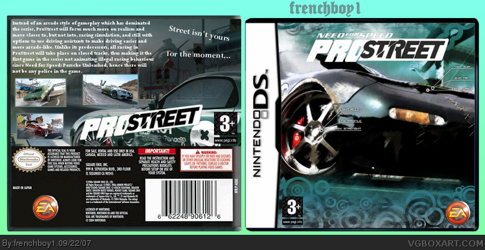
 Need for Speed : ProStreet Box Cover Comments
Why does no one take a look at my WiPs ?
Anyway, here's my new one. Comments and suggestions are welcome...
[ Reply ]
I like the style, but those round symbols in the lowe part of the front, doesn't look very NFS. Actually the turcoise colourscheme doesn't feel very NFS.
[ Reply ]
The logo on the front needs a drop shadow or something to make it a bit more visible, and the font on the back is boring. Otherwise, it's a cool overall design.
[ Reply ]
I will fav anything that says Need for Speed in its title
[ Reply ]
The back needs to be organized better, and the text on the front around the car seems awkward.
Edited at 1 decade ago
[ Reply ]