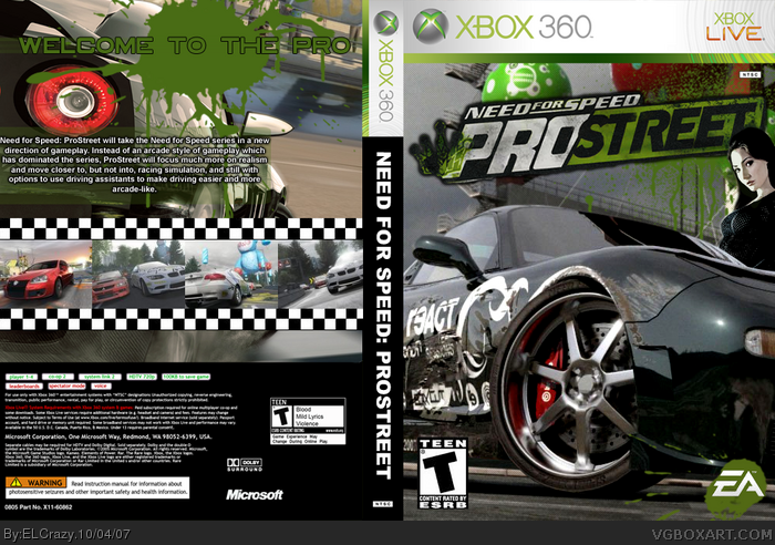
My main two dislikes would be that the car looks stretched on the front, and the checkered flag looks too...I dunno, can't put my finger on it (the checkered flag on the back)
#8, probably because people objected to having pictures of chicks on racing game boxes. it makes them look like magazine covers. i'm all for cars and babes, but it's simply a racing culture and it doesn't actually have anything important to do with racing itself.
i like it a lot, but you need a better back template. I have one, speak to me on MSN sometime and i'll send it you.
i perfer the first version, because i think the new one looks to green on back plus the car light looks more like a eye stairing.
also like the checkered flag idea but impo it could be smaller
 Need for Speed: ProStreet Box Cover Comments
I really liked how this turned out. Especially the front.
Favs and comments are appreciated! :)
[ Reply ]
Yo this is hott I should come to yo house and slap you in the face
[ Reply ]
I like it, I love the green effects.
My main two dislikes would be that the car looks stretched on the front, and the checkered flag looks too...I dunno, can't put my finger on it (the checkered flag on the back)
[ Reply ]
wow this is good. nice job.
[ Reply ]
Thanks guys. :)
[ Reply ]
This is good! But your backs are becoming slightly repetitive.
[ Reply ]
#6, True. Any way of improving the back?
[ Reply ]
The front is quite nice. But why hide the girl? :P
[ Reply ]
I wanted to show it as if she was going into the car....or something like that. :P
[ Reply ]
awsome FAV
[ Reply ]
#8, probably because people objected to having pictures of chicks on racing game boxes. it makes them look like magazine covers. i'm all for cars and babes, but it's simply a racing culture and it doesn't actually have anything important to do with racing itself.
i like it a lot, but you need a better back template. I have one, speak to me on MSN sometime and i'll send it you.
[ Reply ]
Updated with better quality 2D and minor changes.
VIEW IN FULL!
[ Reply ]
i perfer the first version, because i think the new one looks to green on back plus the car light looks more like a eye stairing.
also like the checkered flag idea but impo it could be smaller
[ Reply ]