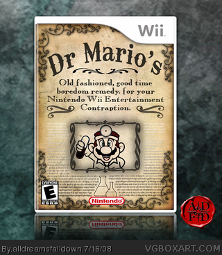
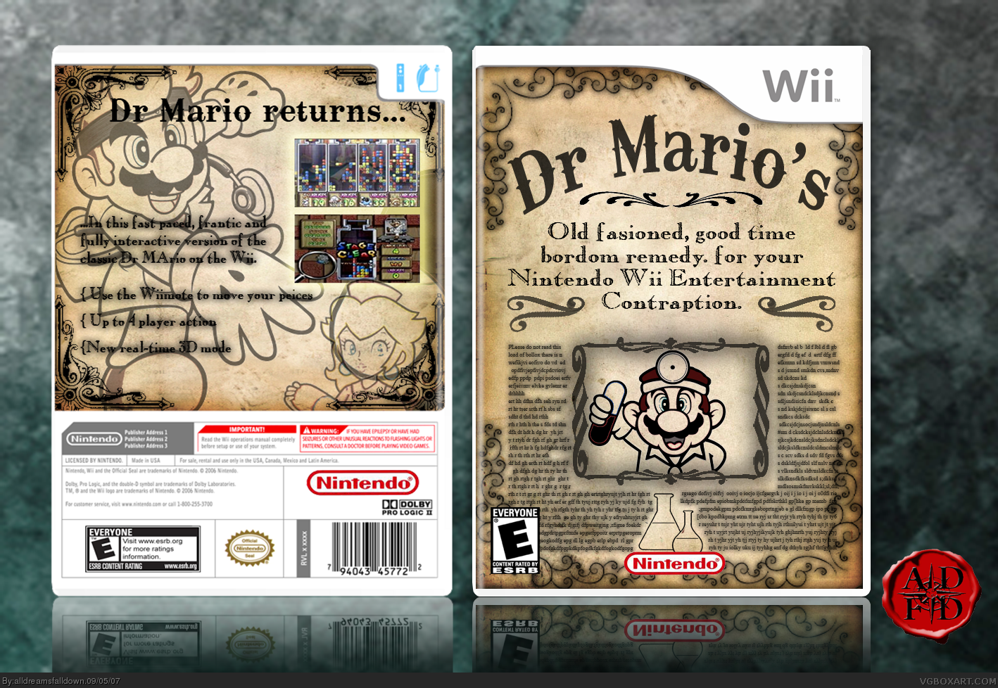
[ Buy Dr. Mario at Amazon ] By alldreamsfalldown 49 on September 5th, 2007 No Printable Available [ Box updated on July 16th, 2008 ] [ original ] Dr. Mario Box Cover Comments Comment on alldreamsfalldown's Dr. Mario Box Art / Cover. Cancel Reply alldreamsfalldown 49 [ 1 decade ago ] My Newbee Round 3 box. [ Reply ] Brettska99 45 [ 1 decade ago ] good box, just i don't like how hard the text is too read on the back Edited at 1 decade ago [ Reply ] KoopaDasher 30 [ 1 decade ago ] Hehe. This is great. Gotta love it. [ Reply ] alldreamsfalldown 49 [ 1 decade ago ] That back sucks in general. [ Reply ] Destined Reality 22 [ 1 decade ago ] Awesome box! I love the borders! Good luck on our match! (I think it will be a close one) 5/5 [ Reply ] finalfantaseer22 43 [ 1 decade ago ] nice design, but there's typos, the back is unpolished; the text is illegible and the screens are lamely placed/ framed. i like the asldjadslk aklajsd la jkdljas on the front though [ Reply ] alldreamsfalldown 49 [ 1 decade ago ] I think it's best if you all ignore this one. [ Reply ] dmshaposv 47 [ 1 decade ago ] @#7, why? Its quite a good box. I Feel if you had gotten rid of the drop shadow on the text on the front, and lowered its opacity a bit it would have been much better. [ Reply ] Ervo 48 [ 1 decade ago ] It's looking great. If you correct some typos i might fave it. [ Reply ] alldreamsfalldown 49 [ 1 decade ago ] Suggested changes made. [ Reply ] Vengeance 40 [ 1 decade ago ] i don't really want to bump this, but i noticed an error... at the left side of the box you can see a random part of mario's foot. =/ Edited at 1 decade ago [ Reply ] alldreamsfalldown 49 [ 1 decade ago ] Oh yeah, thought I cut all that excess off. Thanks. I might update it. [ Reply ] devilman 1 [ 1 decade ago ] 10 / 5 !!! [ Reply ] Magnetixs 1 [ 1 decade ago ] How you make the style?!?! [ Reply ] Magnetixs 1 [ 1 decade ago ] How you make the style?!?! [ Reply ] alldreamsfalldown 49 [ 1 decade ago ] EEW! Why you commenting on this? I may update this without the back because it's so hidiously bad. [ Reply ]
 Dr. Mario Box Cover Comments
My Newbee Round 3 box.
[ Reply ]
good box, just i don't like how hard the text is too read on the back
Edited at 1 decade ago
[ Reply ]
Hehe. This is great. Gotta love it.
[ Reply ]
That back sucks in general.
[ Reply ]
Awesome box! I love the borders! Good luck on our match! (I think it will be a close one) 5/5
[ Reply ]
nice design, but there's typos, the back is unpolished; the text is illegible and the screens are lamely placed/ framed.
i like the asldjadslk aklajsd la jkdljas on the front though
[ Reply ]
I think it's best if you all ignore this one.
[ Reply ]
@#7, why? Its quite a good box.
I Feel if you had gotten rid of the drop shadow on the text on the front, and lowered its opacity a bit it would have been much better.
[ Reply ]
It's looking great. If you correct some typos i might fave it.
[ Reply ]
Suggested changes made.
[ Reply ]
i don't really want to bump this, but i noticed an error... at the left side of the box you can see a random part of mario's foot. =/
Edited at 1 decade ago
[ Reply ]
Oh yeah, thought I cut all that excess off. Thanks. I might update it.
[ Reply ]
10 / 5 !!!
[ Reply ]
How you make the style?!?!
[ Reply ]
How you make the style?!?!
[ Reply ]
EEW! Why you commenting on this? I may update this without the back because it's so hidiously bad.
[ Reply ]