[ Box updated on August 15th, 2007 ] [ original ]
 Sonic Adventure 3 Box Cover Comments
Comment on MugglesMan111's Sonic Adventure 3 Box Art / Cover.

[ Box updated on August 15th, 2007 ] [ original ]
Comment on MugglesMan111's Sonic Adventure 3 Box Art / Cover.
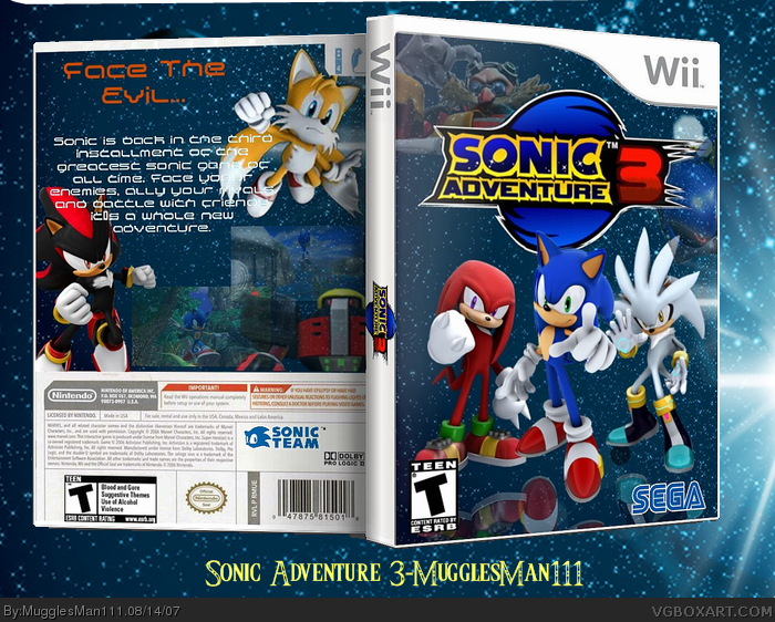
Pretty good although: The screenshot on the back should look integrated better and/or have a border and Eggman looks cut off on the front (also blurry). Also, the characters look like they are floating. Maybe add a reflection to them to make it look like they are on glass?
Ultimately, it's a well designed box, but those annoying gripes leave me at 3.5. Fix it up a little bit, and I think I can safely give it a 4.5
Edited at 1 decade ago
[ Reply ]
I couldn't have said it better myself. Actually...
The text on the back is too hard to read and there's only one screenshot. BTW, why use the Triforce font on the bottom for a Sonic game? Just wondering.
Edited at 1 decade ago
[ Reply ]
#2 i was just saying my name and what i made, it has nothing to do with the actual boxart
[ Reply ]
okay, just wondering. I like the fact I know what font it is. I feel special
[ Reply ]
i updated with what #1 said. let me know what you think
[ Reply ]
Not too bad but you should make the reflection more directly under the characters. Otherwise, it justs looks random and slops up the box a bit
[ Reply ]
screenshots are now hard to read, but I understand because there's not much room.
[ Reply ]
pretty good 5/5
[ Reply ]
you did'nt give me credit thats my logo :(
very good I love it
but the text is hard to read and that's all
4.5/5
....THAT PIC OF SHADOW IS AWSOME!
Edited at 1 decade ago
[ Reply ]
#9 well then im sorry credit to EggBoy13 for making my box complete with his logo.
[ Reply ]
I don't like the low-opacity screenshots on the back. Also the text could use some sort of shadow or something as it completely blends into white areas (Tails's tail). Also the low-opacity Eggman render seems a bit random to me. It's an alright box overall, 3/5.
[ Reply ]
#10 thanx
[ Reply ]
SHADOW = GAY! good box art though
[ Reply ]
Nice box! Although I thought the back was kinda of plain, good job! 4/5
[ Reply ]
99.99/100 thumbs up
[ Reply ]
Great Box, but I don't like the back's font. 4.75/5
[ Reply ]
The reflection looks off
[ Reply ]
i like why its rated "T"
-blood and gore
-suggestive themes
-use of alcohol
-violence
[ Reply ]
awesome work 5/5 favorated
[ Reply ]
cool.
[ Reply ]
It looks nice, but the screenshots are too transparent.
[ Reply ]
This is Amazing, 5/5
[ Reply ]
love it!! apart from the reflection, you need to work on that a bit.
+fav
4/5
[ Reply ]
luv it
5/5
[ Reply ]
out of all the other boxs, this one is the best, it looks the coolest, and it has silver one of the most awesome sonic characters ever.
[ Reply ]
This box is wicked!
But it would be better if you change the text
next to shadow's head orange. 5/5
+faved
Edited at 1 decade ago
[ Reply ]
Nice box 4/5
[ Reply ]
Triforce text? WTF? Anyway the box is cool
Edited at 1 decade ago
[ Reply ]
Ah yes, I remember this, pretty nice box... exept for the logo... :l
[ Reply ]