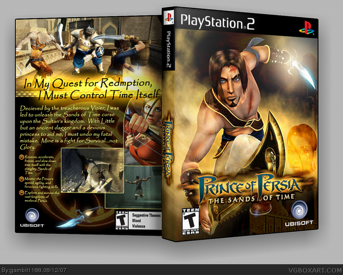
[ Box updated on August 13th, 2007 ] [ original ]
 Prince of Persia: Sands of Time Box Cover Comments
Comment on gambit1188's Prince of Persia: Sands of Time Box Art / Cover.
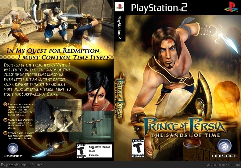
[ Box updated on August 13th, 2007 ] [ original ]
Comment on gambit1188's Prince of Persia: Sands of Time Box Art / Cover.
This is my first attempt at a box. Please comment and let me know what you think. Please note that this is just for my personal use and is not meant to look totally official (note no fine print or "features" on the back cover).
Edited at 1 decade ago
[ Reply ]
Wow. For a first, it's very good.
4.5/5
Welcome to the site! :)
[ Reply ]
Thx #2. Any hints on how to make it better?
Edited at 1 decade ago
[ Reply ]
Try using artwork for the front, and try to make borders for the screenshots behind. I suggest using 1px Stroke (if you're using Photoshop).
[ Reply ]
I'll make sure and do the boarders in the morning. As for artwork, this is as nice as it gets for this game. Sry.
[ Reply ]
You're the second person to use this picture and not give him a floor to stand on. A floor would be an improvement, apart from that its pretty good. Well done.
[ Reply ]
Very good.
I'd give it 4.5/5
P.s check your Personal Messages
[ Reply ]
Touched up the back a little and made it 3d. Thx to Roboross for showing me Imandix.
[ Reply ]
Good job but I think the girl looks out of place for some reason.
[ Reply ]
#9, front or back?
[ Reply ]
#10, Well both, I think you should remove that character from the front, or fade a better picture instead if you can. Also on the back can you move her up?
[ Reply ]
the problem with the back is the material itself. Thats the only part of that image i have. I'll try changing it out tomorrow.
[ Reply ]
Is that any better. If not I'll go back to the old one and try something different for that portion of the back.
[ Reply ]
Stop complaining people this is much better then other hall of fame boxes. Down at the right you should have put the sand that is in the girl. Other then that it looks really nice.
[ Reply ]
#14, could you please explain what you mean a little better. Thank you for you help everyone!
[ Reply ]
This is really good for a first. It's not necesary, but I suggest using the "papyrus" font in the back if you could. Some game info wouldn't hurt either. great box overall
[ Reply ]
I used the font that was to official font in the later games. I'll try papyrus and see how it looks. Thx for the suggestion.
Turns out that I like that font better. Updated!!
Edited at 1 decade ago
[ Reply ]
#17, it looks like that font was the one used in the manual for this pop game and I just happened to remember it now ;) love the update
[ Reply ]